Baixa Experimenta
Visual Identity
Challenge
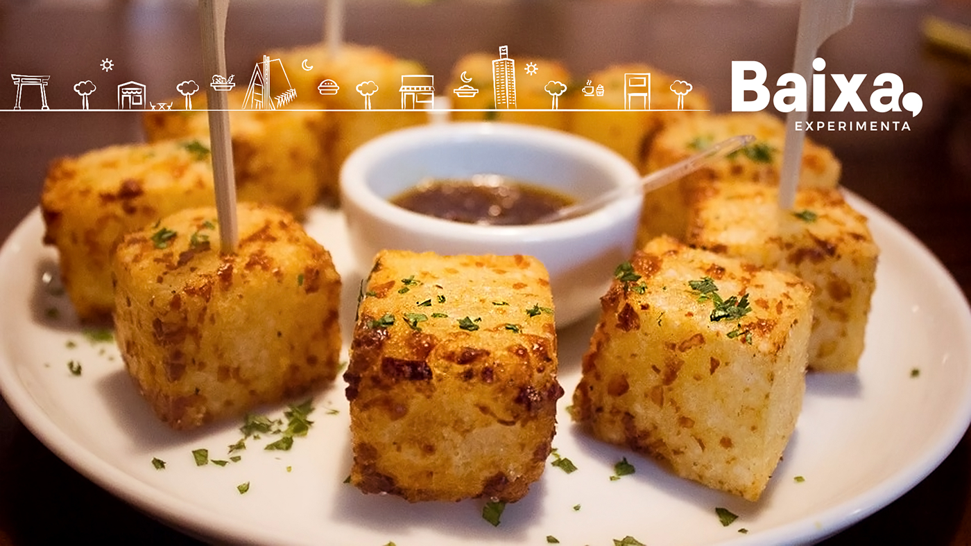
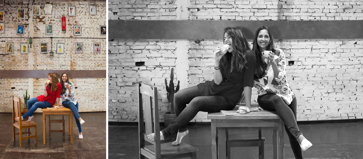
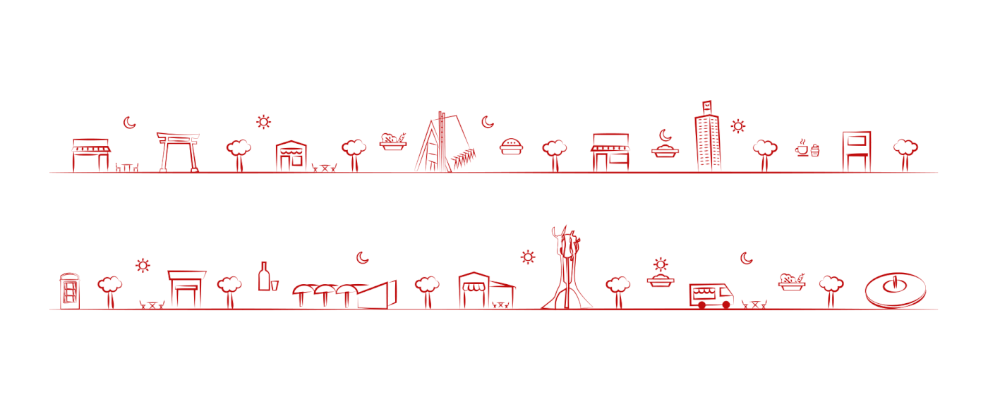
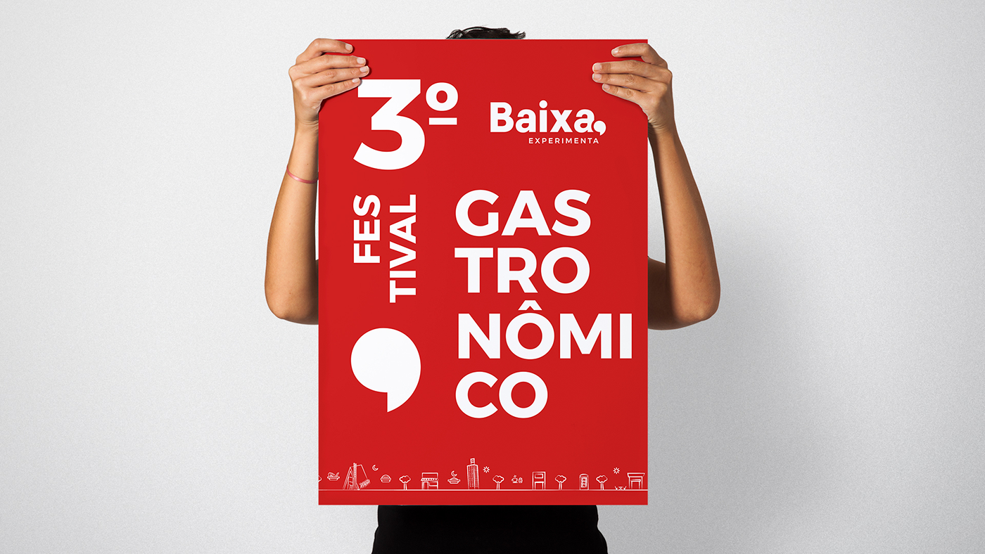
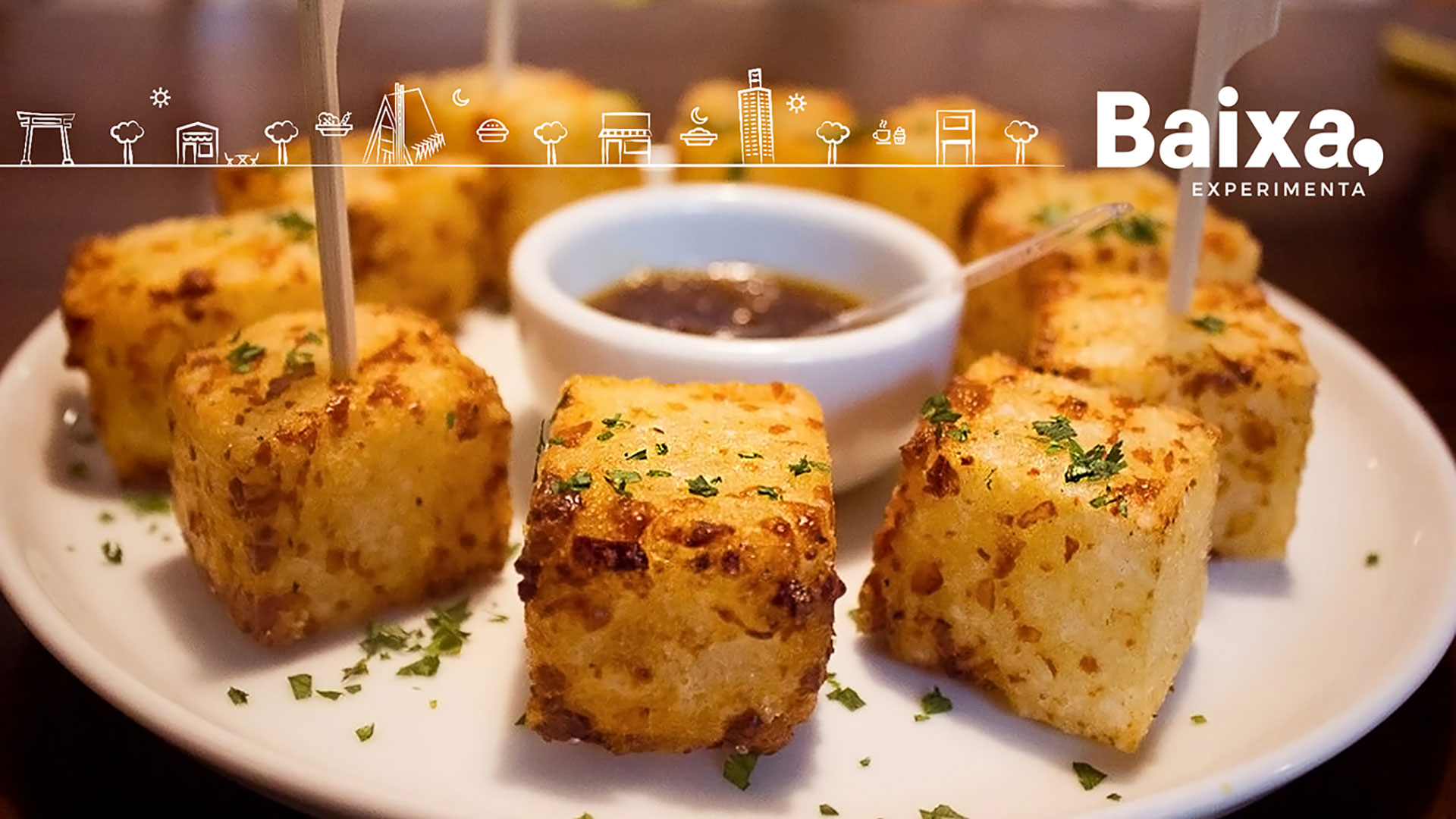
Baixa Experimenta is a gastronomic and cultural guide for the region of Londrina. Created by journalists Tatiana and Eduarda, the site is suitable for those who love to eat well and discover new experiences. It fell into our hands to develop a new communication that reflected the new positioning of this platform. In order to reinforce the diversity and absence of prejudices with new gastronomic experiences. Baixa Experimenta is the evolution of the Baixa Gastronomia Londrina, so it was very important to communicate elements that carry the identity of the city and the old brand.
Proposal
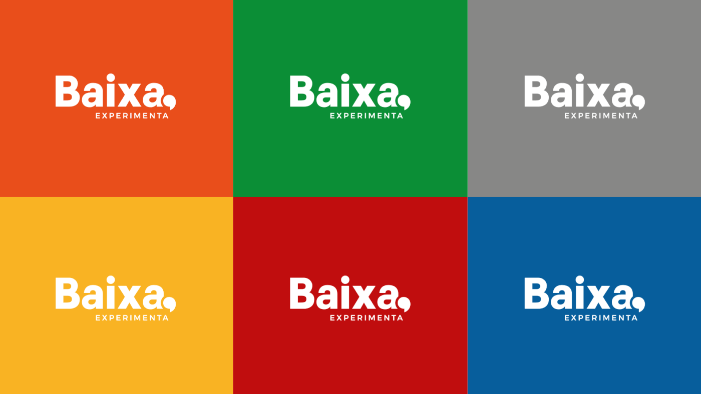
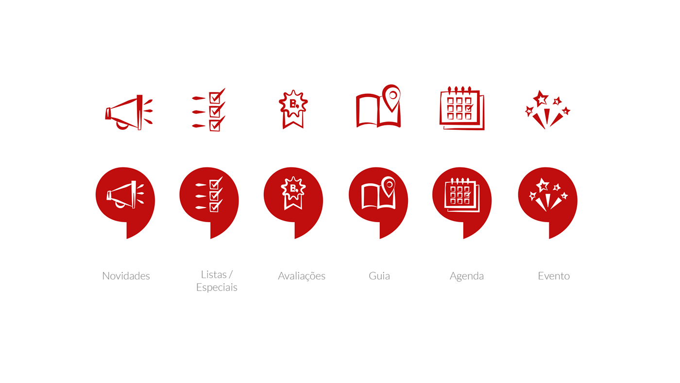
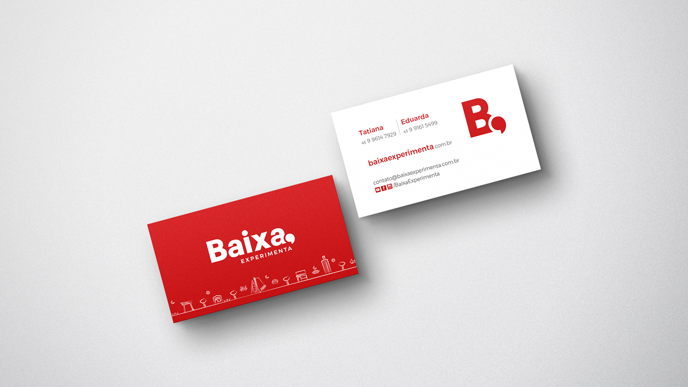
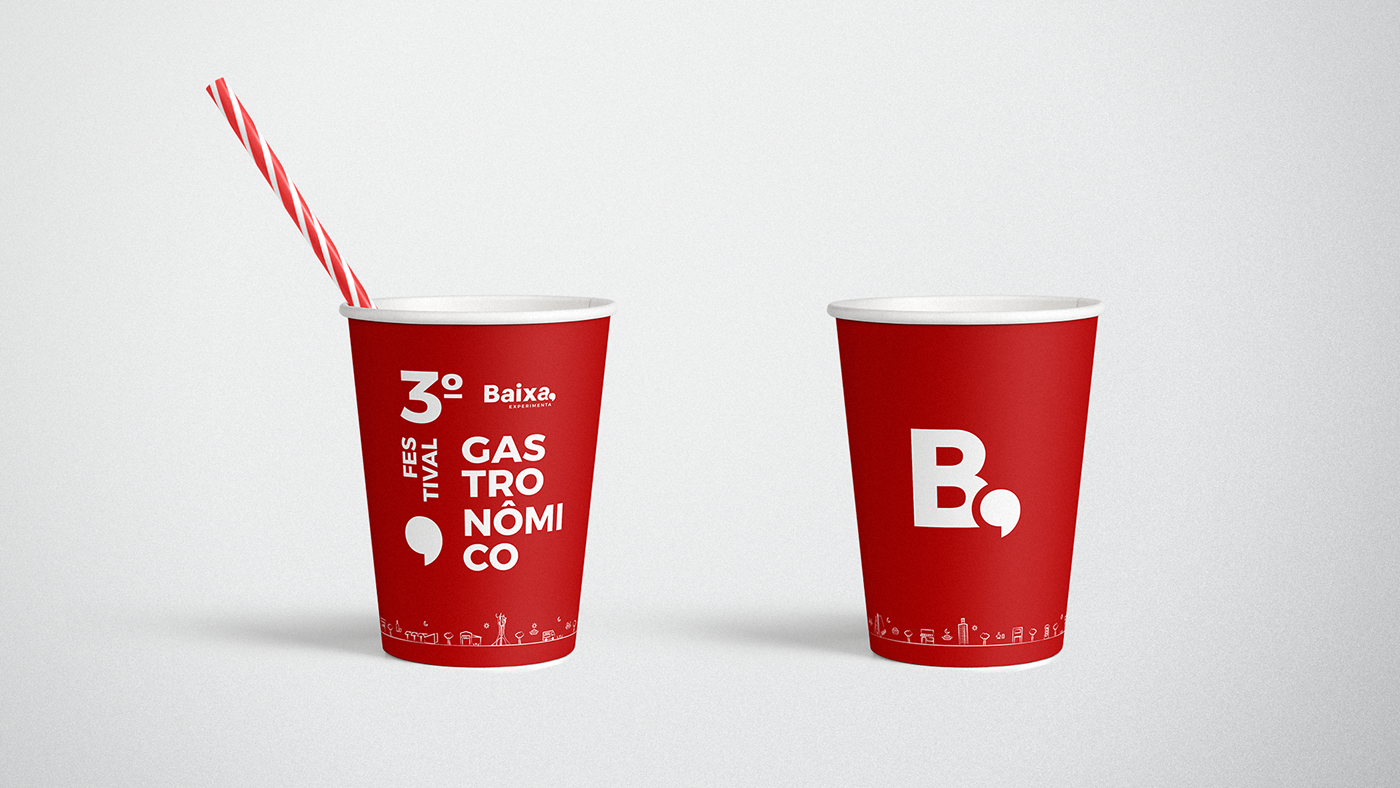
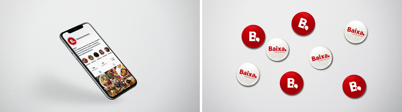
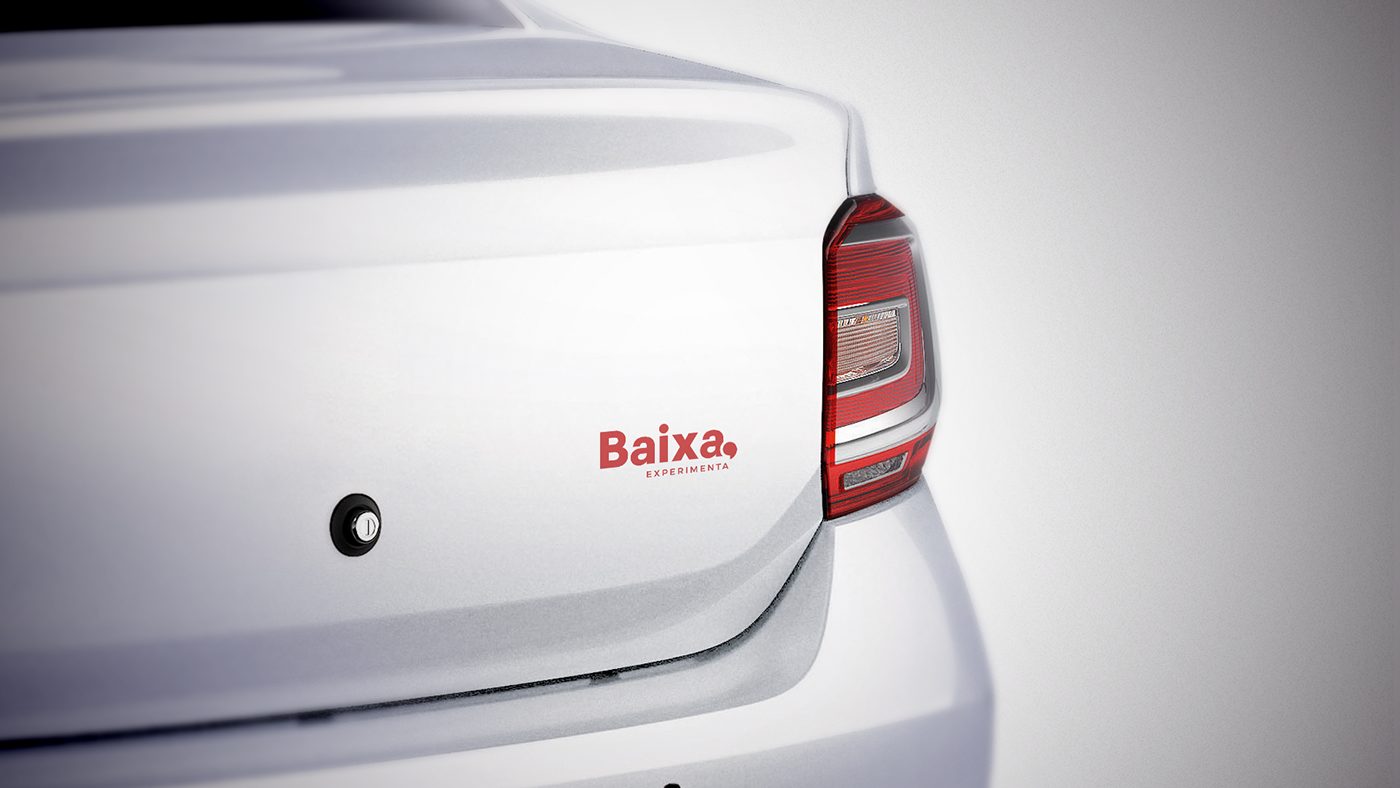
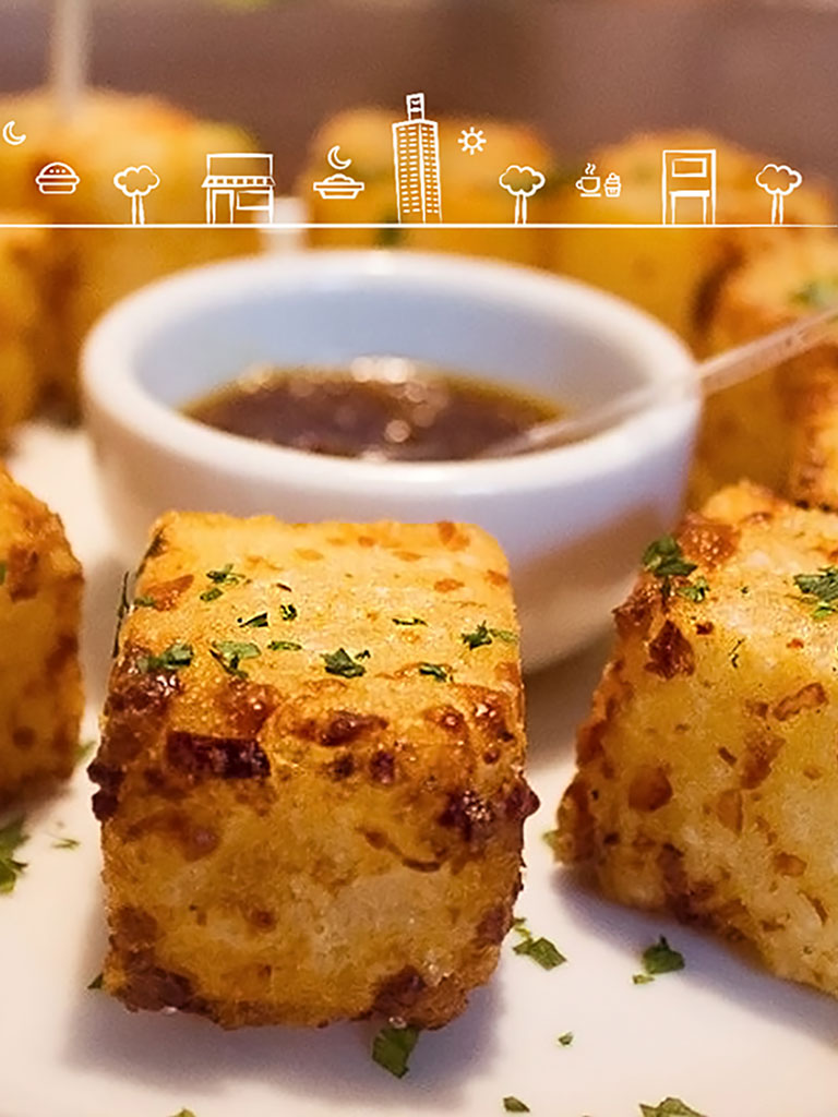
Because it is journalistic content, after several studies and tests, our proposal was to work a typography with a more basic style, but we use the comma as a key element. The comma concept brings the idea of sum and diversity. That is, when we list several items we use the comma to show that there is continuity. In the colors, we work hard the red that besides characterizing the old communication, makes strong reference to the city. We complement the palette with five more colors thus reinforcing the idea of diversity. There were also created a set of icons that represent the places / monuments that represent Londrina. And others that characterized the content segment published on the platform.