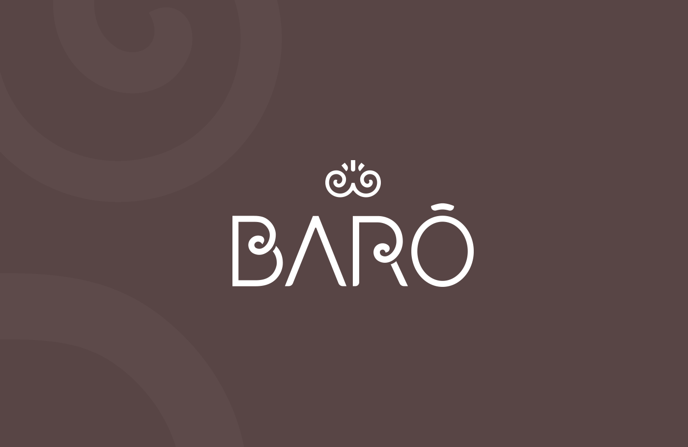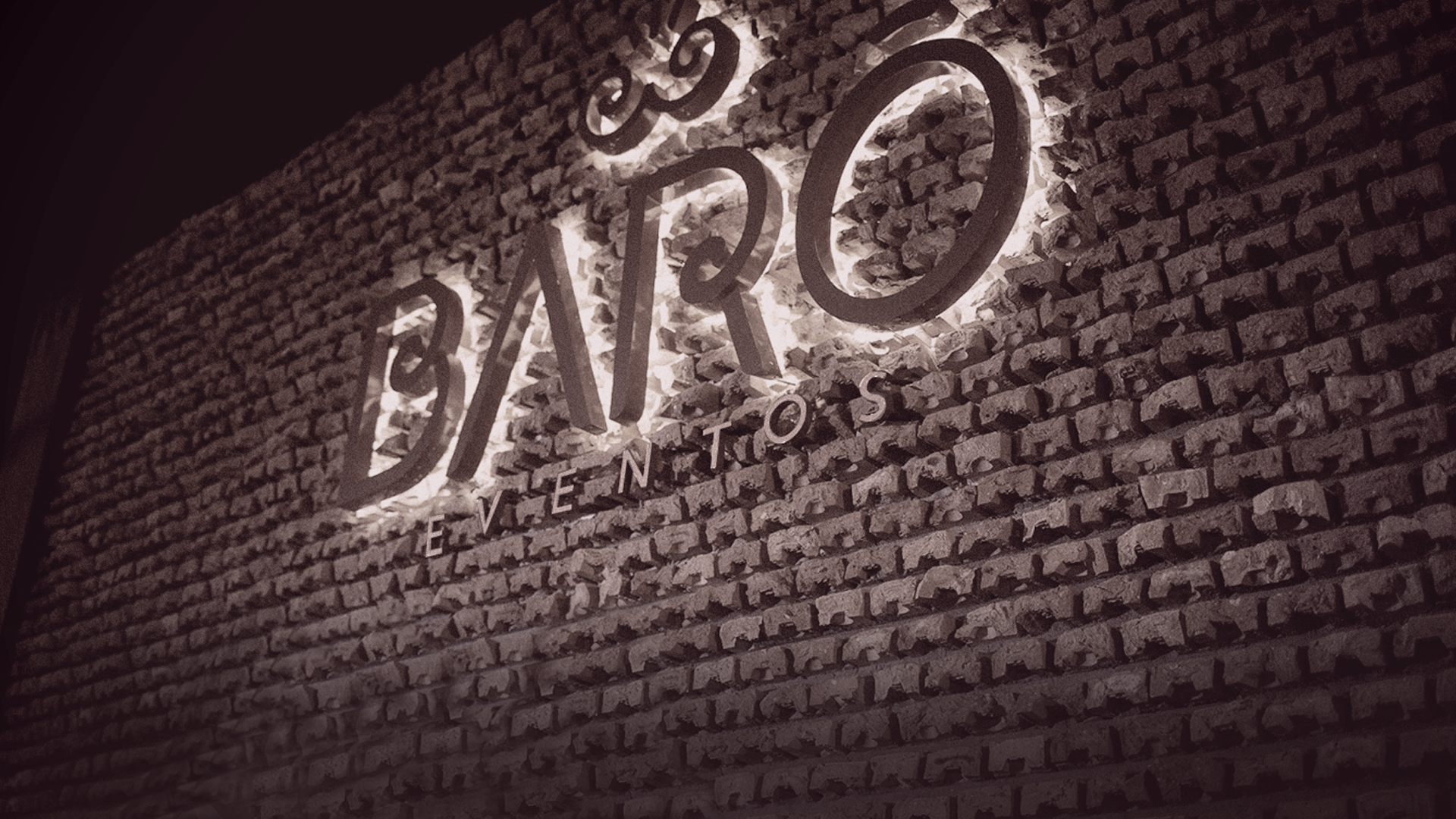
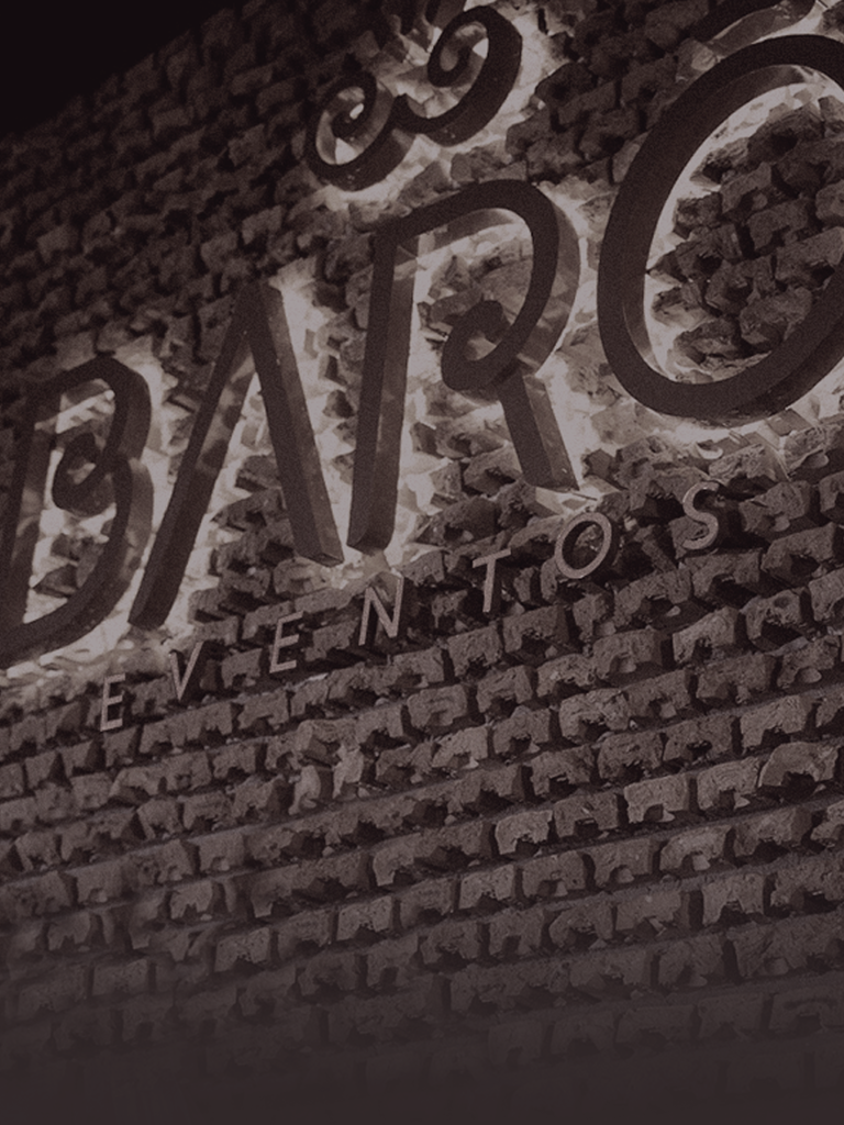
Barô
Naming | Visual Identity
Challenge
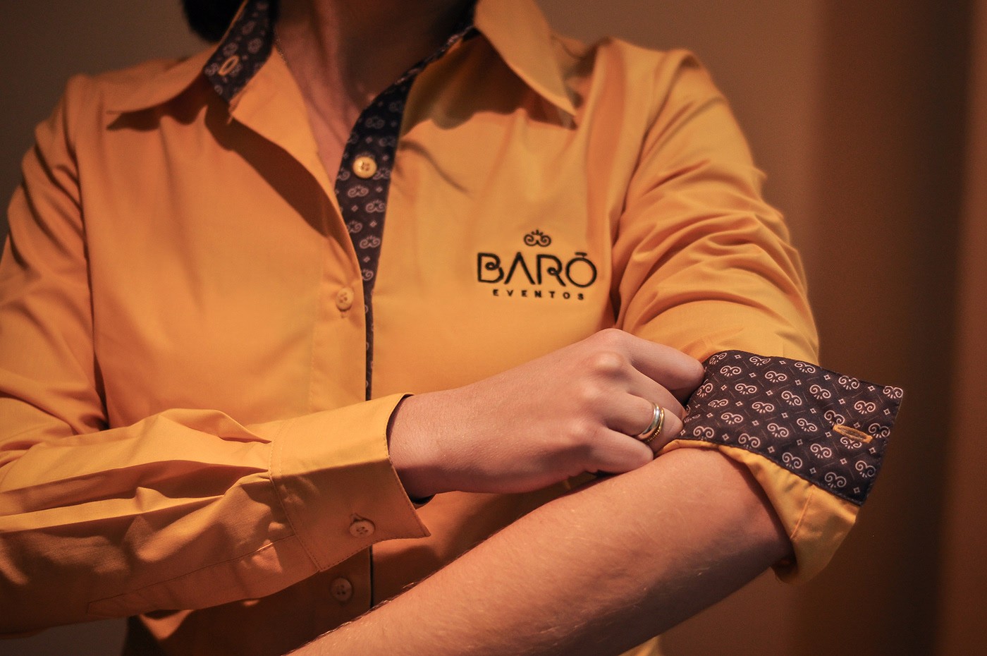
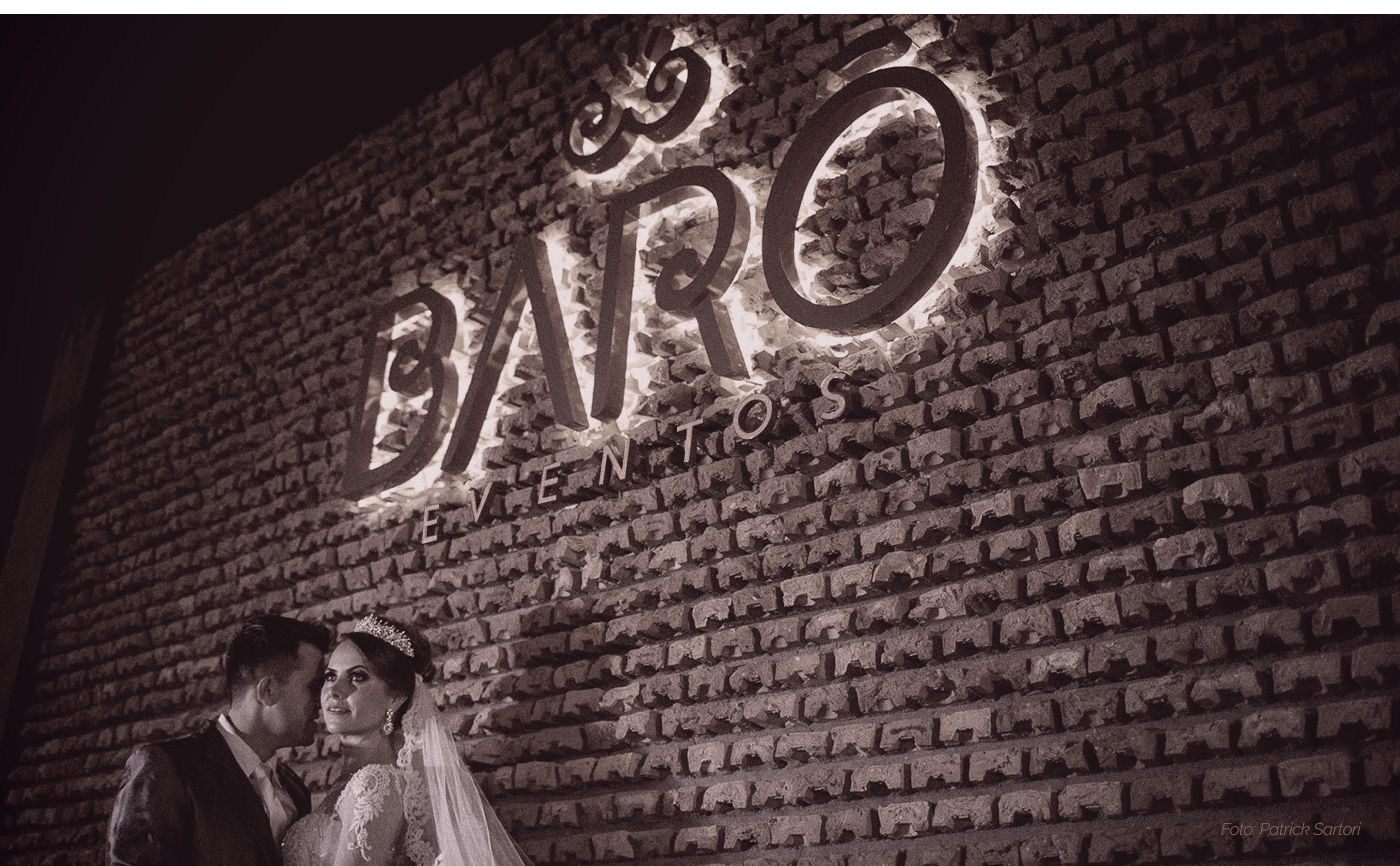
Refinement, sophistication and attention to all the details defines Barô Brand. We were presented with the challenging of constructing from the ground the formulation of this company that works with two upfronts: renting the hall; the physical space for parties and events. Also, the organization of wedding parties, graduations, among others.
Proposal
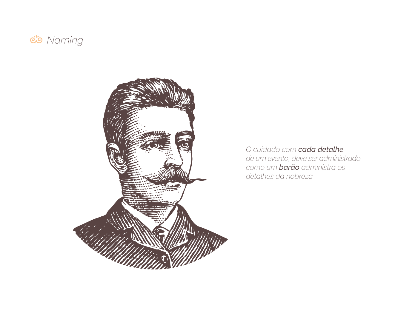
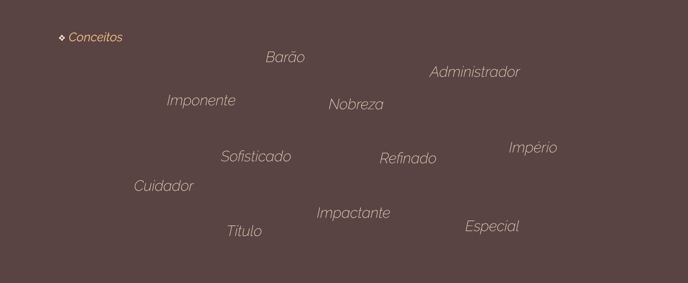
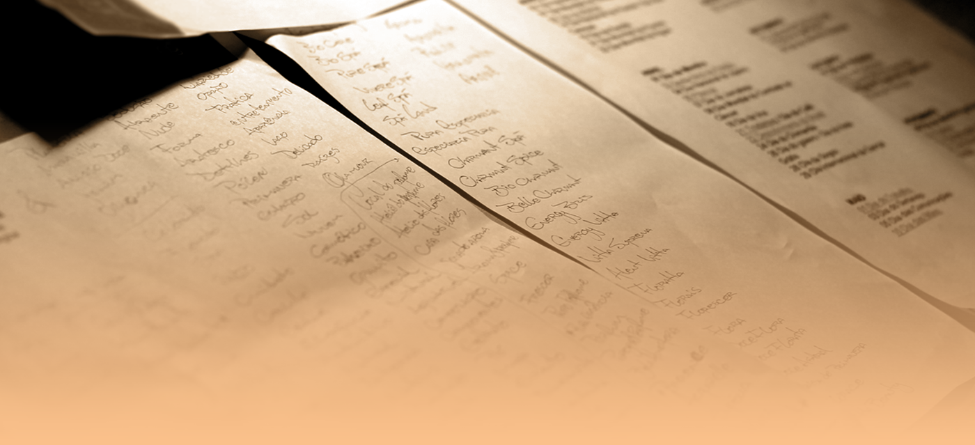
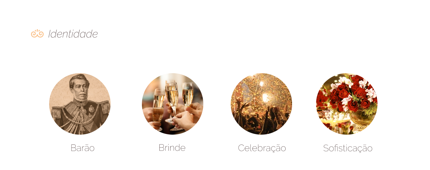
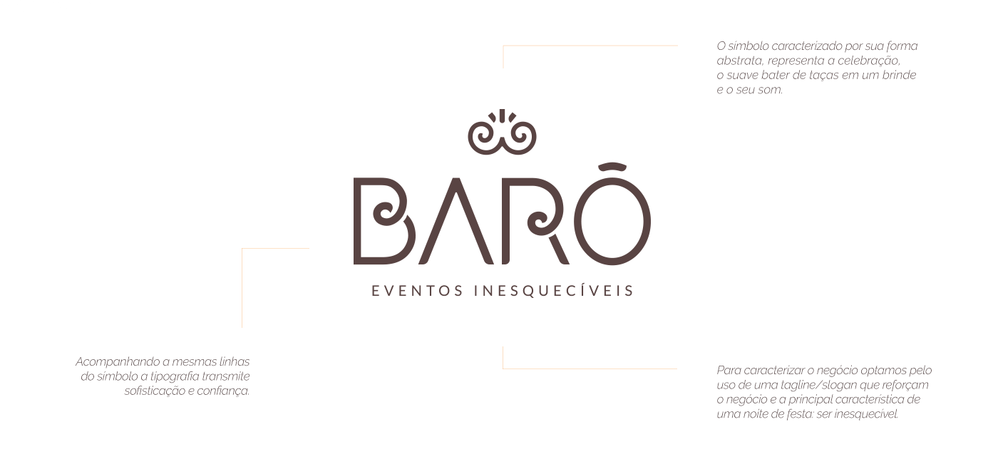
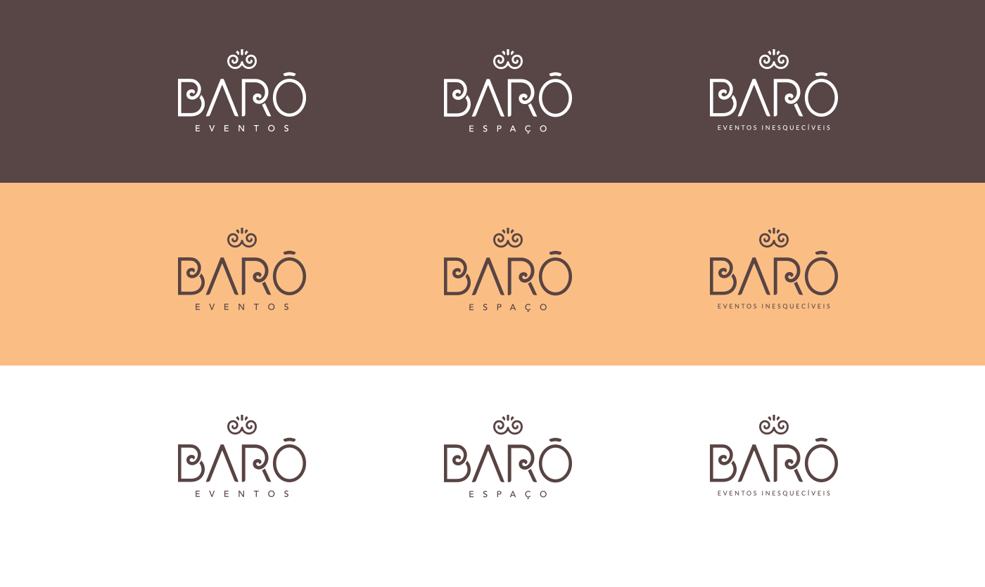
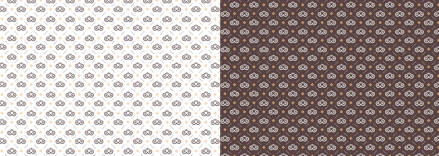
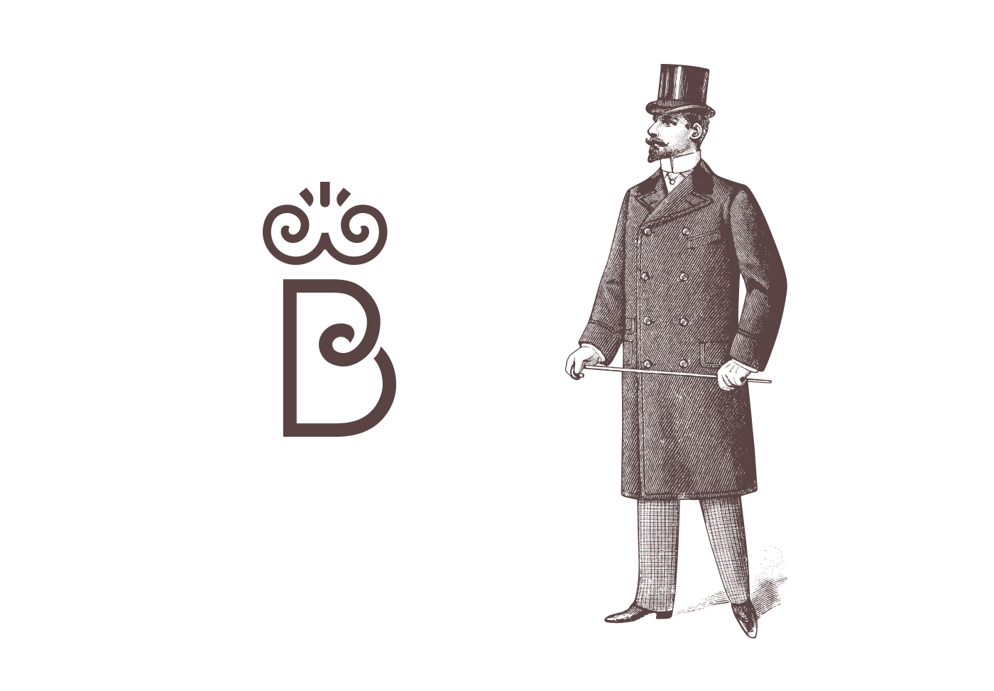
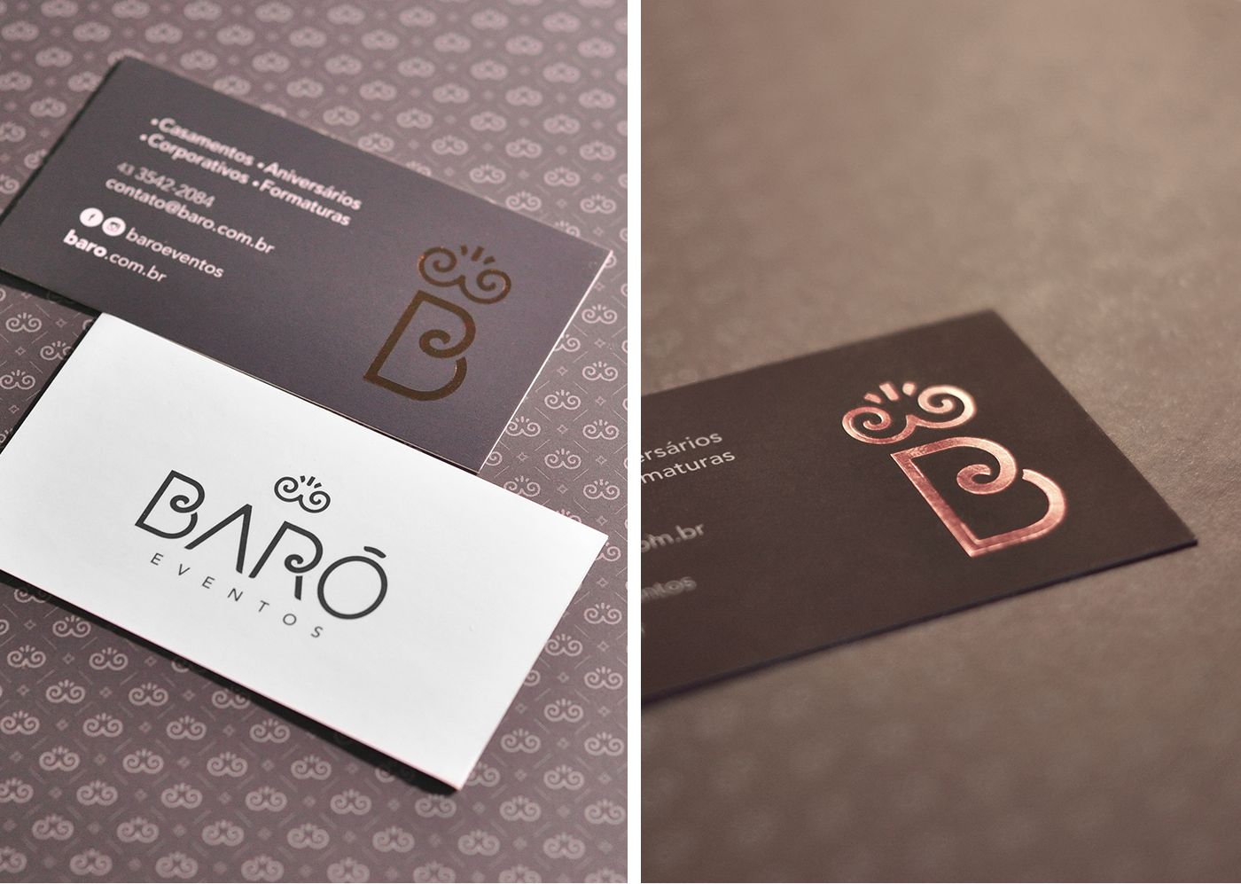
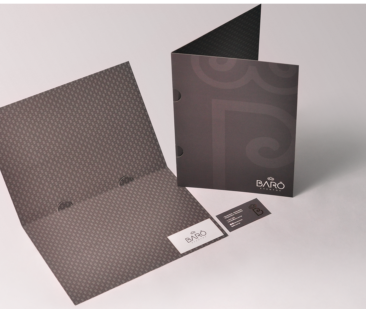
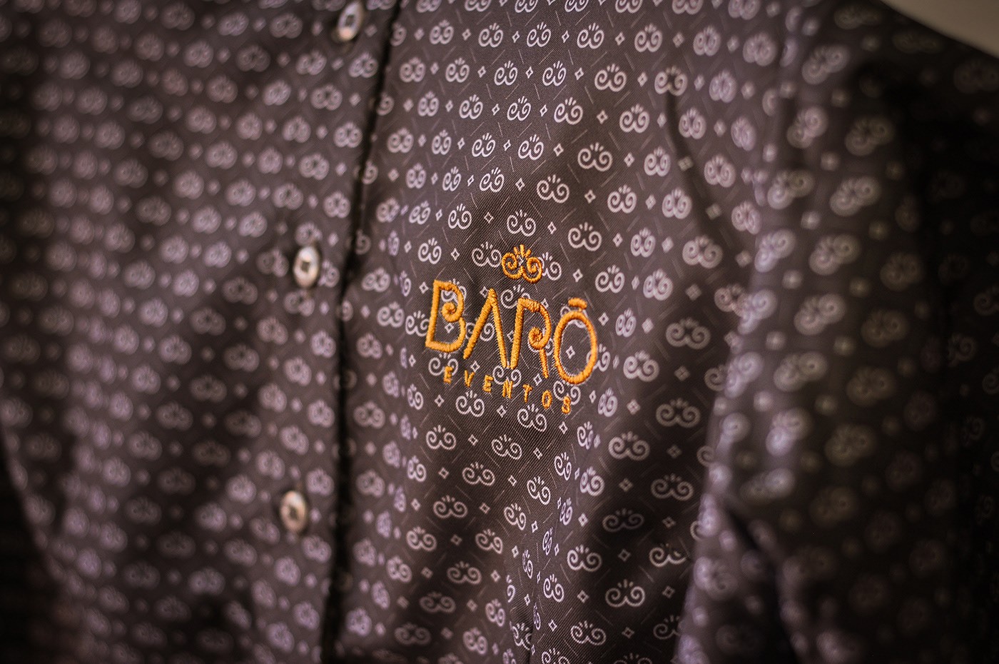
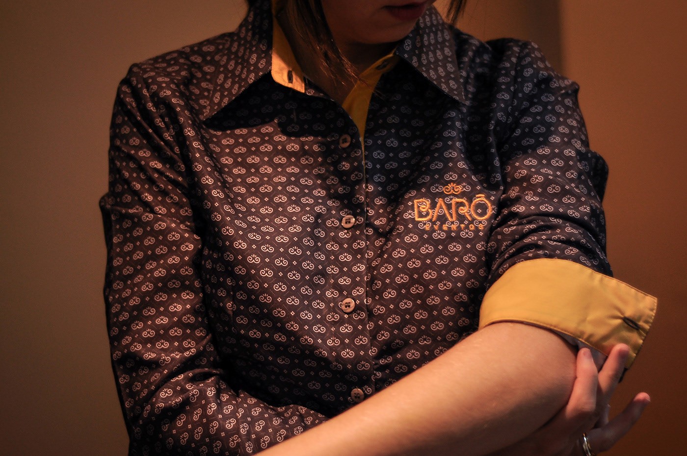
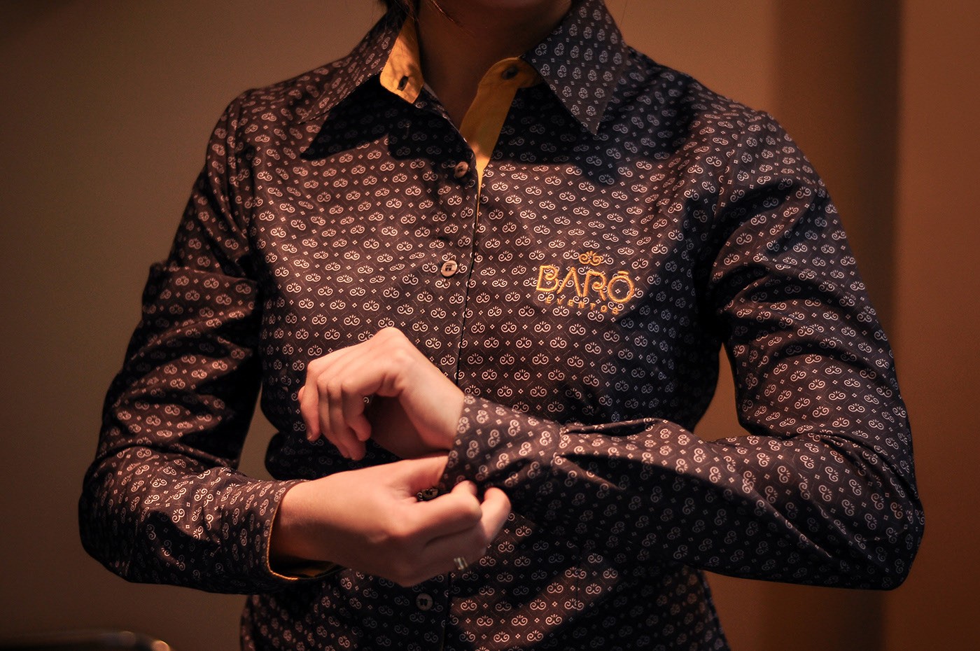
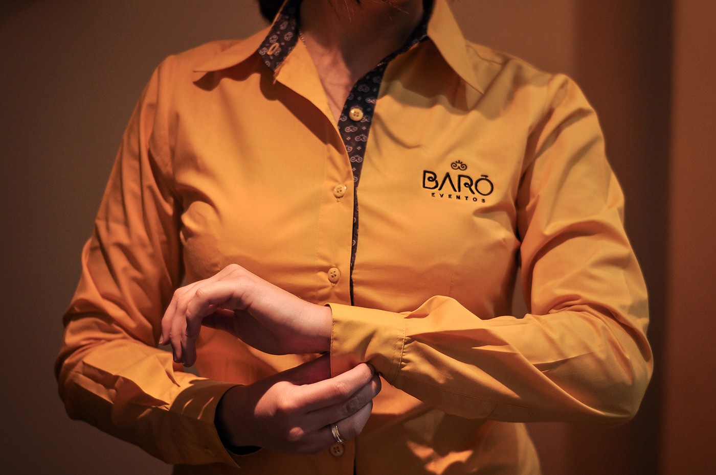
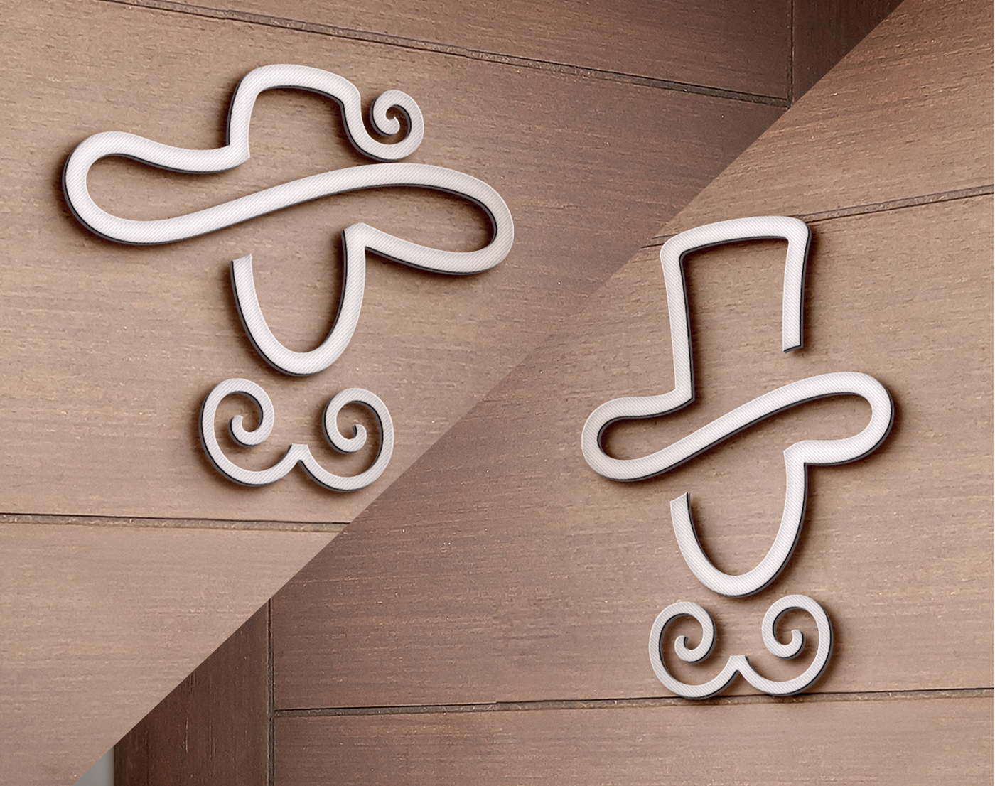
From the very start, we focused on working on an image of grandeur and elegance, so that the name of the company could already work for this. Thus, the figure of the baron was the one that best corresponded so that we took the reference to create a strong name of easy pronunciation. On the Visual Identity, the simple and continuous lines bring elegance in the proposal as the brand requested. In parallel, the use of brown color, presents the sobriety of the figure of the baron, contrasts with the energy and happiness that the orange color transmits, reminding the main focus of the brand represents: to realize unforgettable events.