Detalhe
Visual Identity
Challenge
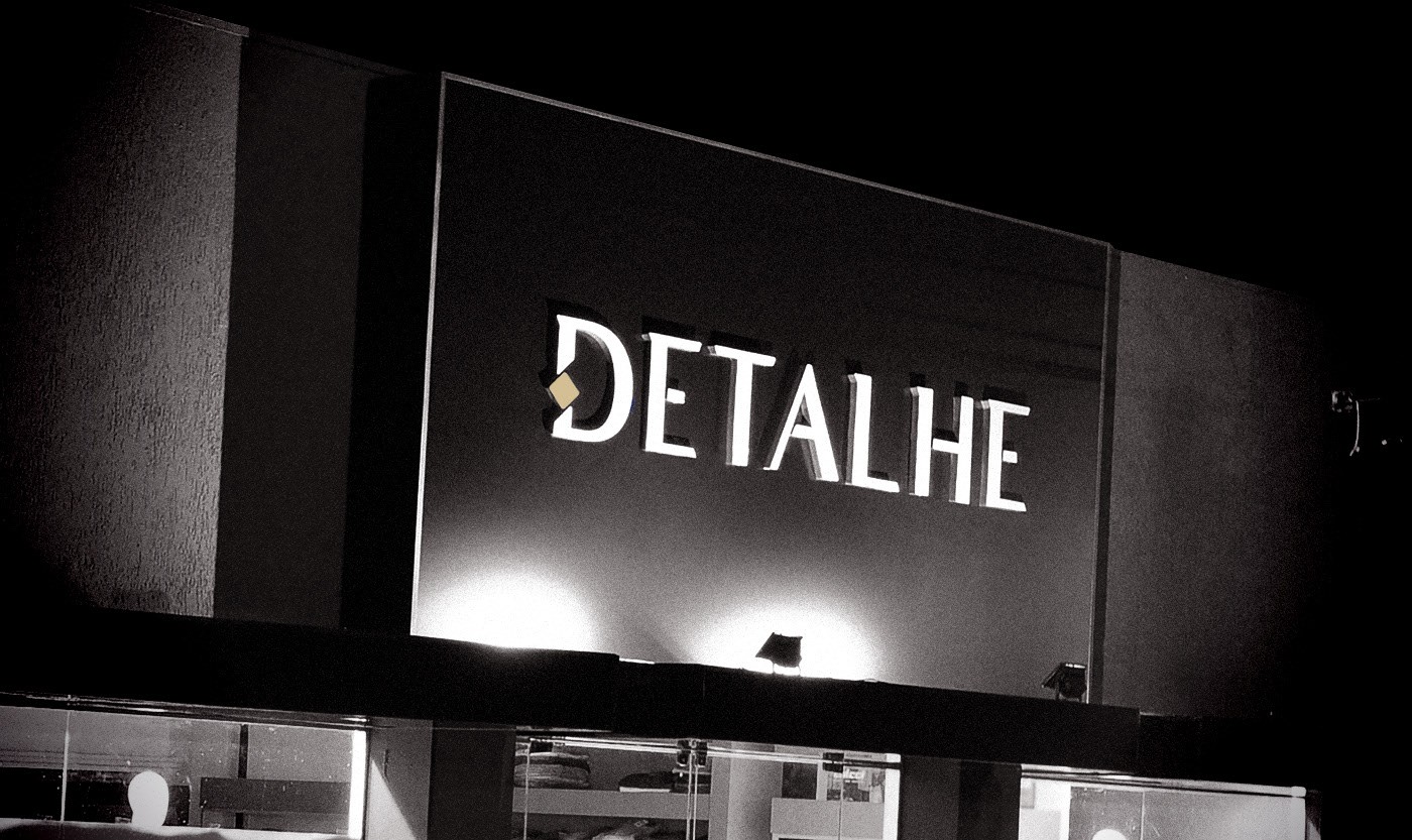
The store has strong name in the local market, considering a radius of 30km. However the old visual identity did not match the level of care and quality of the pieces offered. The biggest difficulty was in translating, especially for new customers, what the store really is and represents.
Proposal
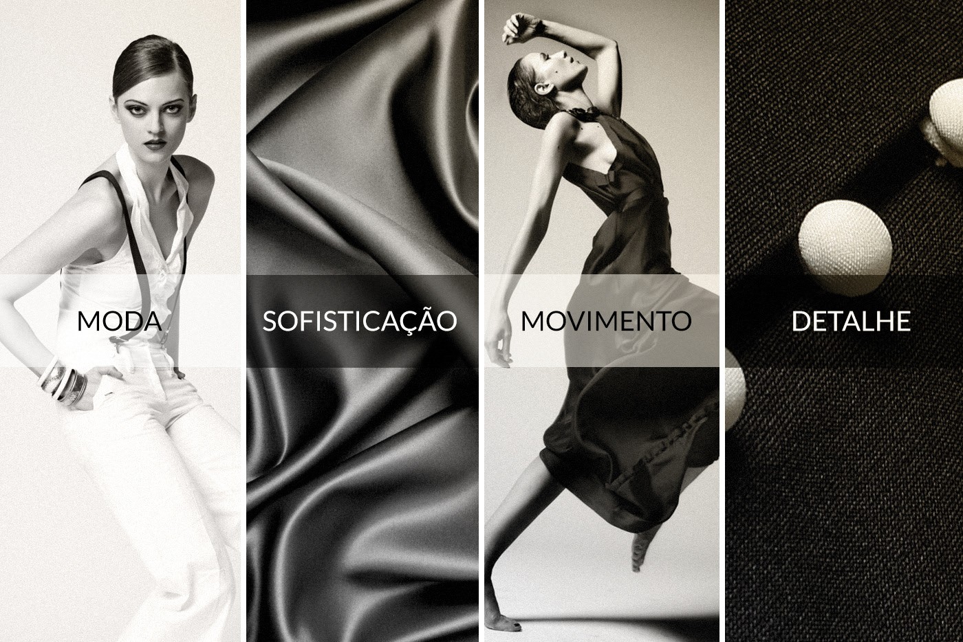
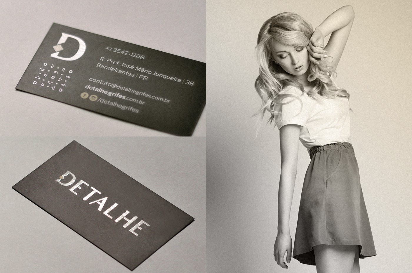
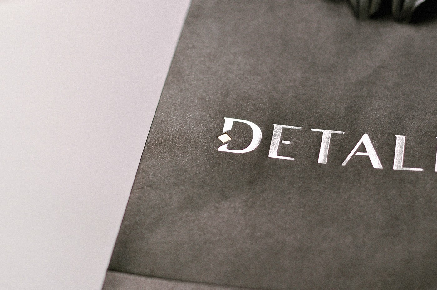
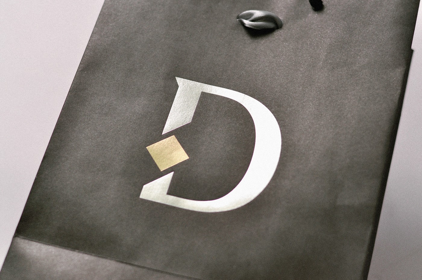
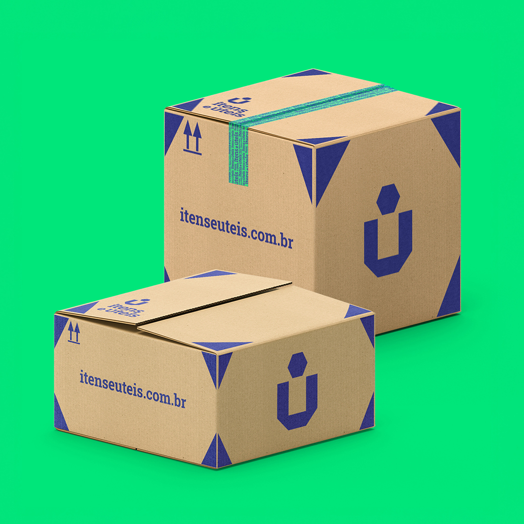
We observed that the sophistication environment in which the customer is immersed entering the store would be the strong point to be worked on.
Given close competitors working with compound names and color varieties, we set out on the strategy of linking sophistication to minimalism.
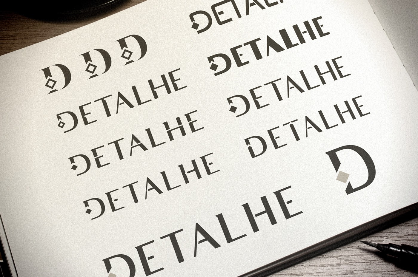
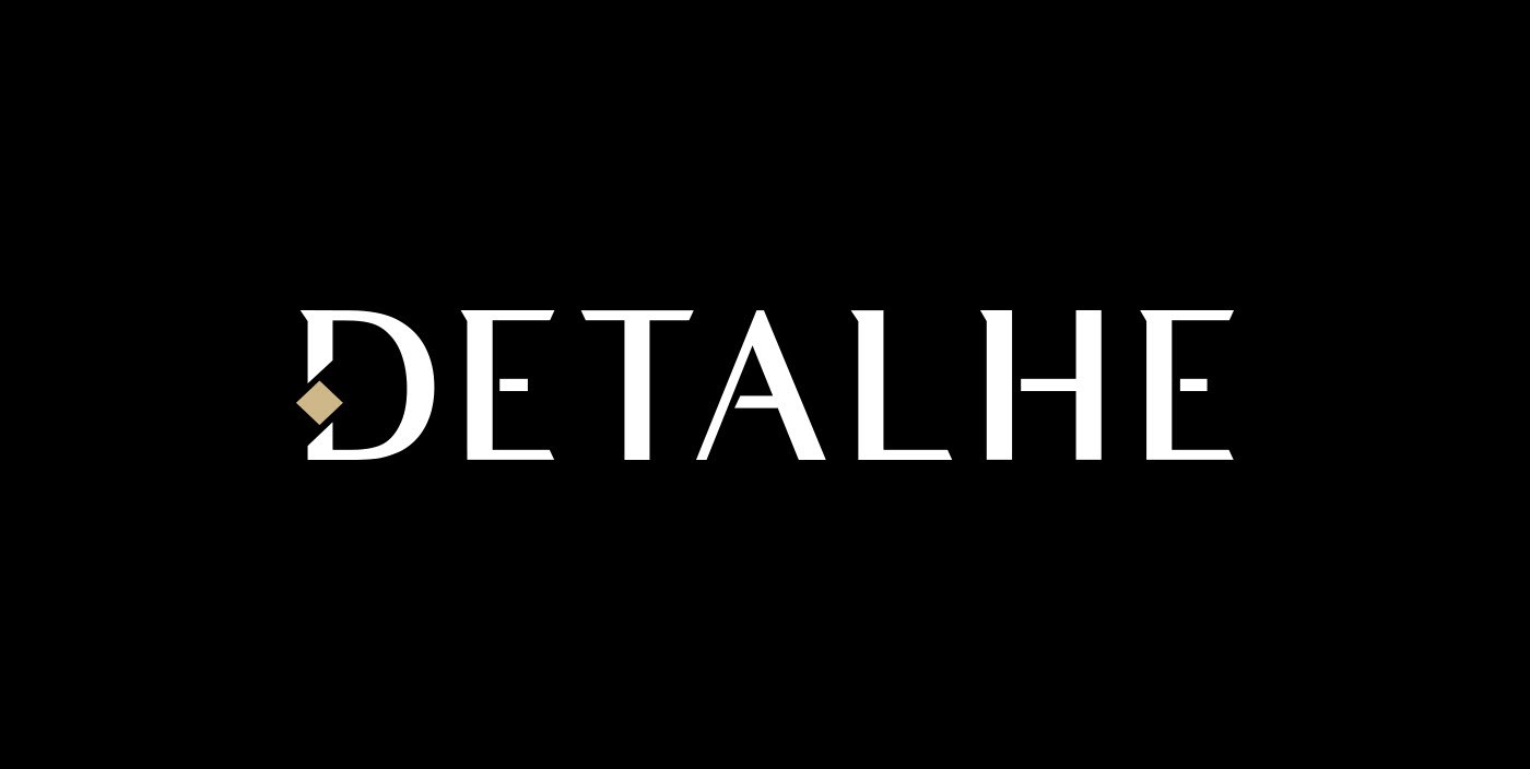
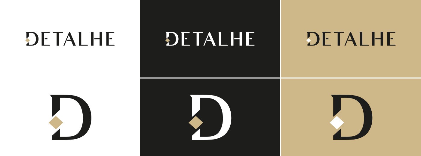
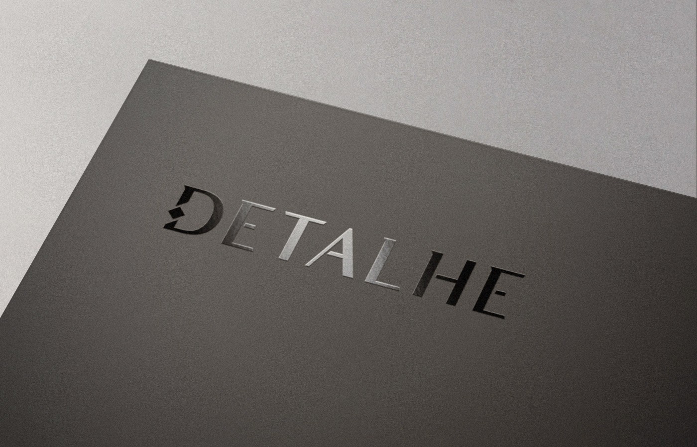
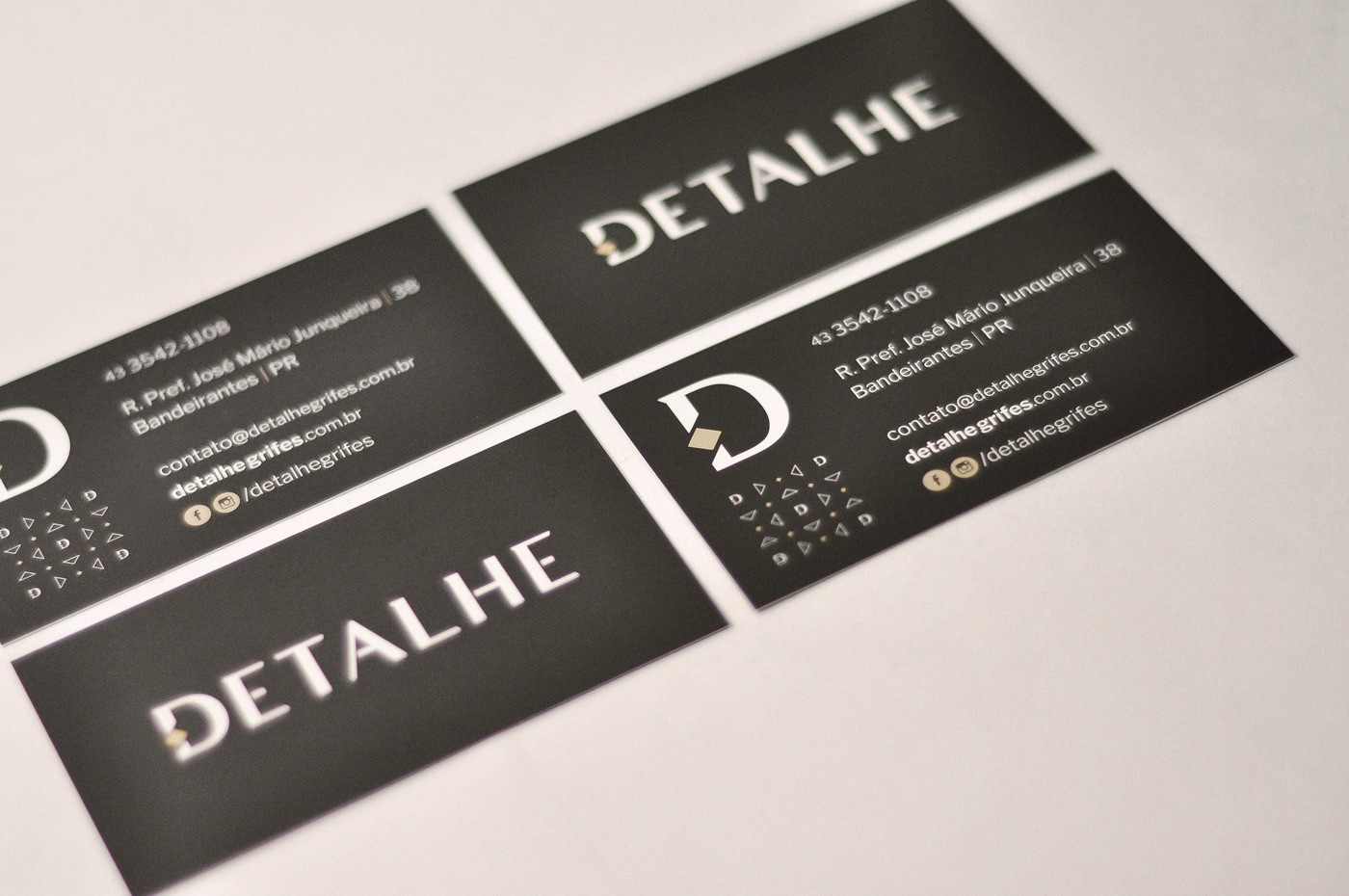
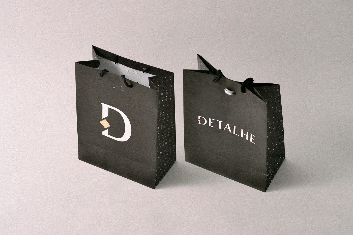
So the idea is to attract attention not in many colors and shapes, but instead, we want to attract with as few elements as possible. We do not choose not to develop a symbol, but to work on a reduction of the mark that can gradually become the "symbol".