Lecoq
Visual Identity | Package | Website
| 2020
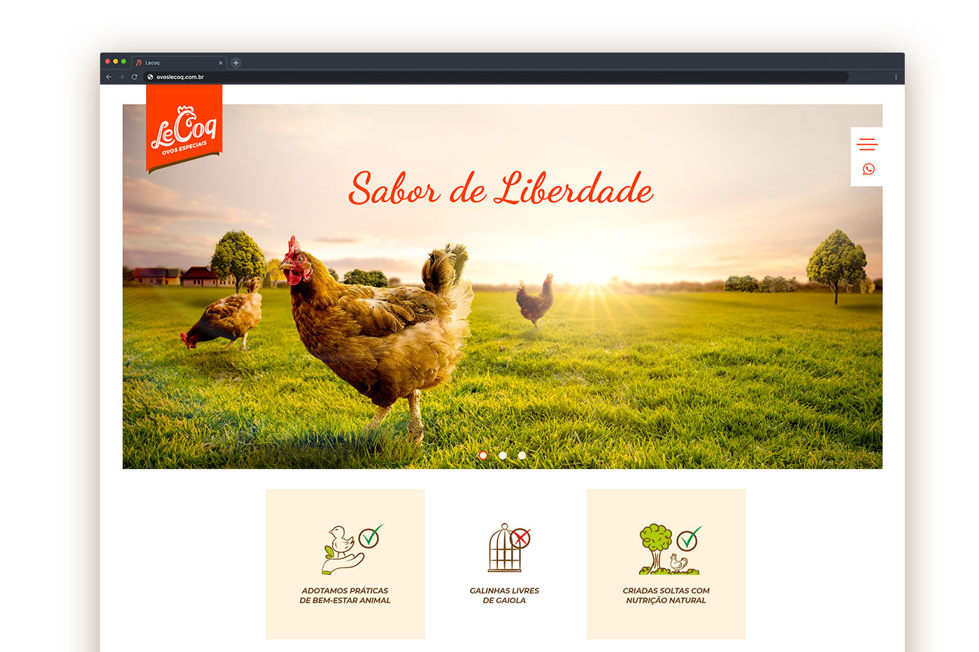
LeCoq is a chicken farm that specializes in raising free-range chickens. This process has as its main focus animal welfare, since chickens go through the growth process naturally. The free-raising mode produces free-range eggs, which are tastier and healthier for human consumption. In addition to the hillbilly, organic eggs and extra protein are also produced.
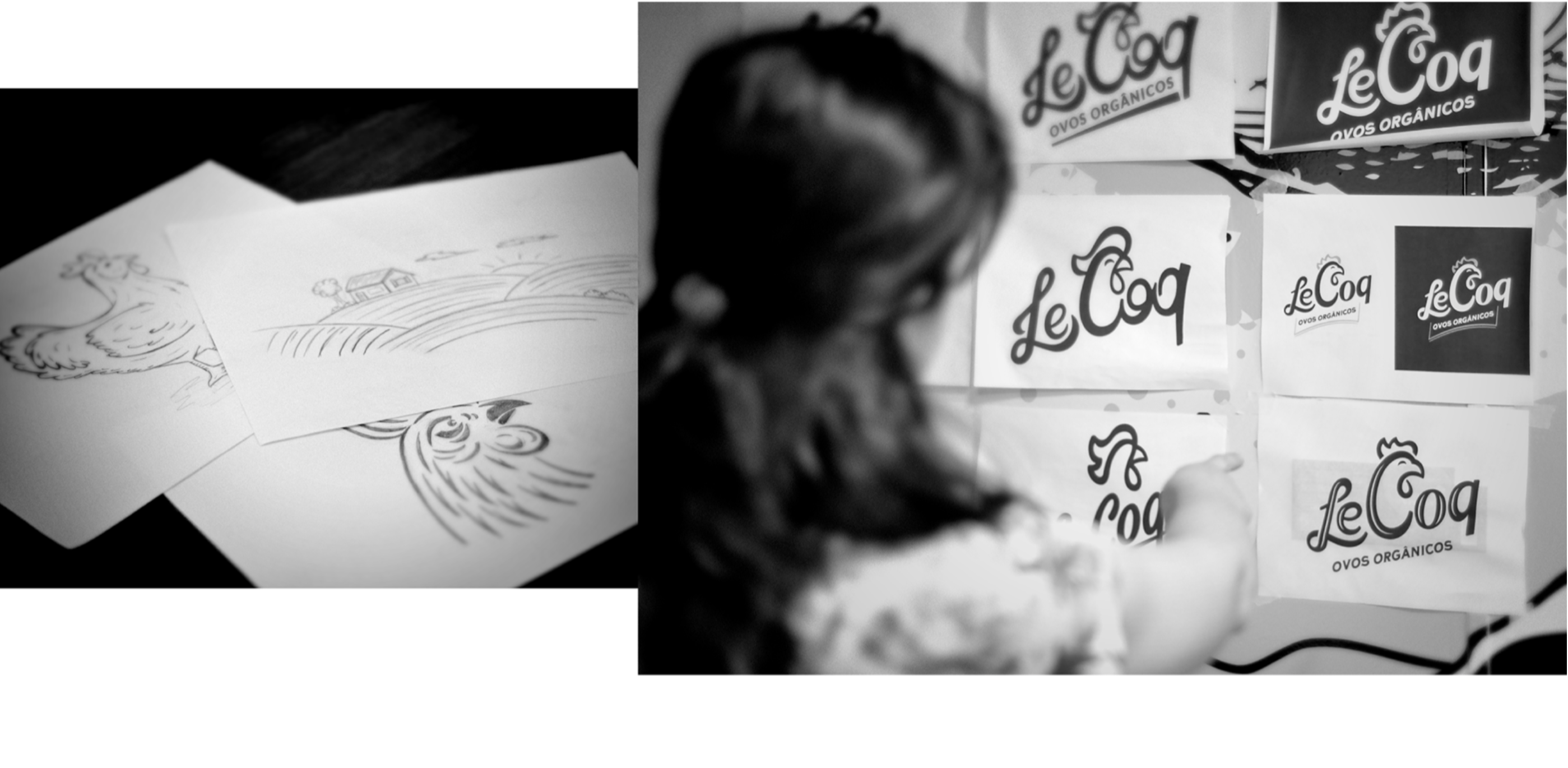
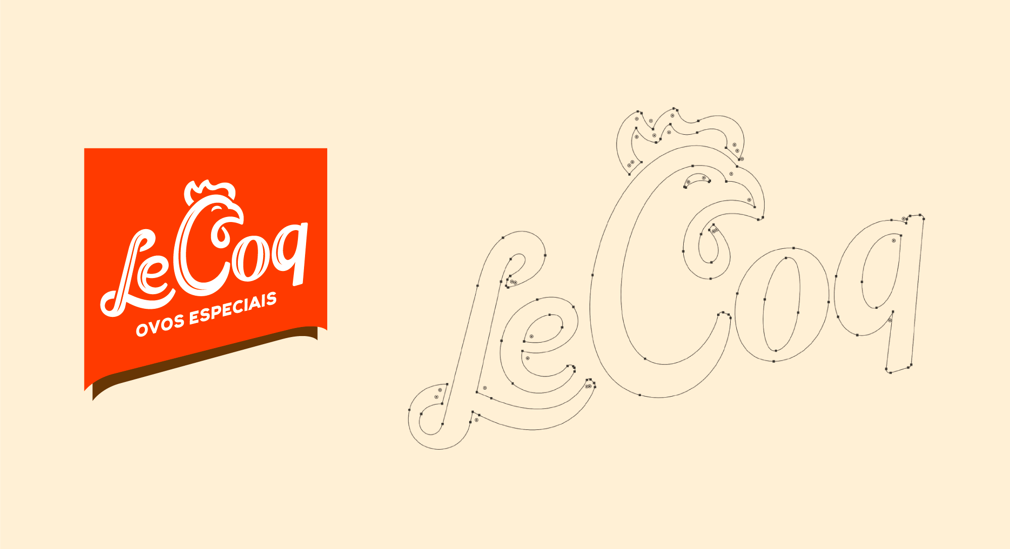
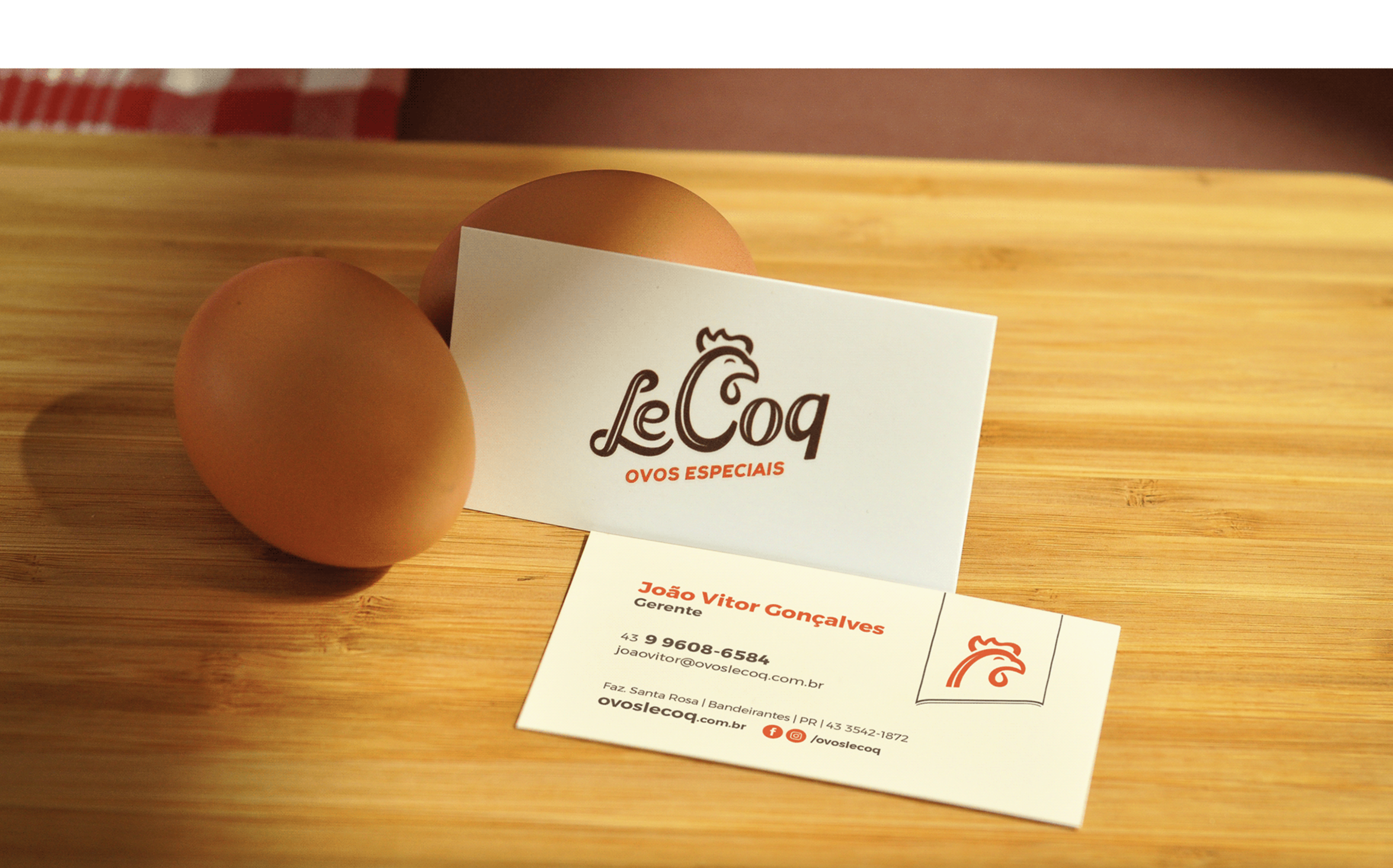
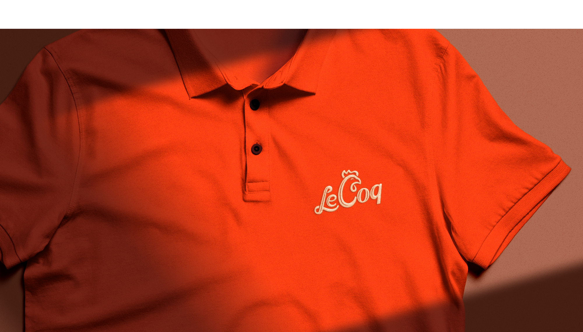
To communicate these differentials through visual identity, we used a logotype. In it we work in a cursive and slightly calligraphic style, thus transmitting tradition and humanity. We reinforce this with the font inclination, in order to characterize handwriting. At the top of the initial C, without impairing the reading, we created the silhouette of a rooster, an element that gives the brand a name. The rooster is used as a logo reduction element, becoming a symbol for uses with less application space.
We also use a badge that accompanies the logo in most applications. This set works as a stamp, demonstrating tradition and quality, and always works as a point of attention. For the colors we use reddish orange as the main color, as it becomes striking. In addition, we use neutral colors: beige and brown. Together they form a comfortable and at the same time warm palette, since we are dealing with food.




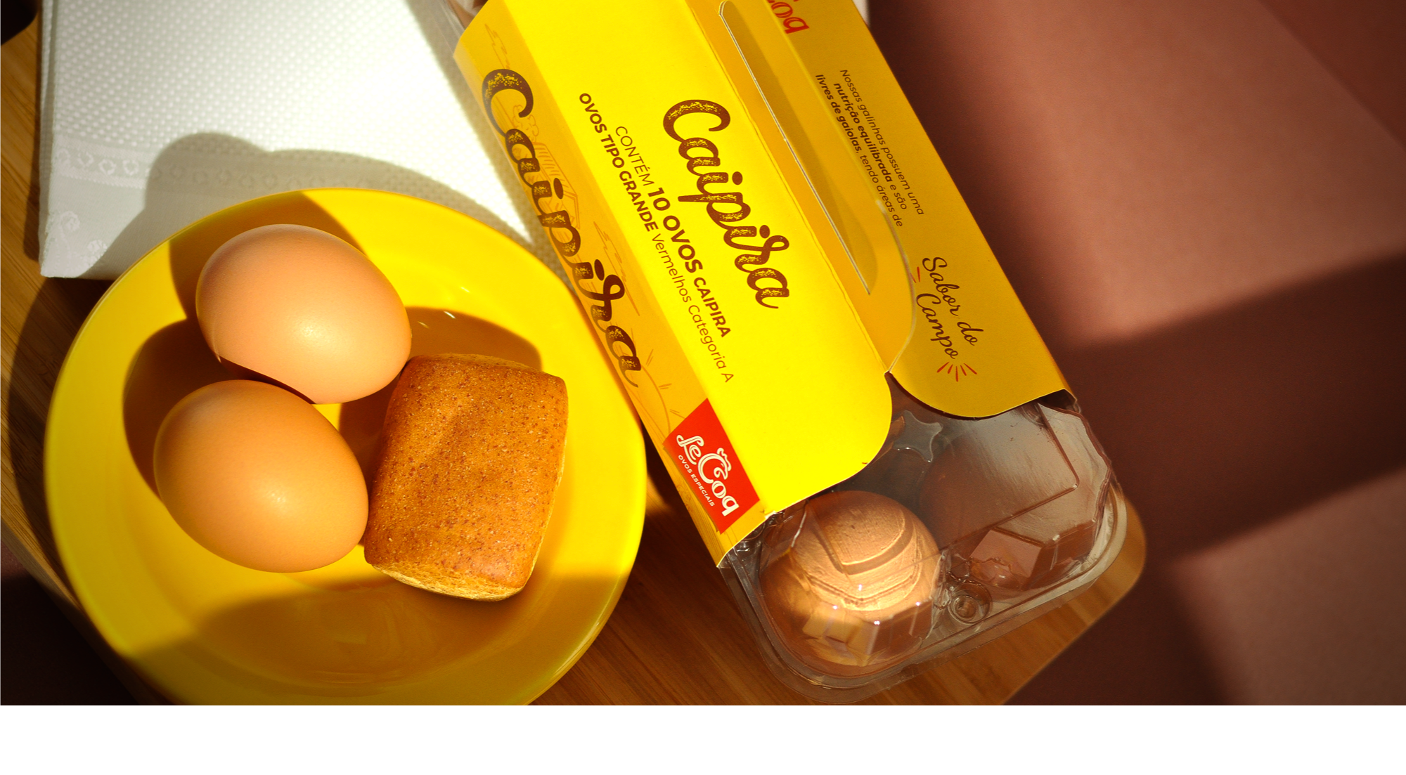
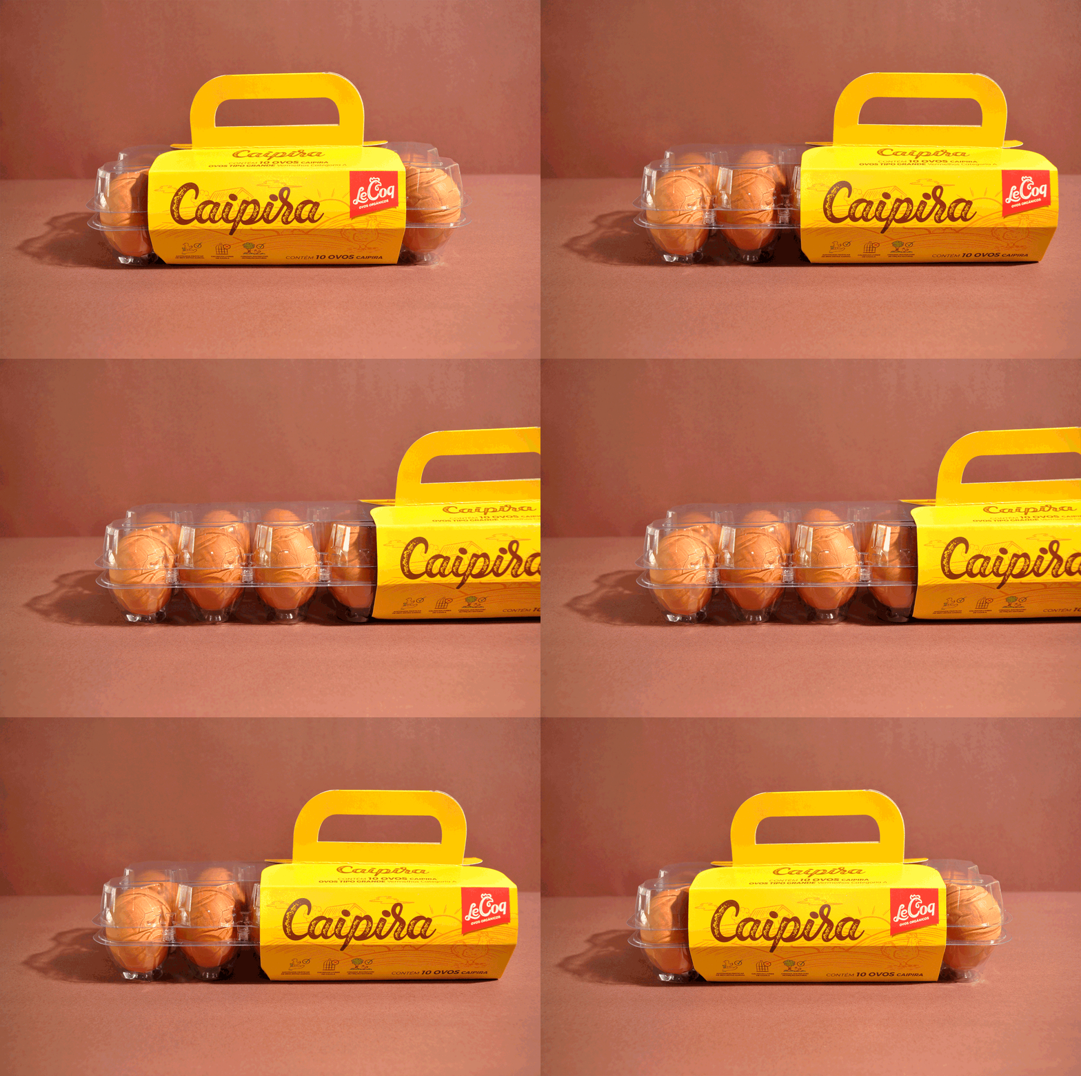
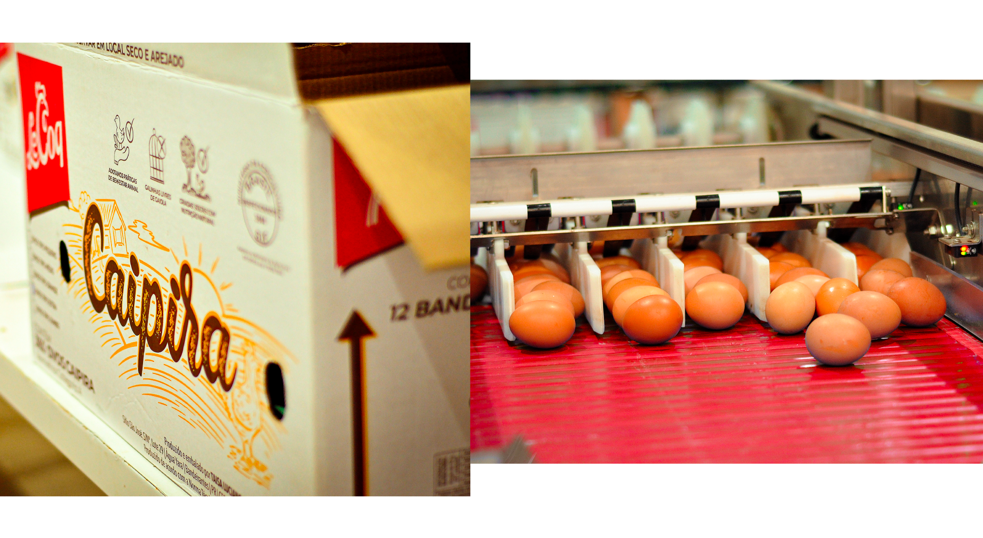
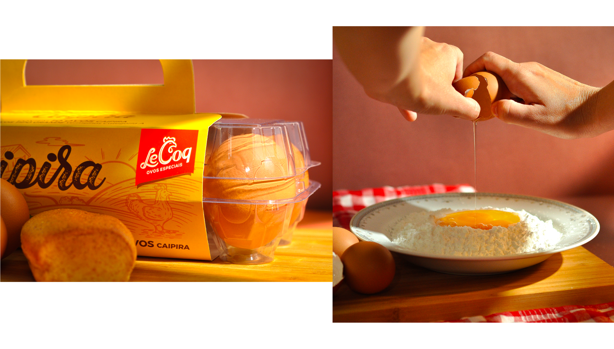
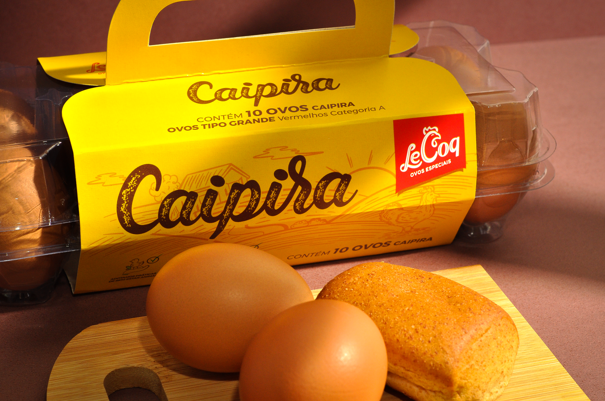
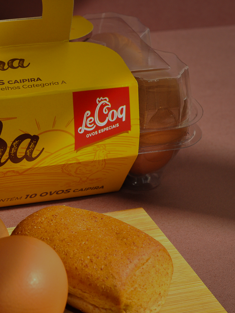
In addition to the identity, we also created illustrations and packaging for the brand's three egg lines. In the main one, the hillbilly, we created a lettering manually with a worn style, which translates simplicity and naturalness. The illustration contains elements of the daily setting of the farm, and was worked in order to function as a texture that complements the name of the line on the packaging.


