Orenz
Naming | Visual Identity
Naming
Challenge
The opportunity to work on this Gym naming project was a surprising challenge for us considering that gyms generally have obvious and relatively similar names. For this project, we had the certainty that all the apparatus of the academy would be black and orange. So, it was necessary to take advantage somehow and work according to this point.
Proposal
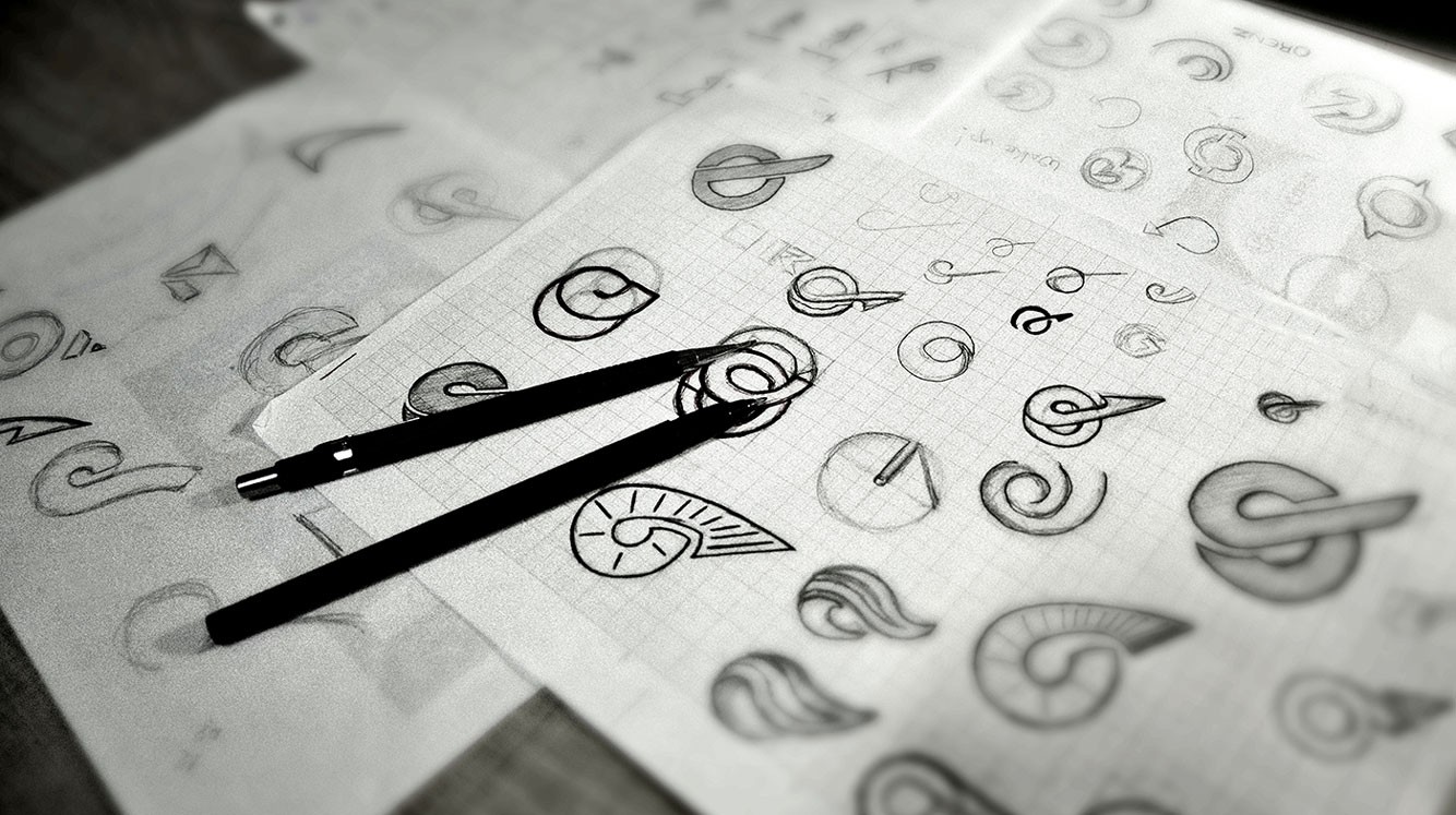
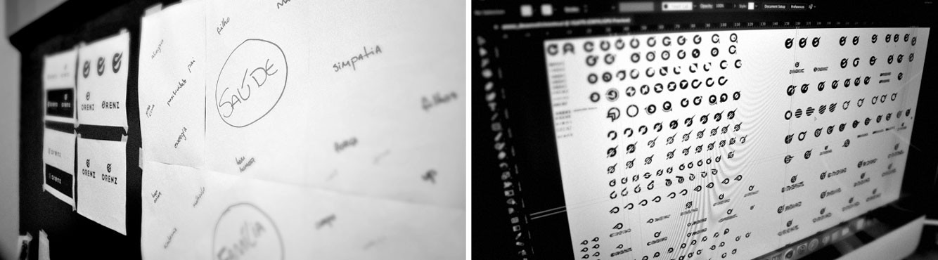
To emerge from this vast ocean of names related directly to the business itself, which only alternate in the search for differentiation, we decided to start creating a unique name. And thus make the name (first item of a brand) unique in its segment. After going through dozens of options we finally reached three finalists and the name Orenz prevailed.


Visual Identity
Challenge
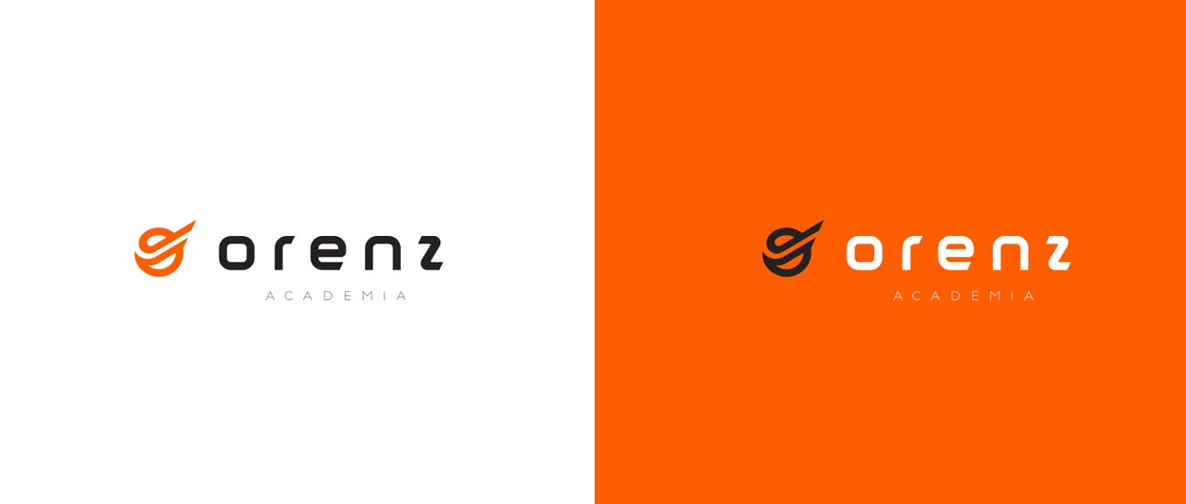
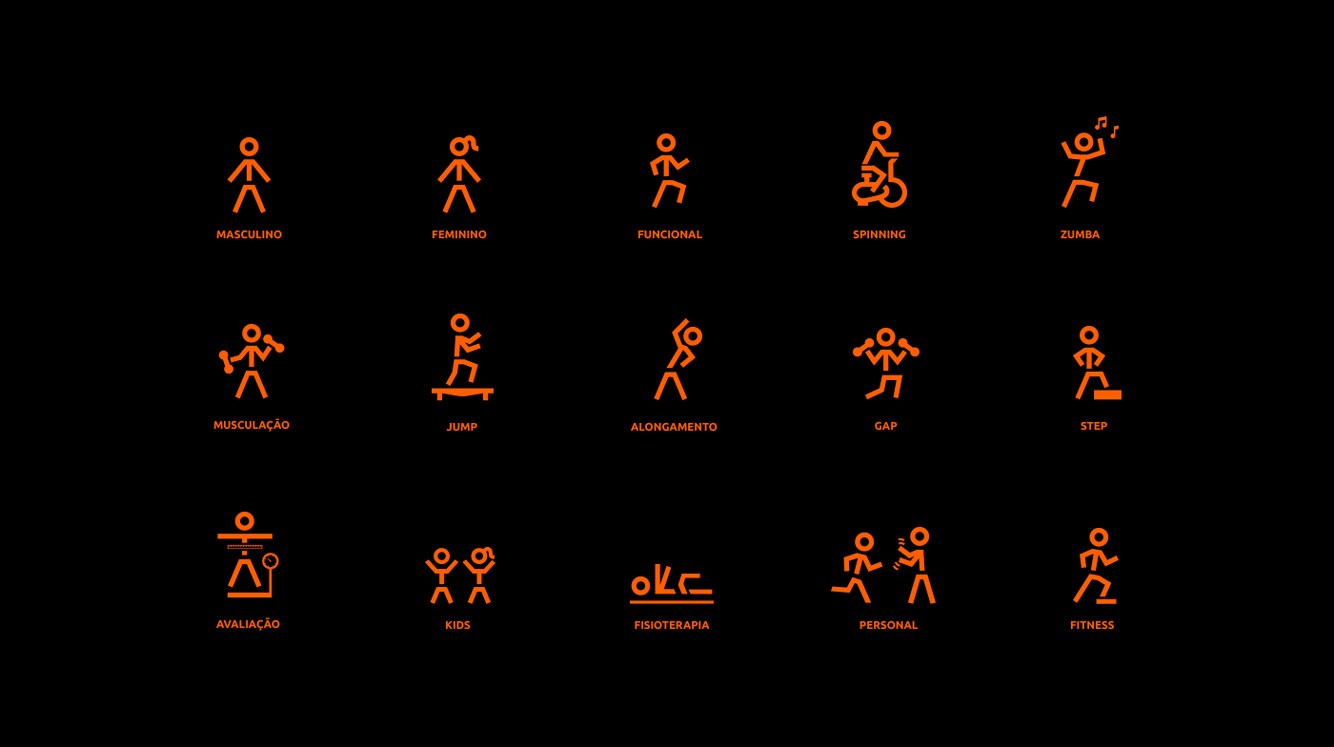
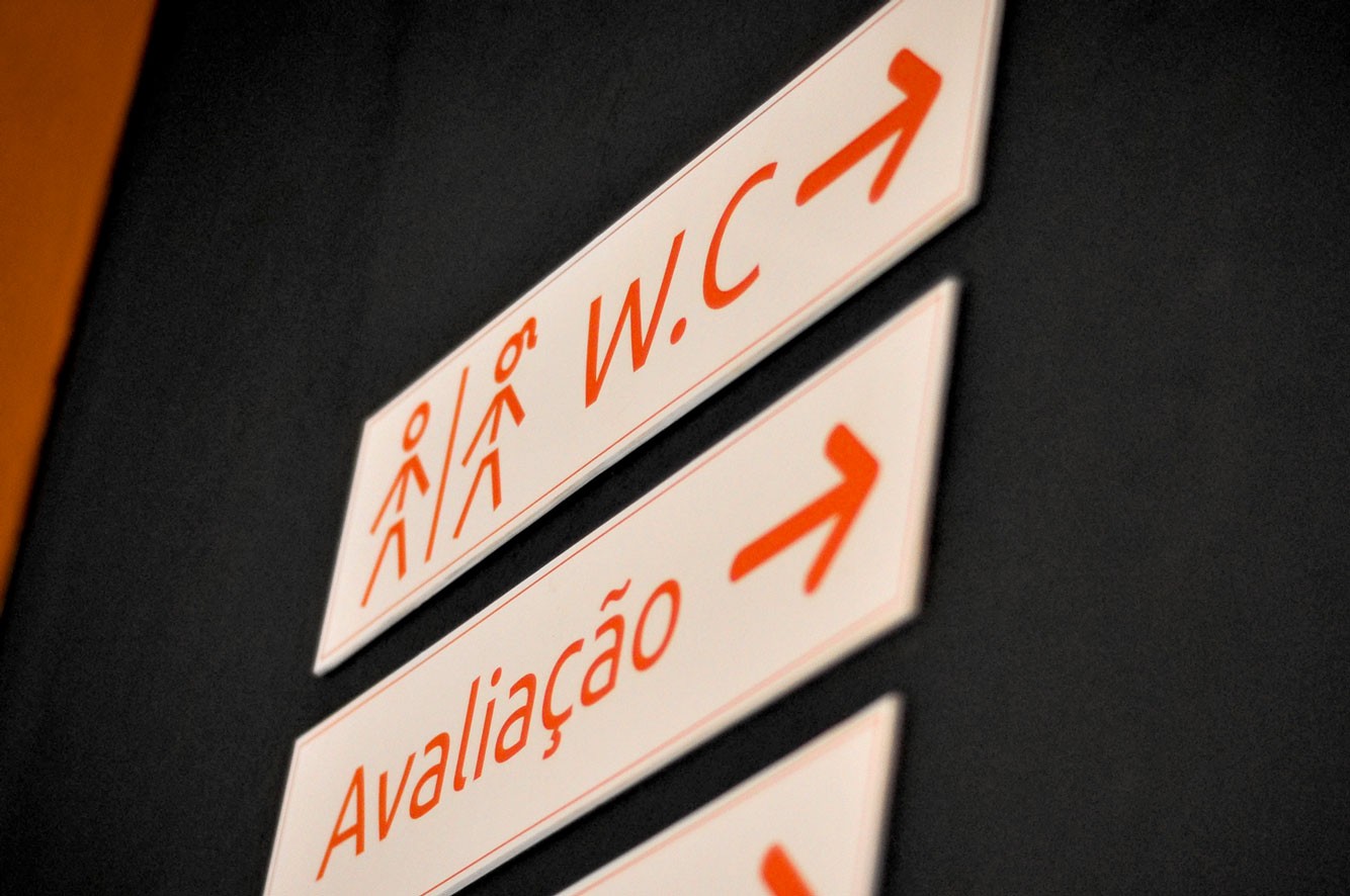
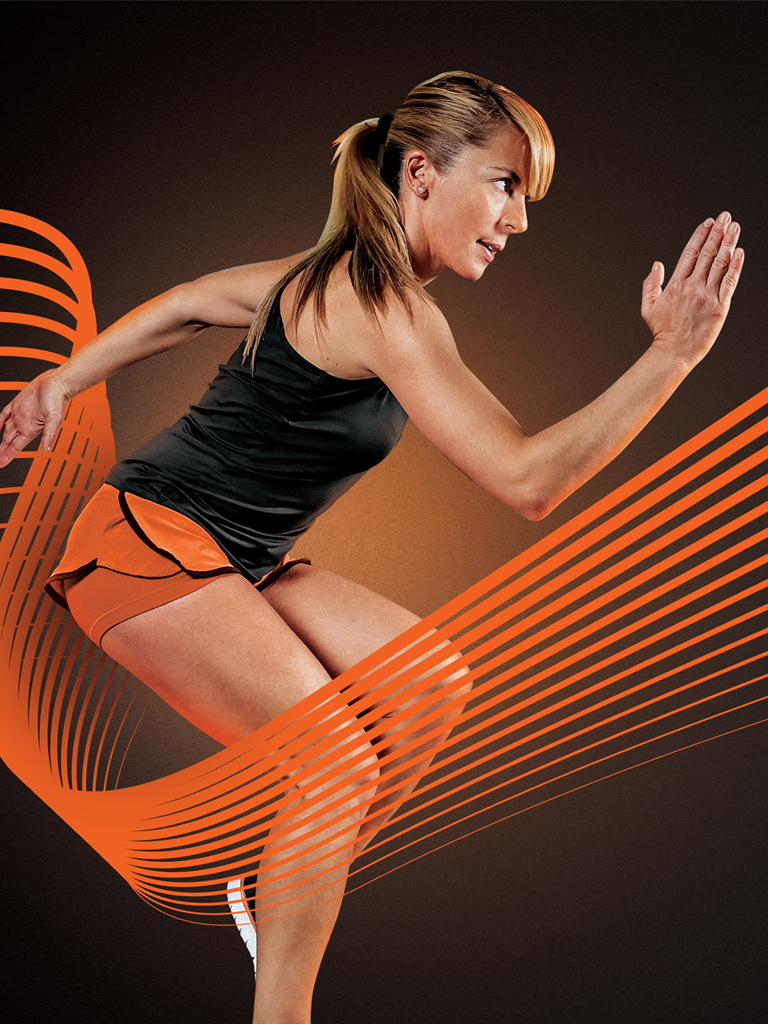
As for the Visual Identity, it was necessary to visually translate the concepts that were initially established. The company profile called for a slight sophisticated place. Orenz is gym that focus on a family environment, it was necessary to escape from the traditional image of a strong men or women. It was necessary to be simple and easy to read, since we were dealing with a new name.
Proposal
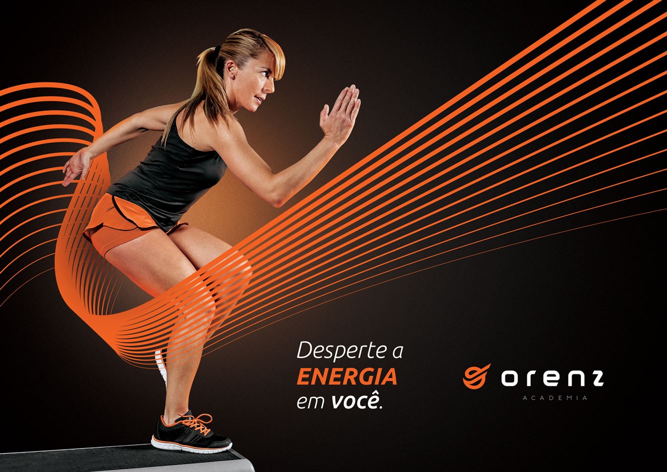
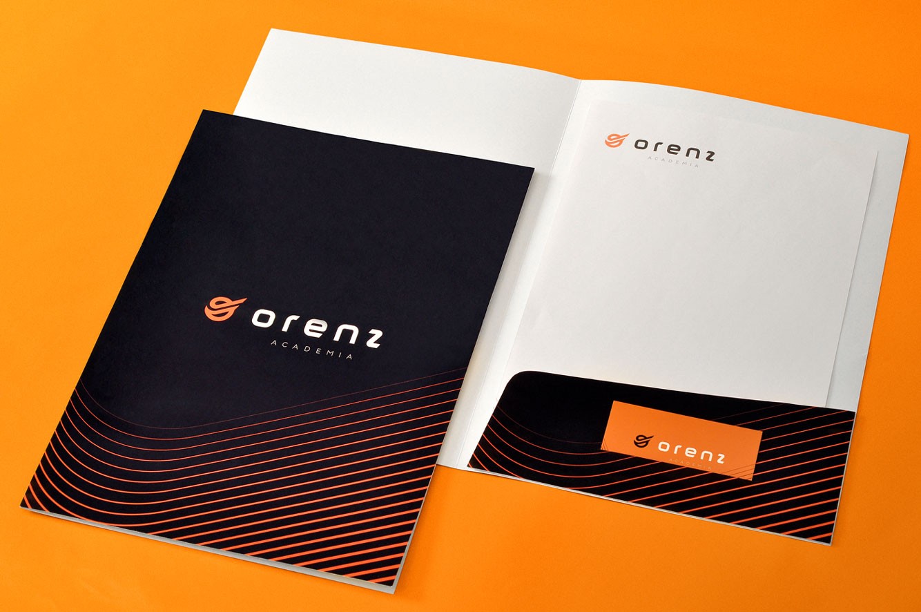
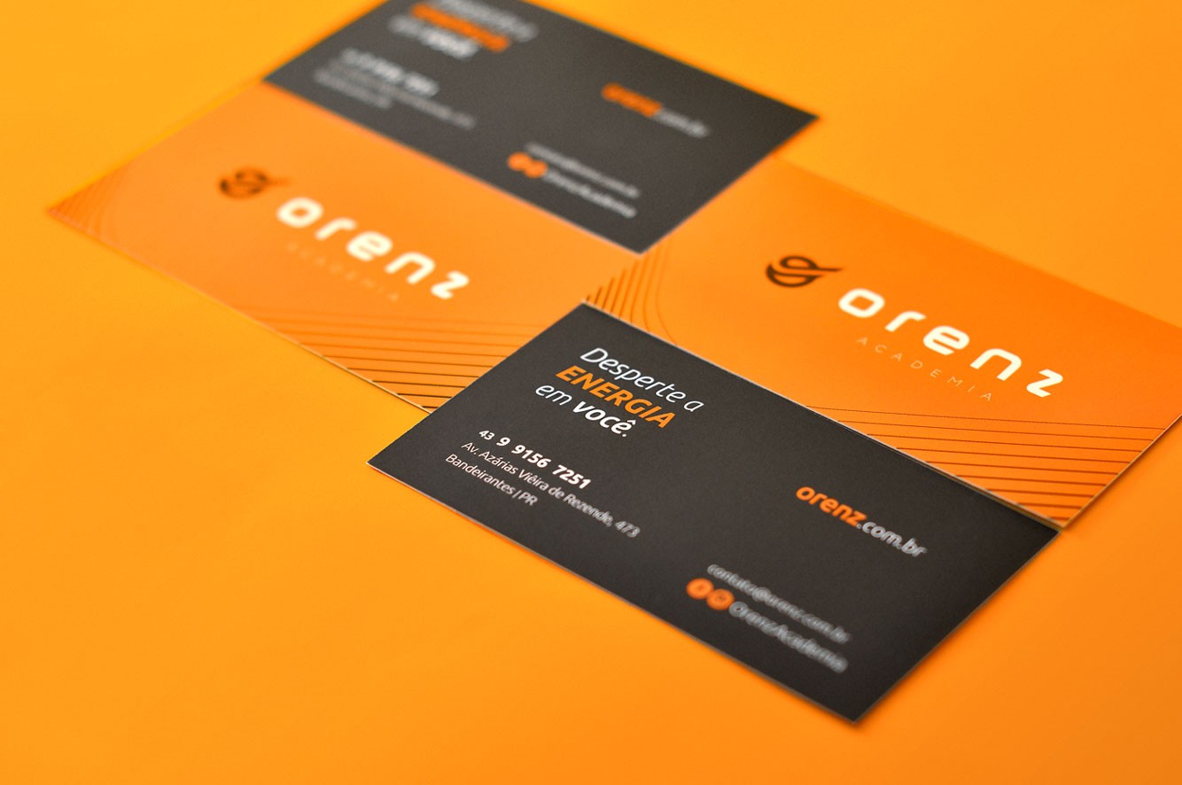
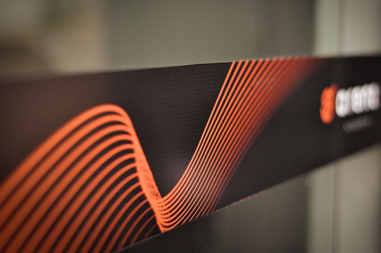
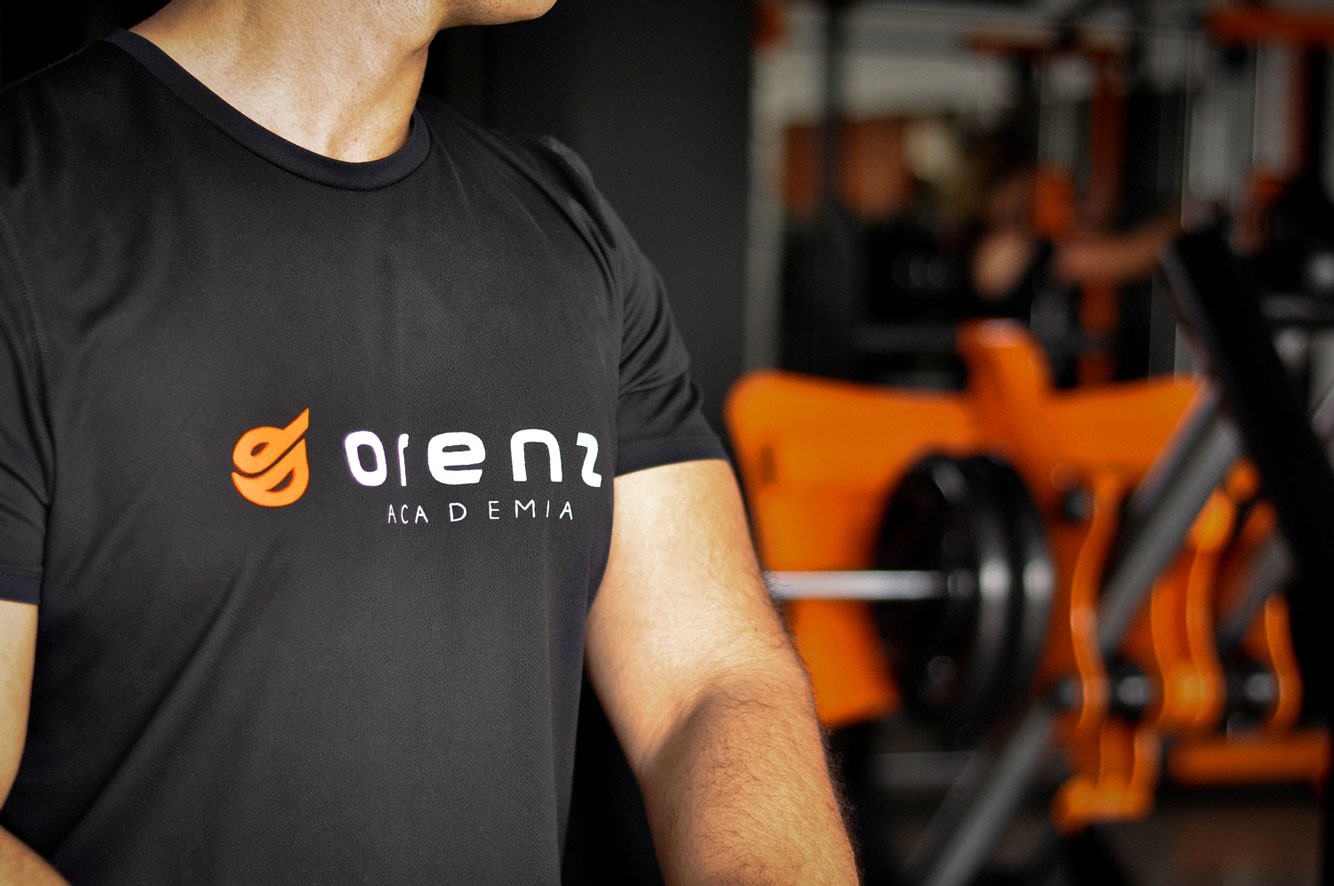
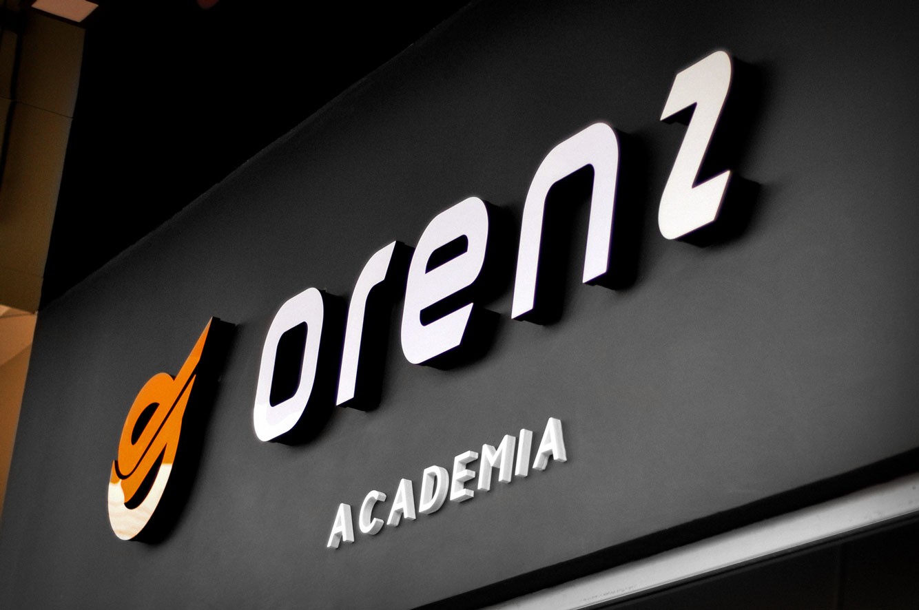
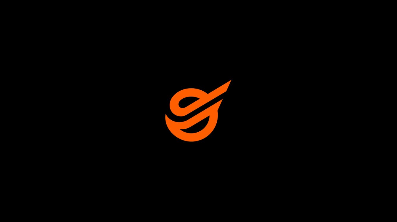
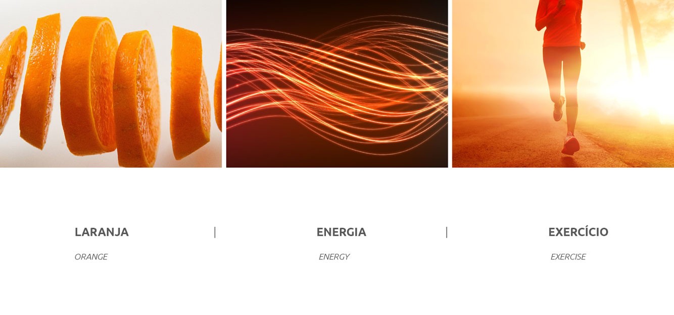
Therefore, we chose to work on a symbol that in the medium term, it could be easily associated with the brand. We explore the initial letter "O" and unified to the idea of "moving", so that it presents the circular movement from left to right, from the bottom up. Reinforcing the idea of movement and making the symbol looks "positive". The built typography, has fixed width and endings in the diagonal work simplicity and movement successively. In addition to being lightly squared, thus bringing strength to the logo. In the visual complement, we worked hard on the idea of movement and energy, it translates the slogan created (Awaken the energy within you) These are fluid lines that change its thickness, and when passing the idea of "raising the energy level".