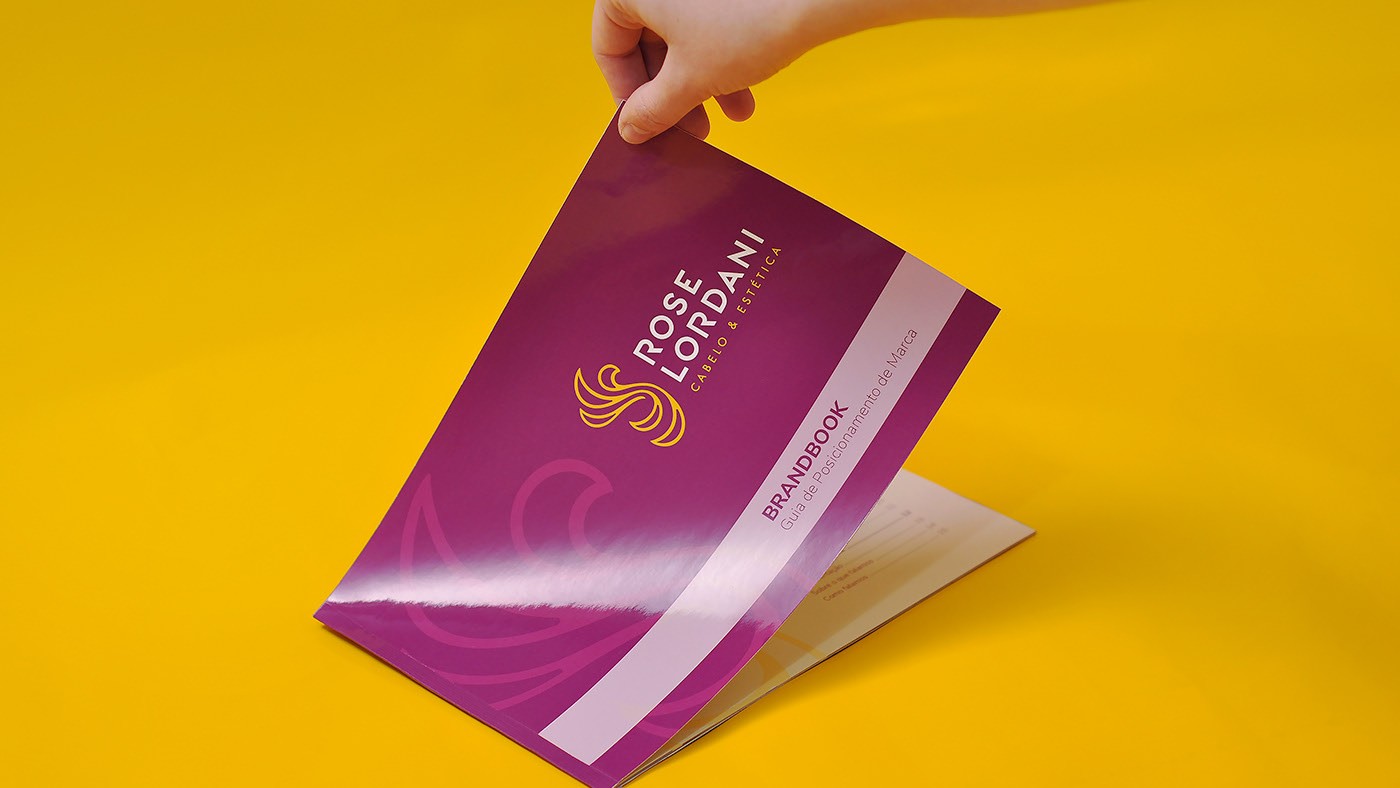
Rose Lordani
Visual Identity
Challenge
After meeting with the owner, employees and clients, we realized that, using the iceberg analogy, the Rose Lordani Beauty Center had a large submerged part of Iceberg hidden, and only a small part exposed, that is, the Beauty Center had great potential not perceived by its public when related to the quality and variety of services offered. Such potential, not found in any other competitor in the region of operation. Therefore, the challenge of the Branding project, starting with Visual Identity, would be to bring to the surface all this capacity, now structured with a pattern of posture and communication.
Proposal
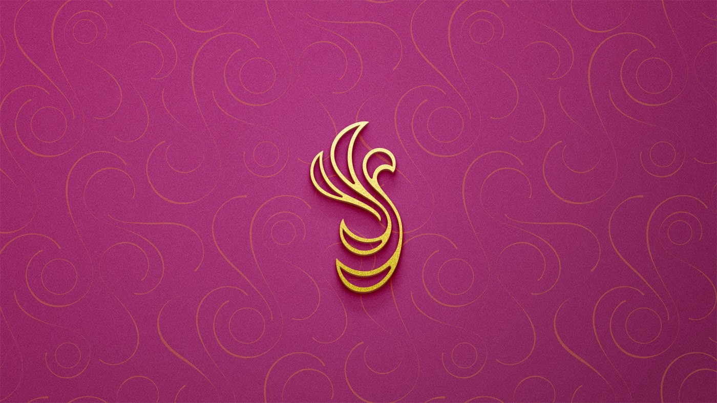
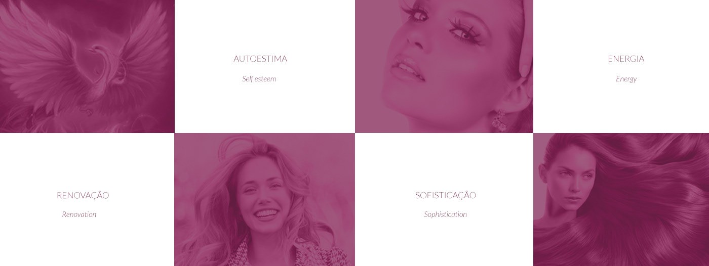
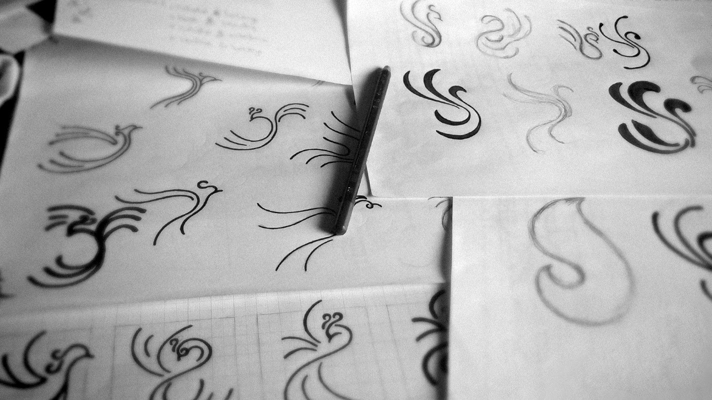
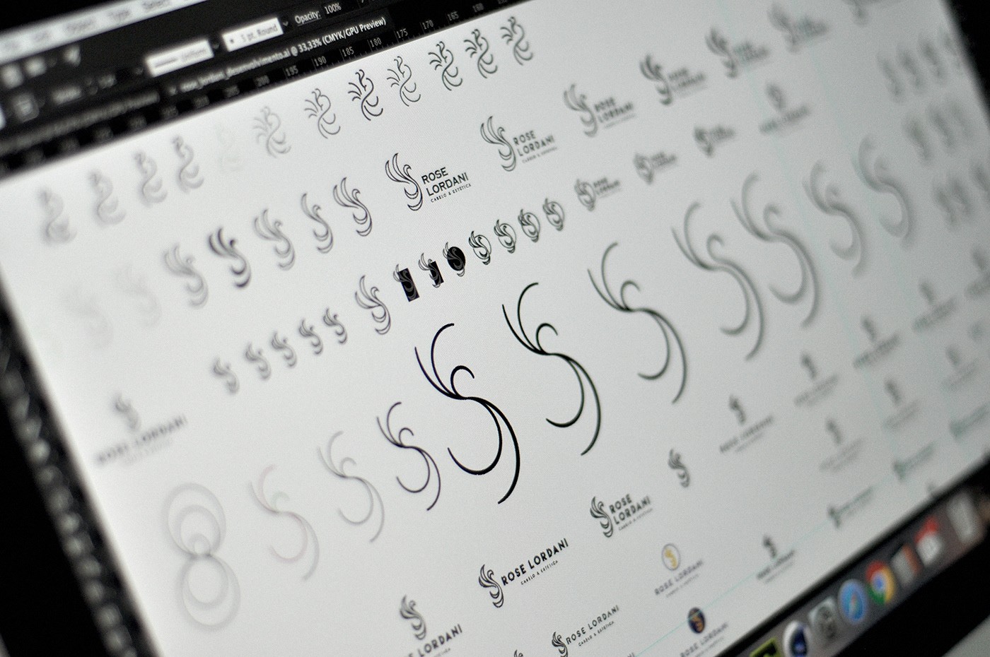
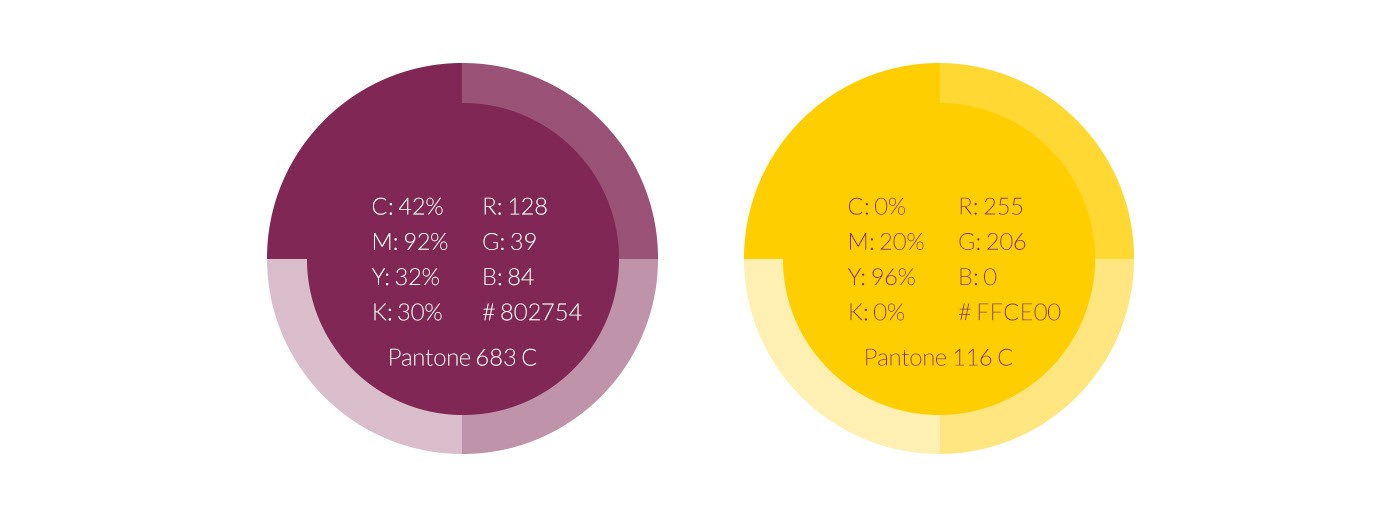
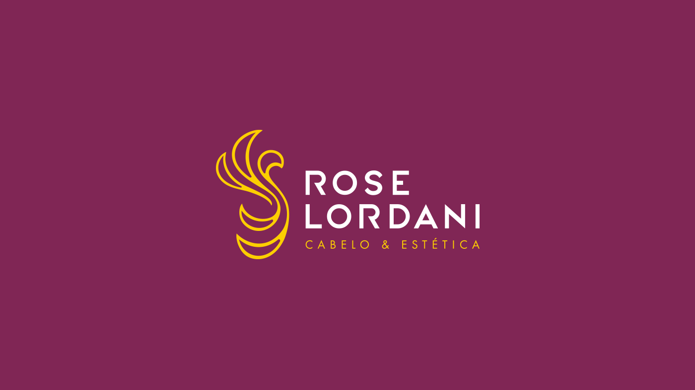
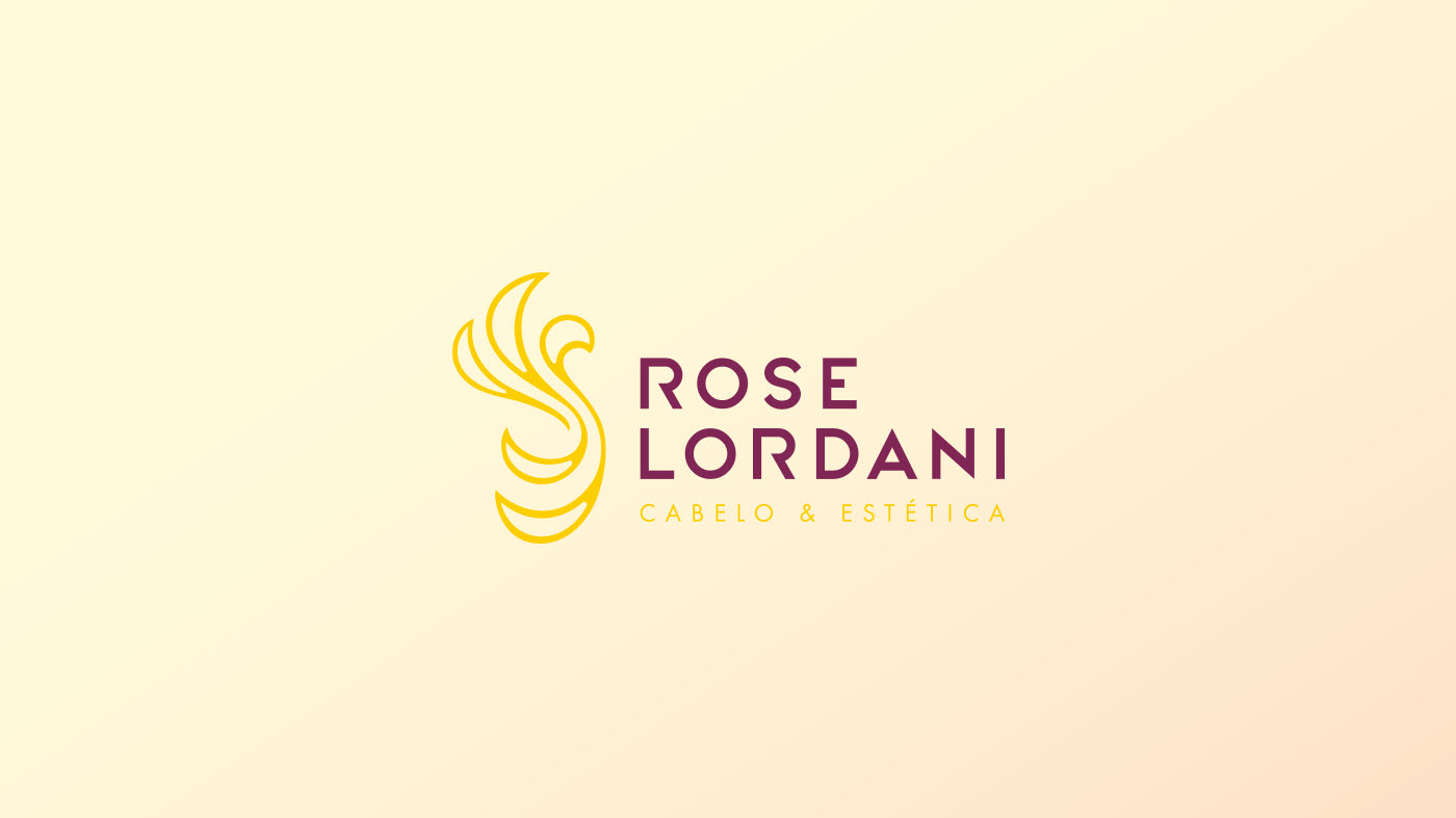
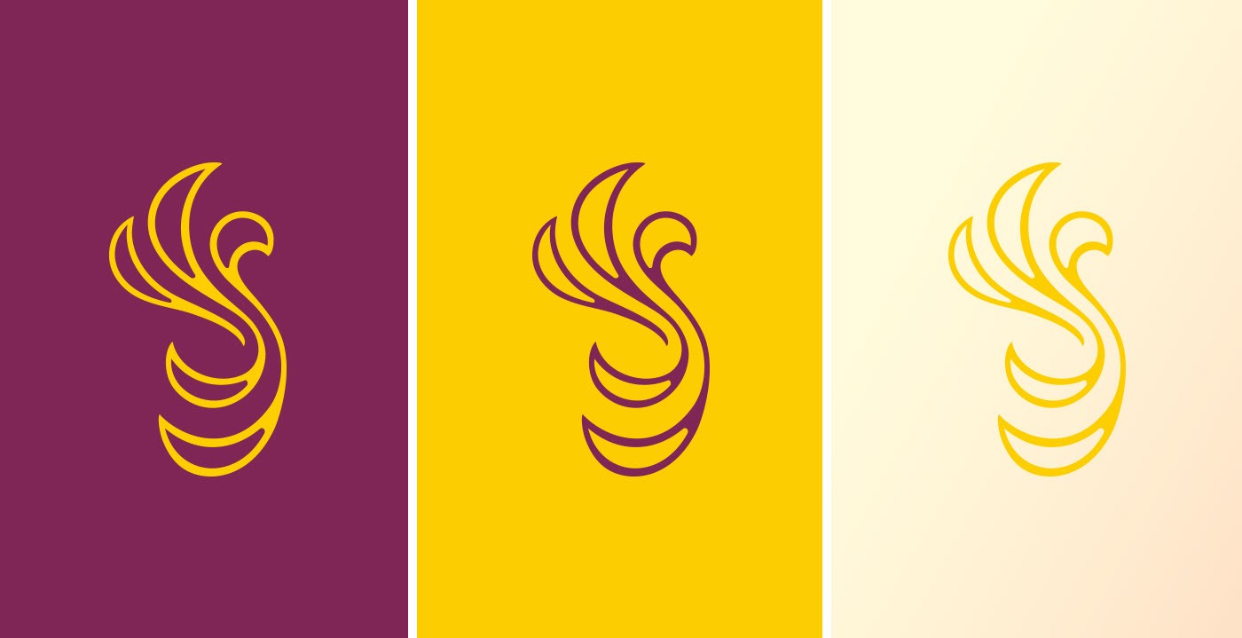
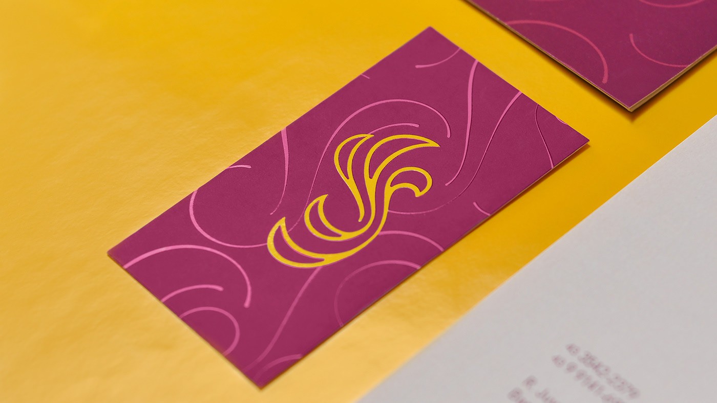
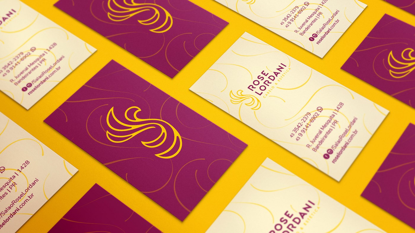
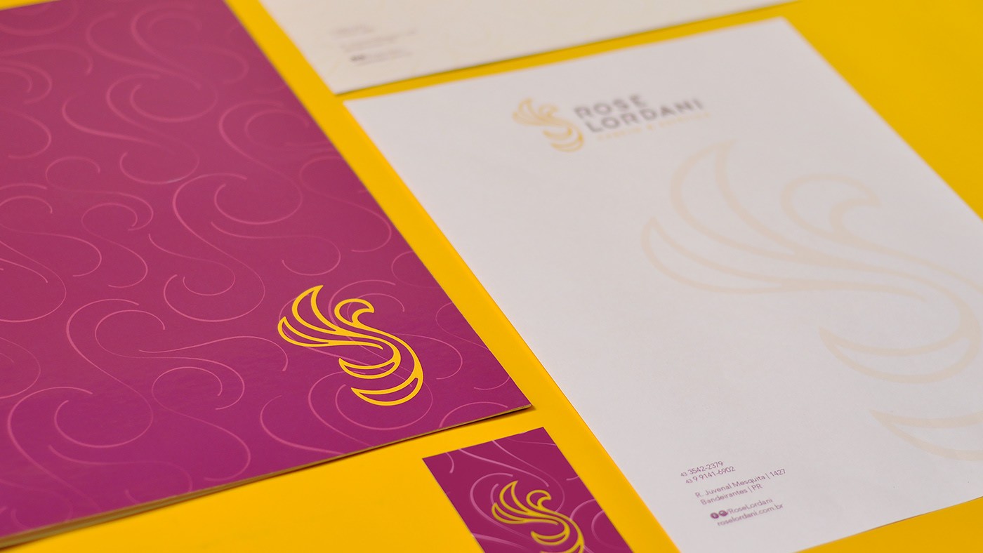
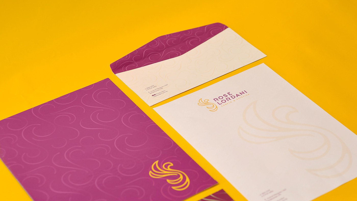
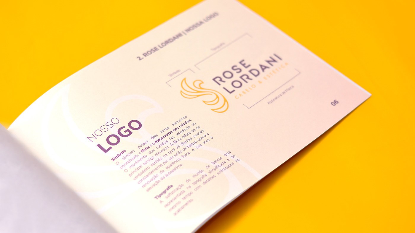
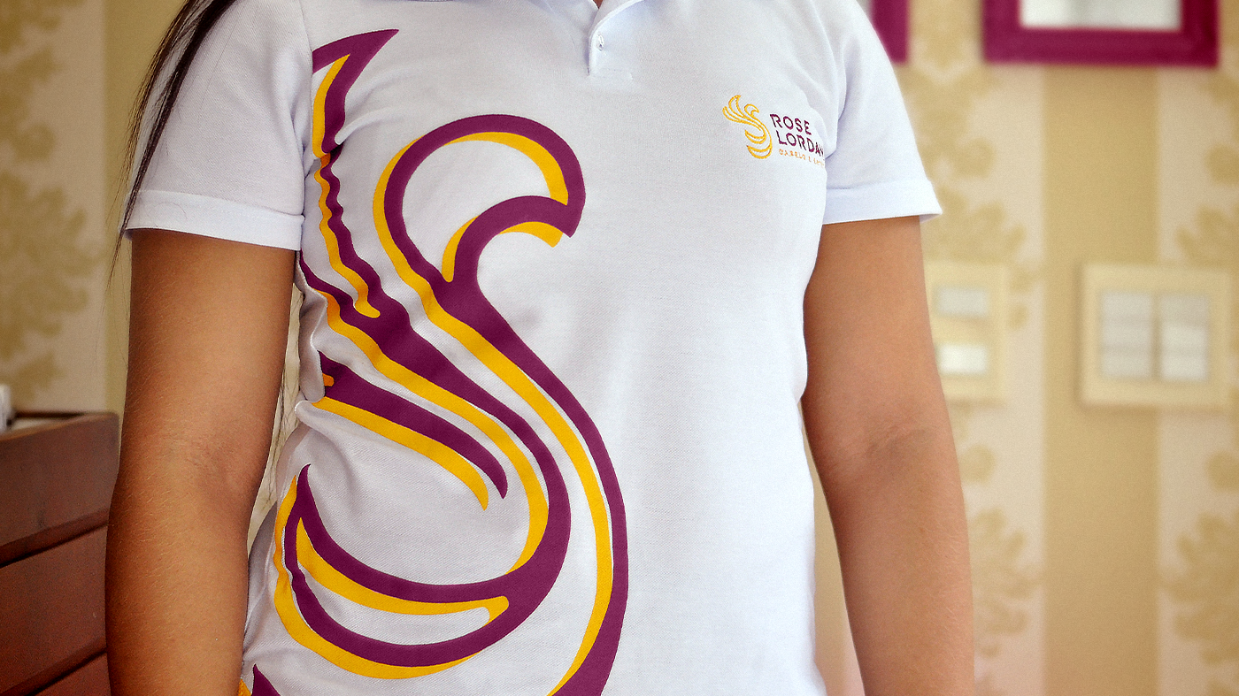
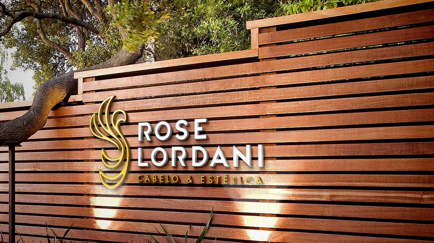
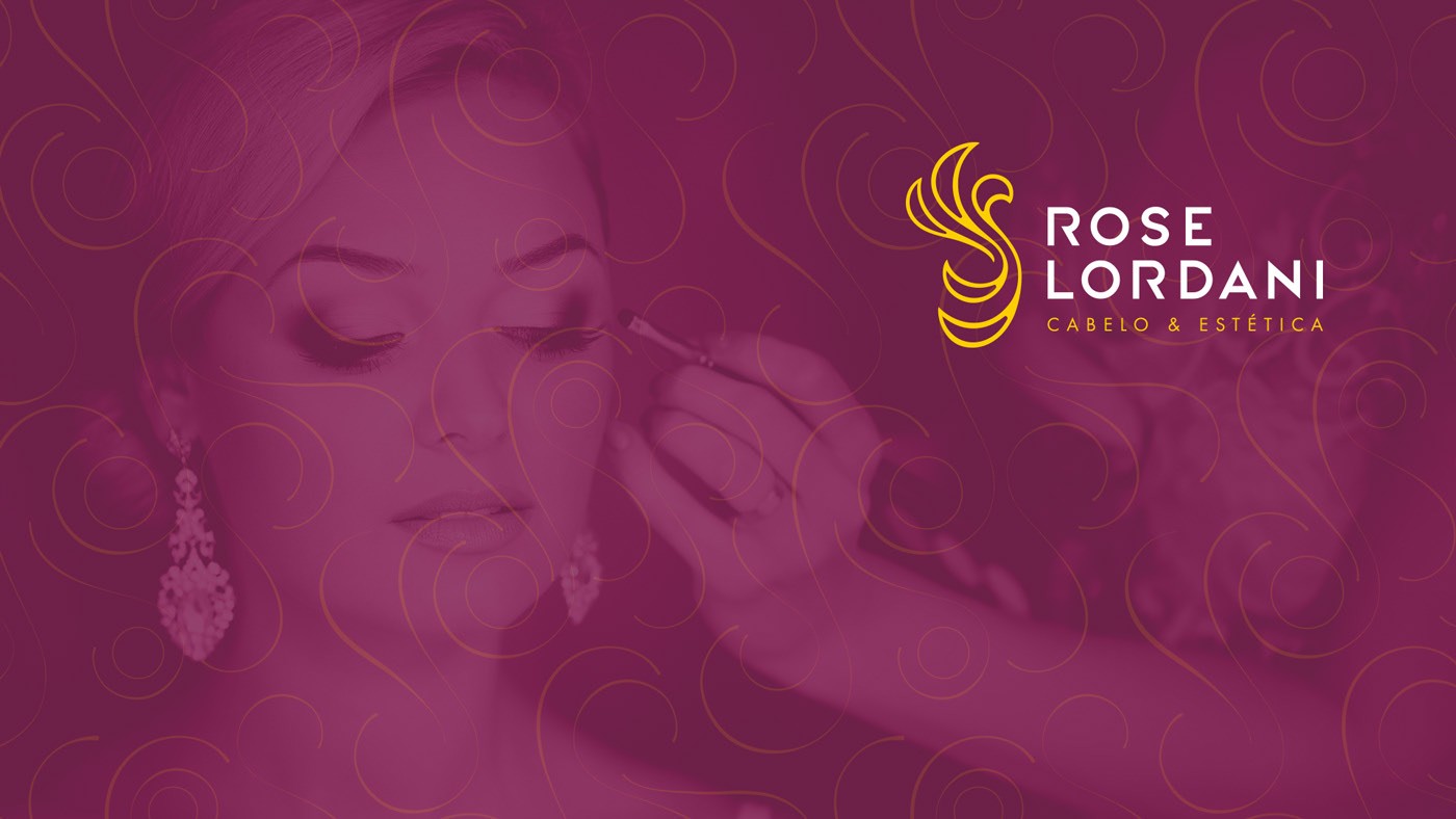
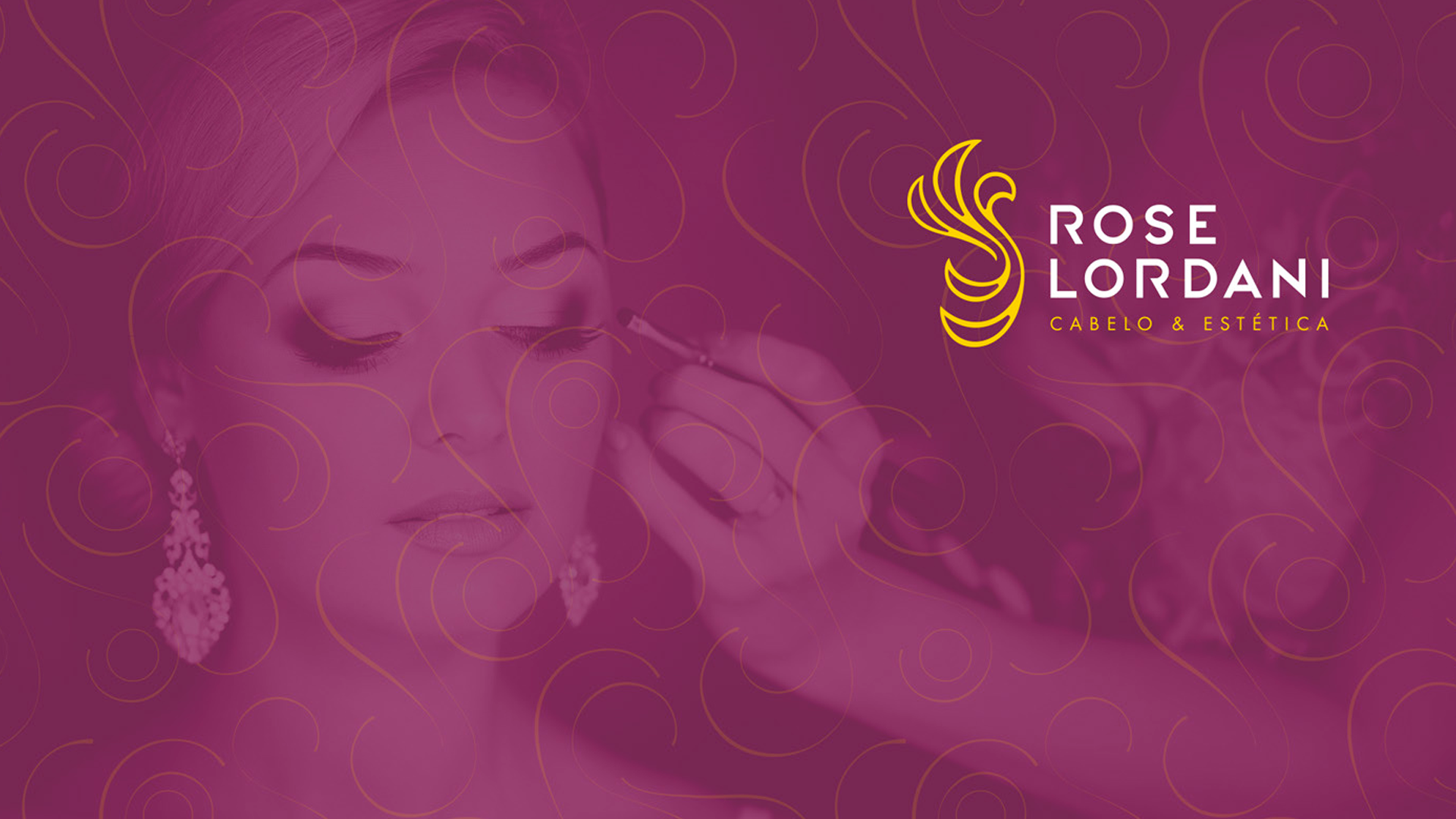
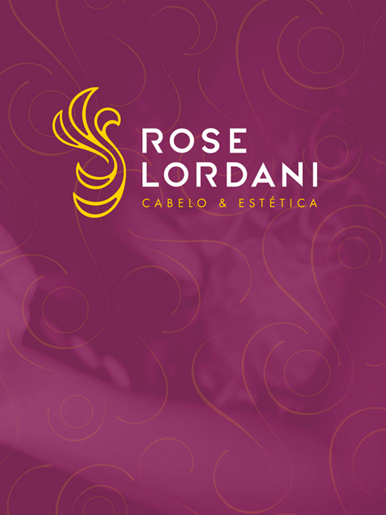
The Visual Identity proposal is to work the modern/elegant style, which fits the personality and the audience lifestyle to be reached. The Beauty Center also carries many characteristics of its owner, a modern thinker person, who constantly seeks to update herself. By combining these aspects with the search for a renewal of appearance and self-esteem, by those who seek the services of the Beauty Center, we come to the figure of a phoenix. An mythological bird that never dies and always reborn from the ashes. From this a symbol was developed that could bring the image of the phoenix without it being so explicit. The symbol also carries the reference to hair movement, the main service offered by the Beauty Center. All this lined with the an exclusive typography, and the colors that work well in contrast, bringing the idea of sophistication and energy.