
Cyklos
Naming | Visual Identity
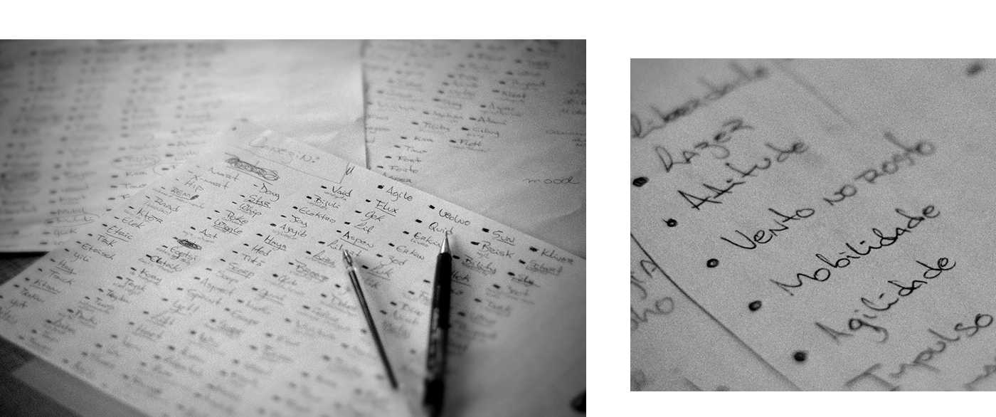
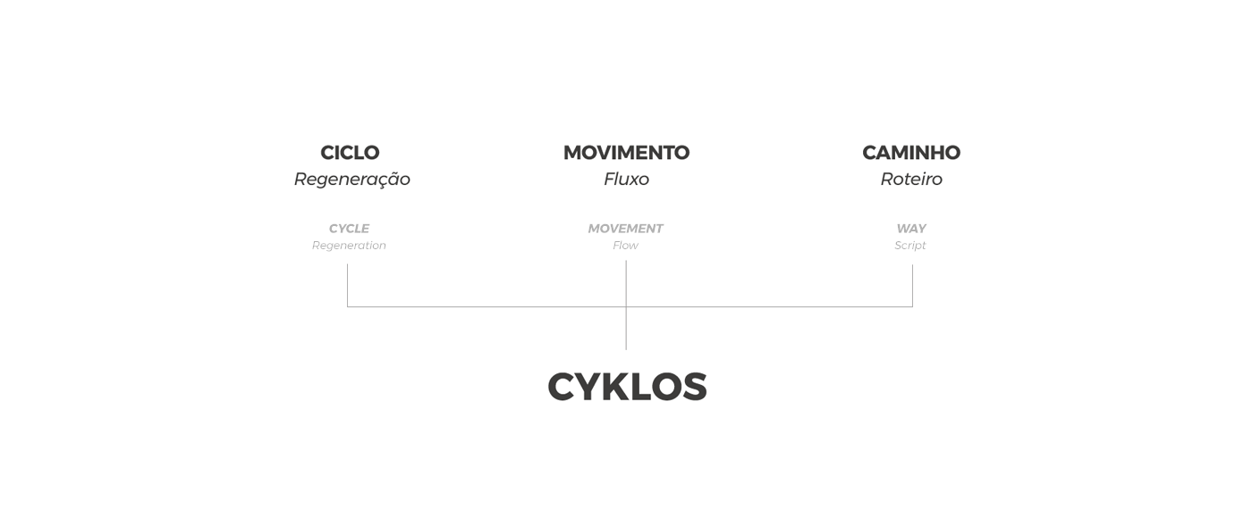
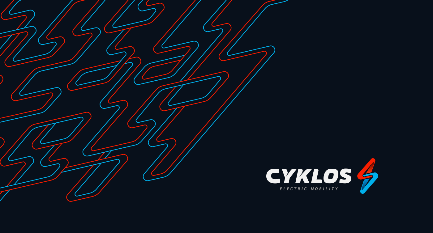
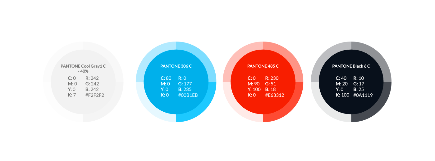
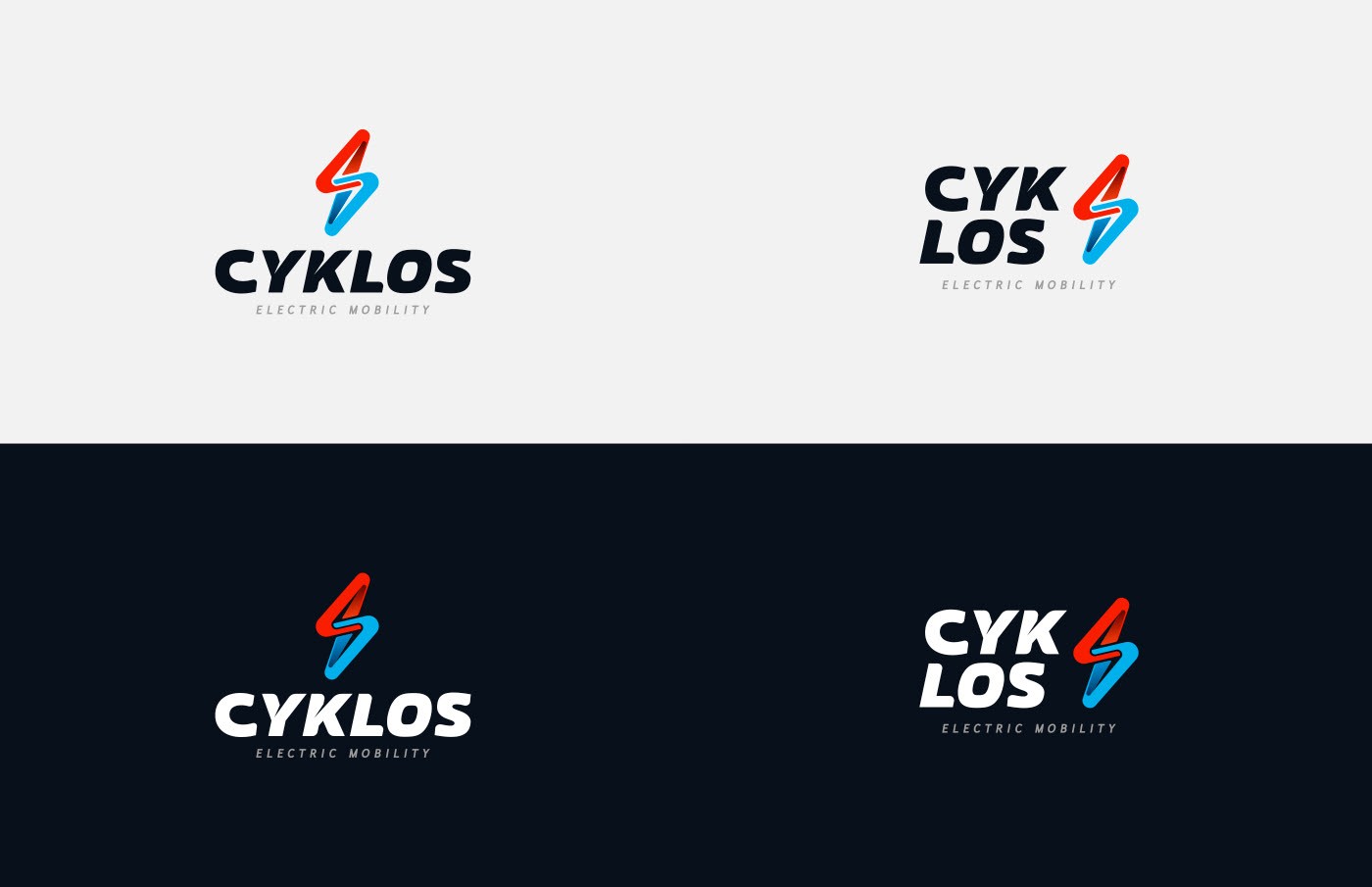
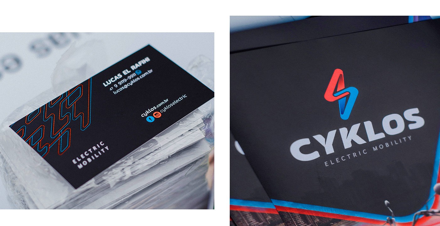
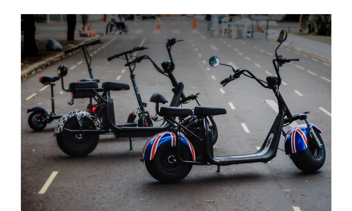
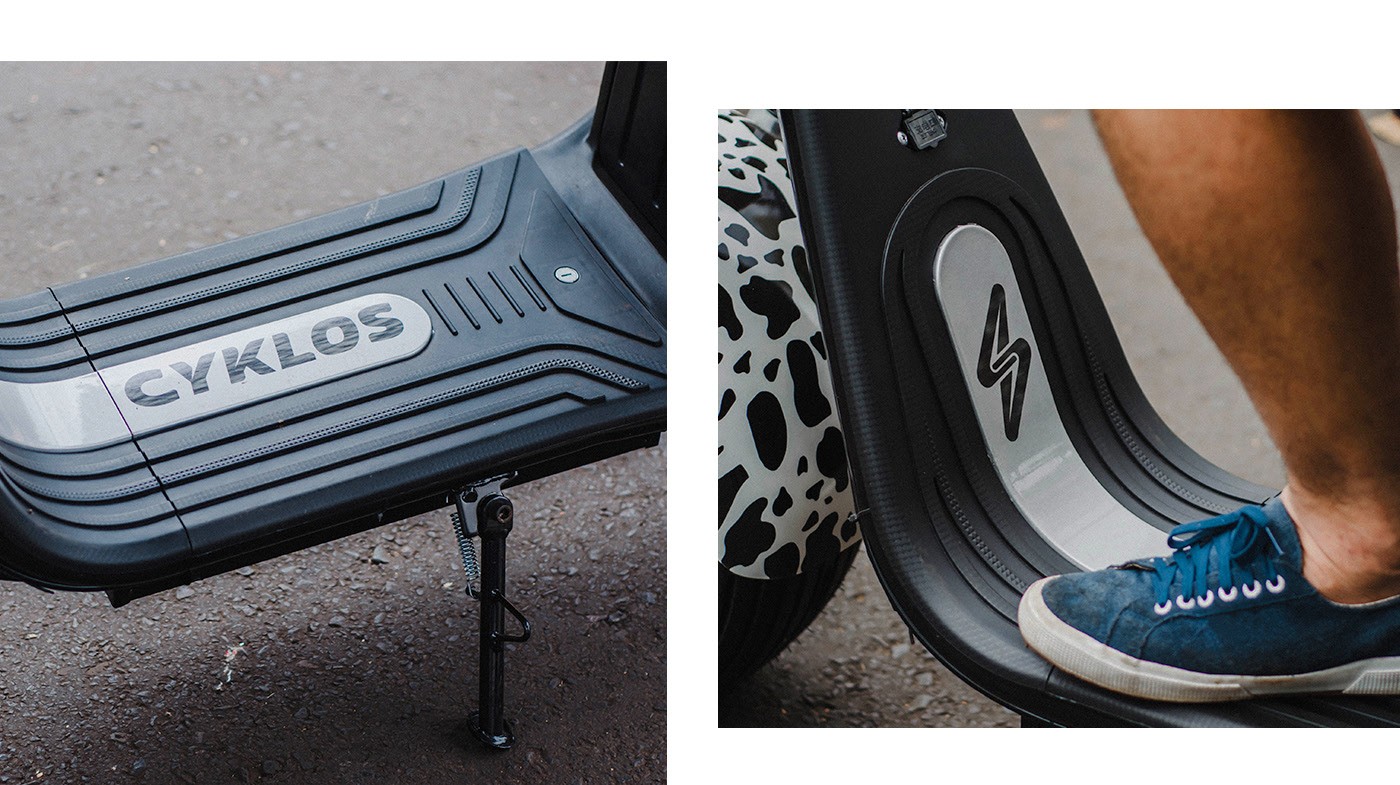
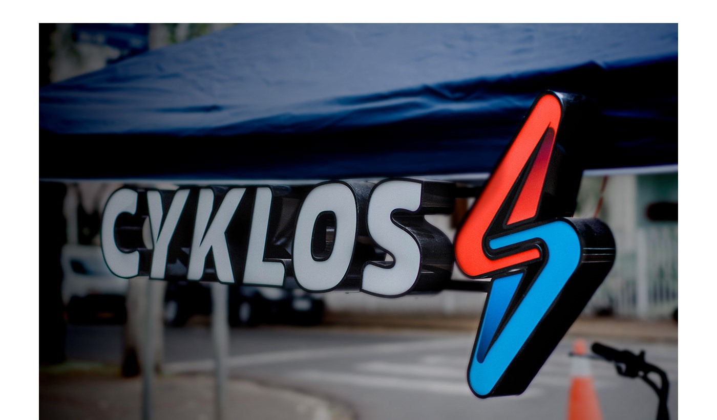
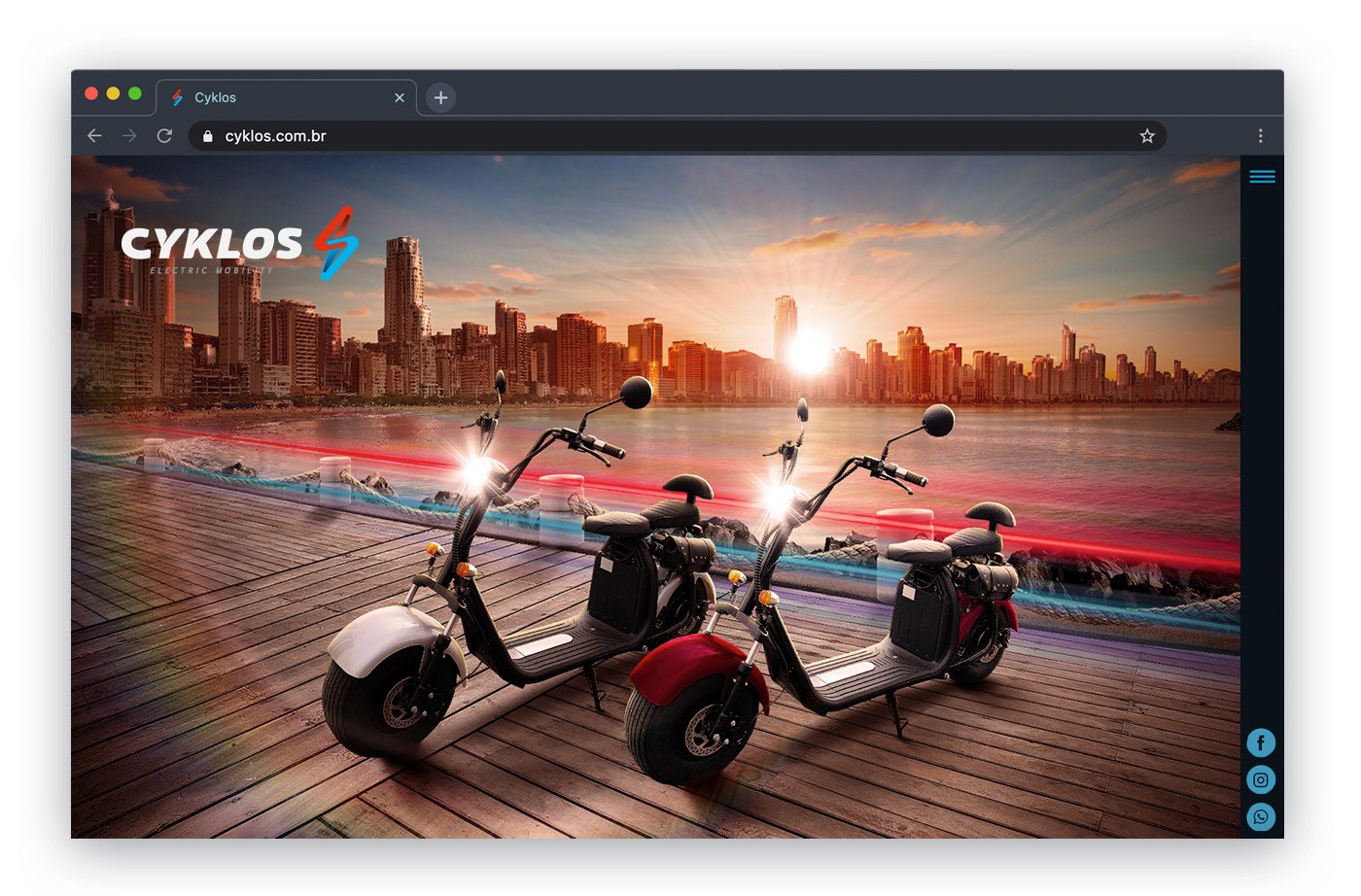
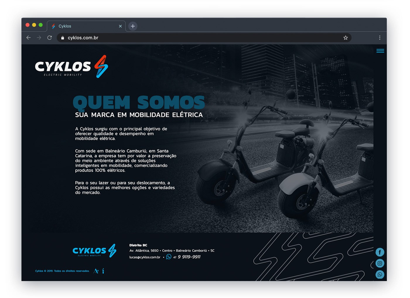
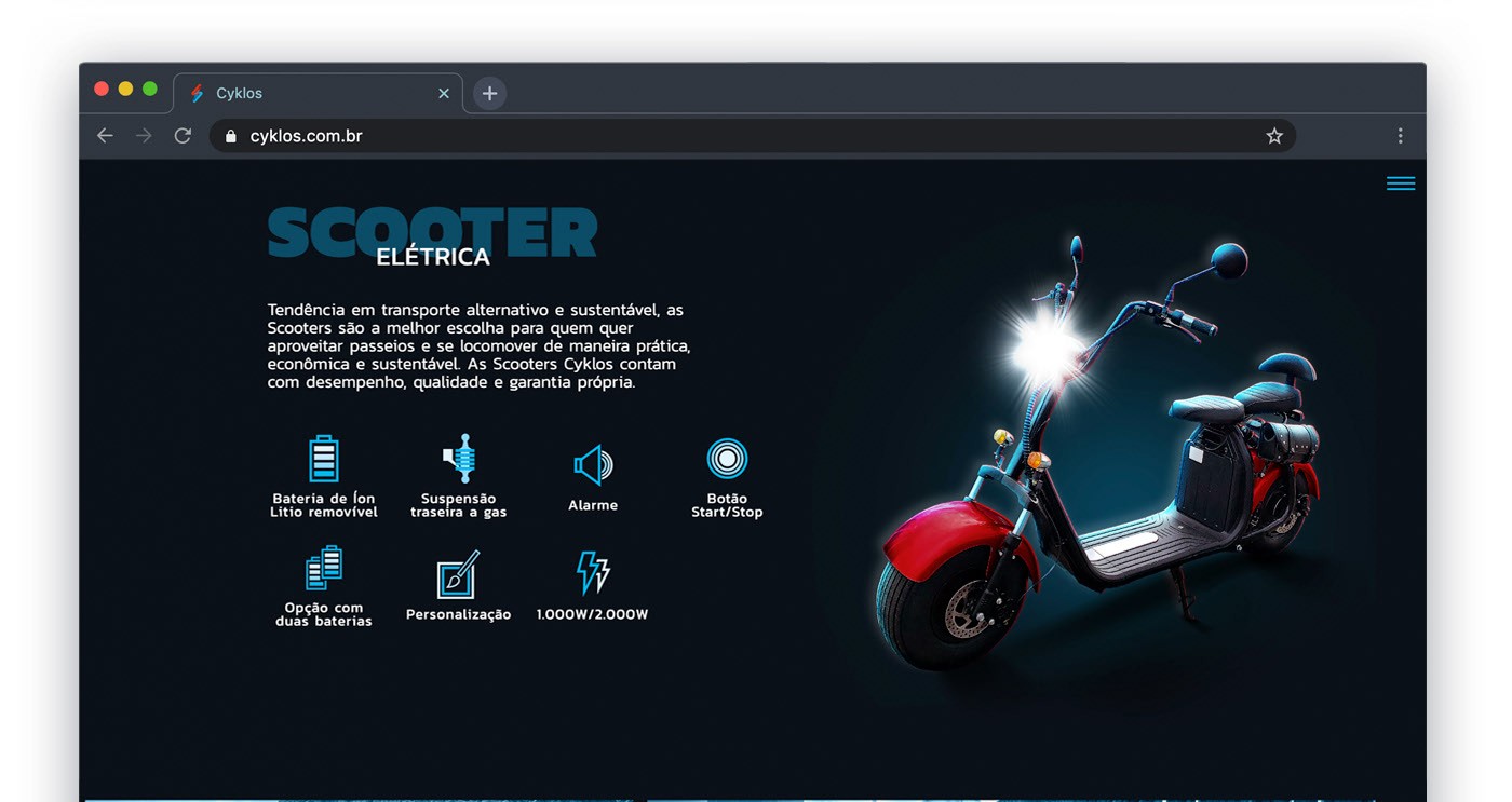
Cyklos emerged with the objective of offering an alternative of quality and performance in electric mobility. Preserving the environment through intelligent mobility solutions is its main mission, selling 100% electric products. To express these values, in addition to the idea of movement, we sought a short name that is easy to remember and that could transmit renewal and electricity. Therefore, in the word "cycle" we find the ideal set of meaning and good pronunciation. We modified its structure giving more personality and exclusivity to the brand, without losing the originality of the word. In visual identity, we create a symbol that unites the image of lightning / electricity with that of infinity. In addition, we reinforce the dynamism and movement that the brand represents, creating paths that go, come back, cross and move away. In the colors, the focus was to transmit vibration, we found this in the combination of light blue and red in contrast to the black background. However, the identity also has versions that work on a light background, if necessary. In addition to the name and visual identity, we also developed the website layout: cyklos.com.br
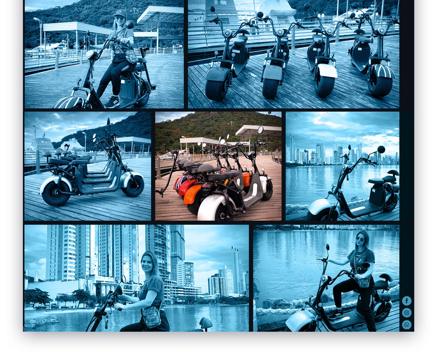
Photos: Beatriz Amaro