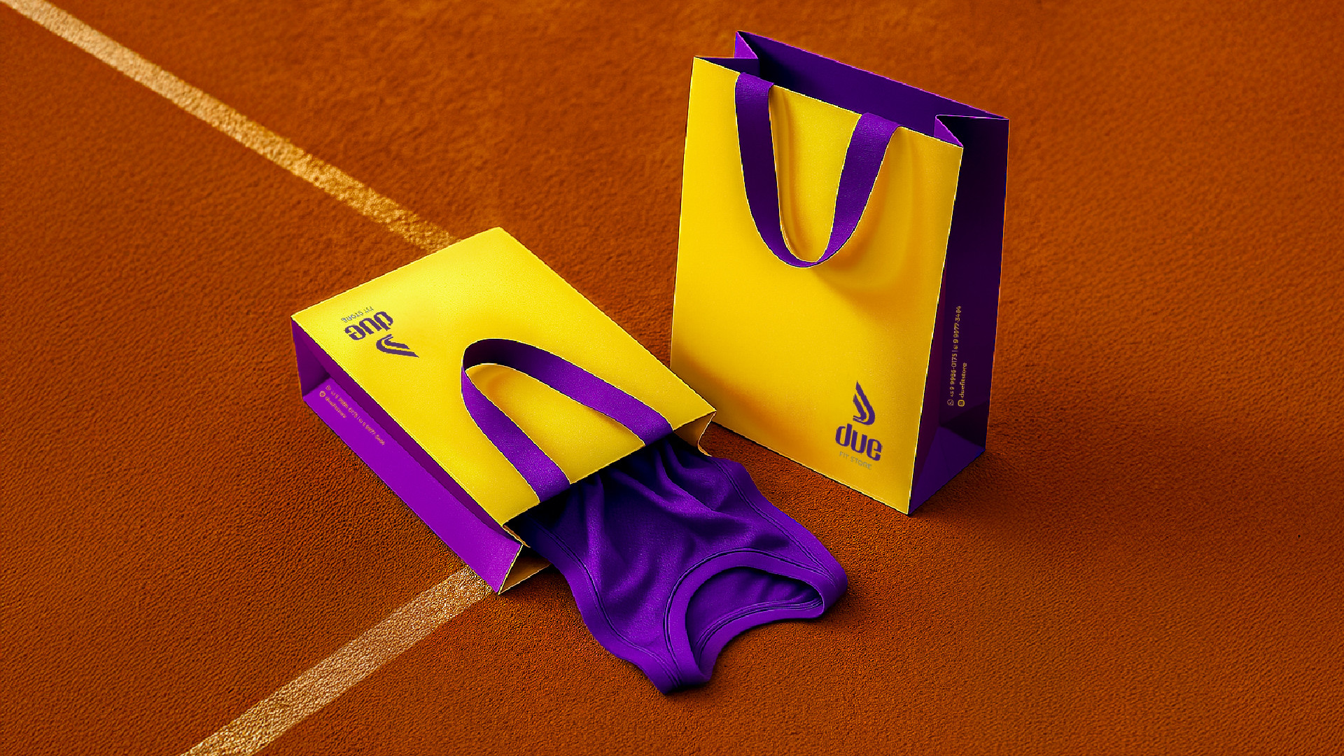
Due
Visual Identity
| 2022
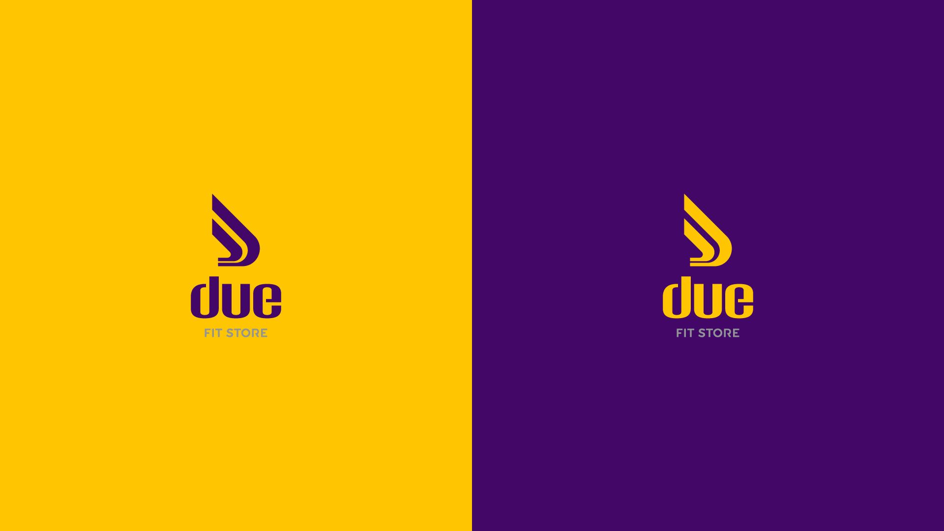
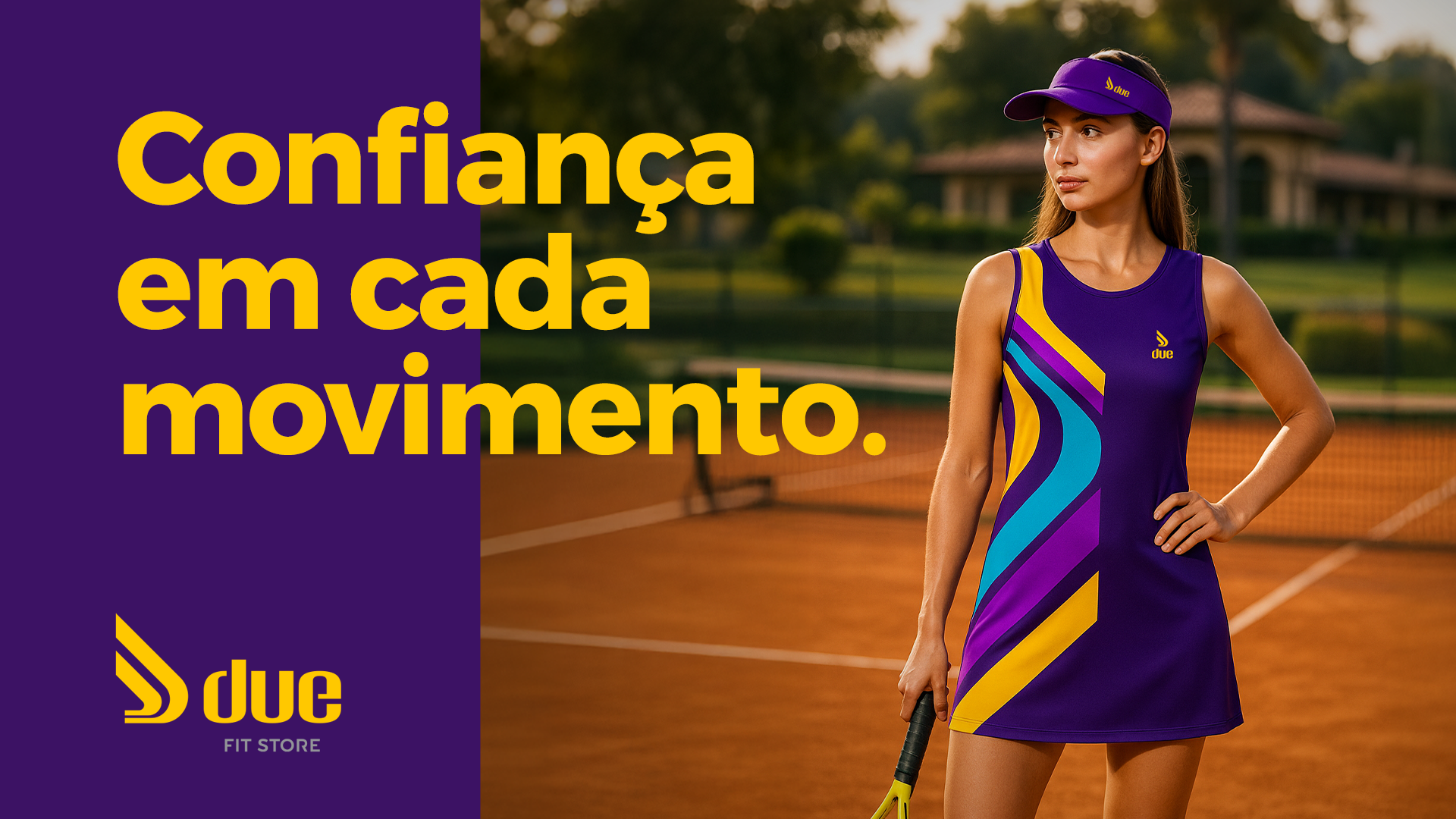
We proudly introduce the identity of Due Fit Store — a brand designed with purpose and a forward-thinking vision.
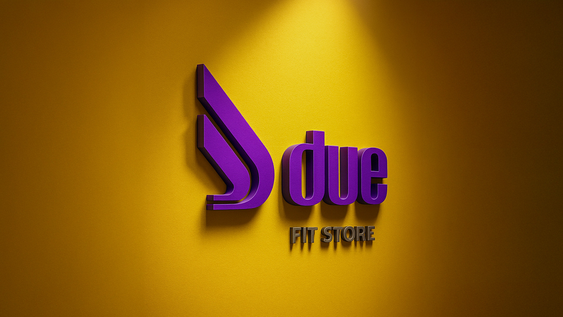
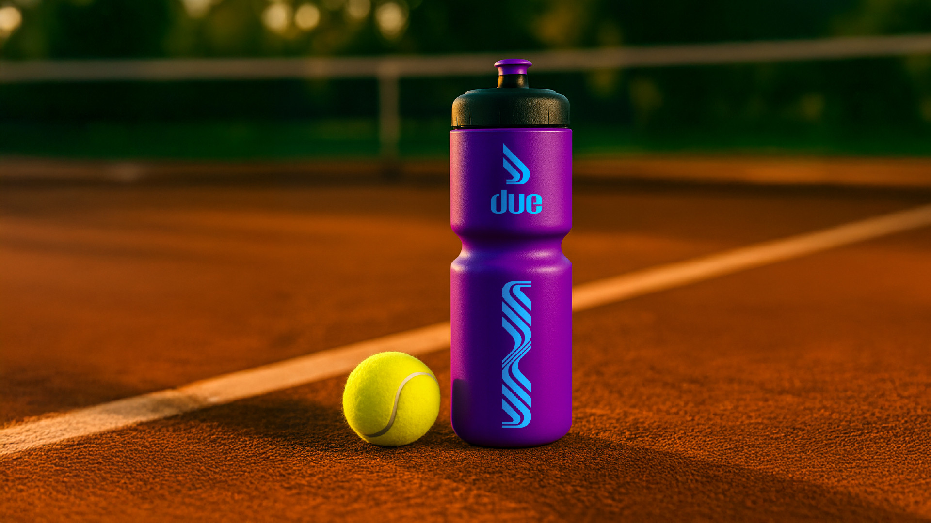
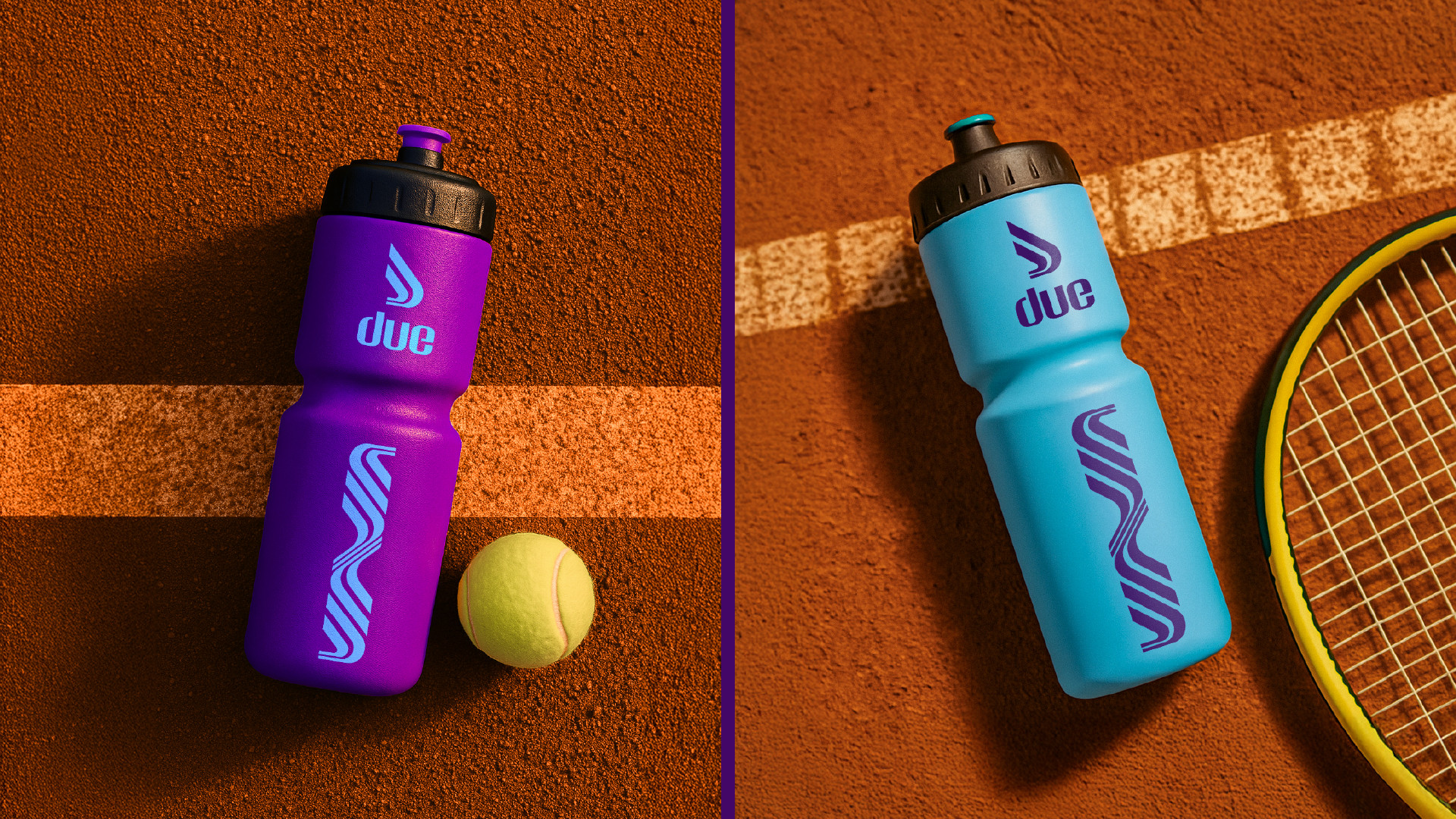
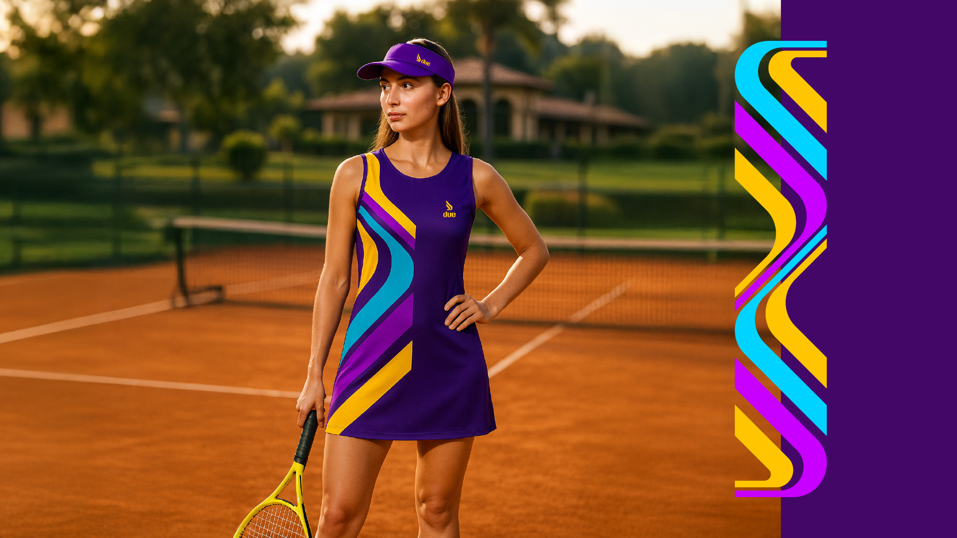
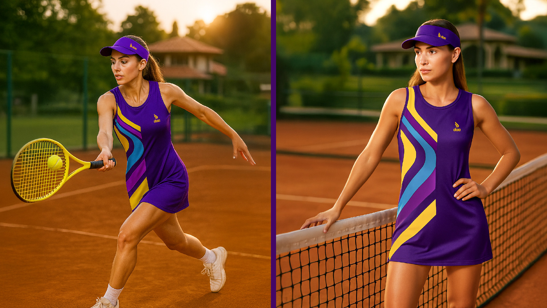
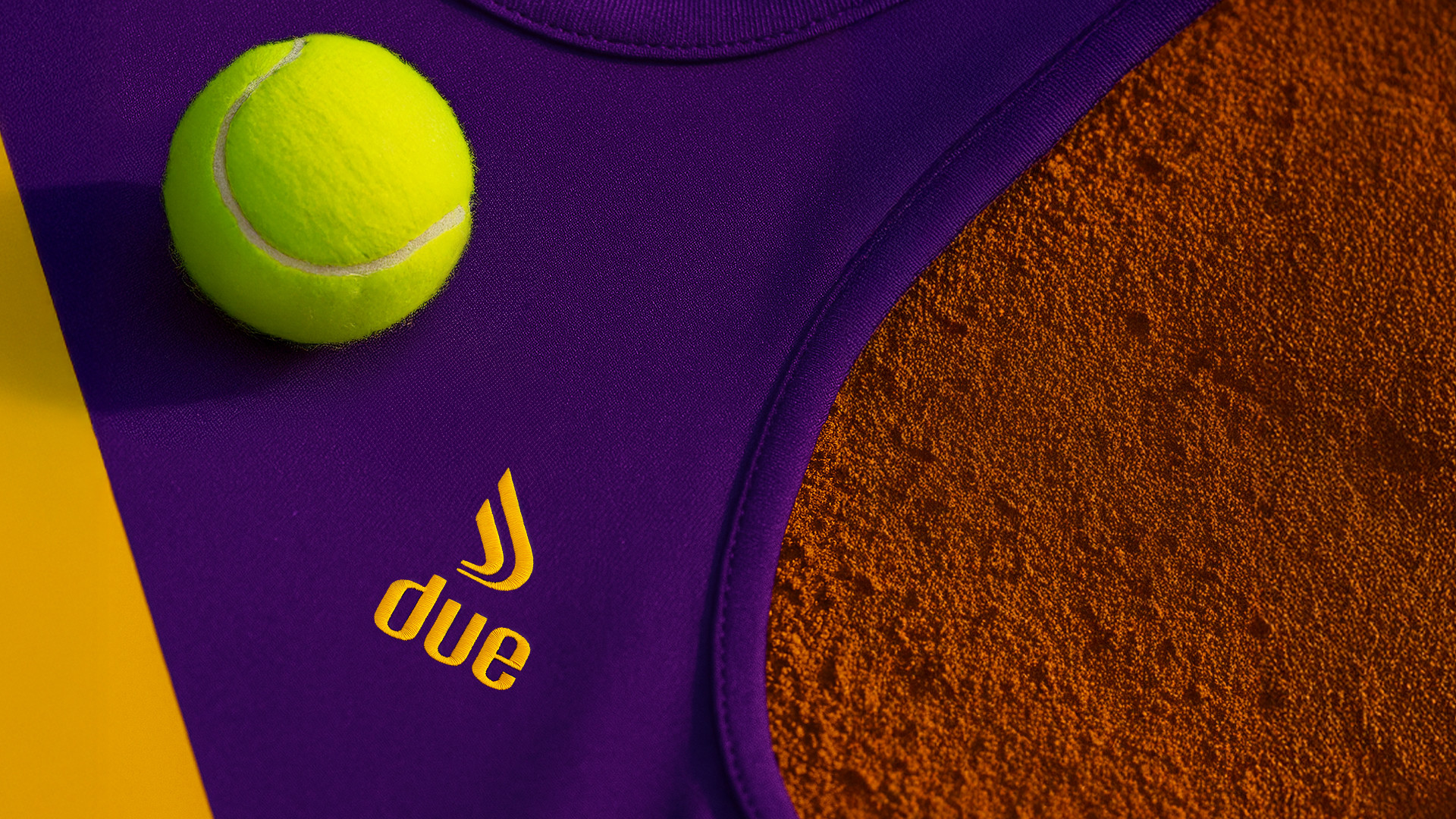
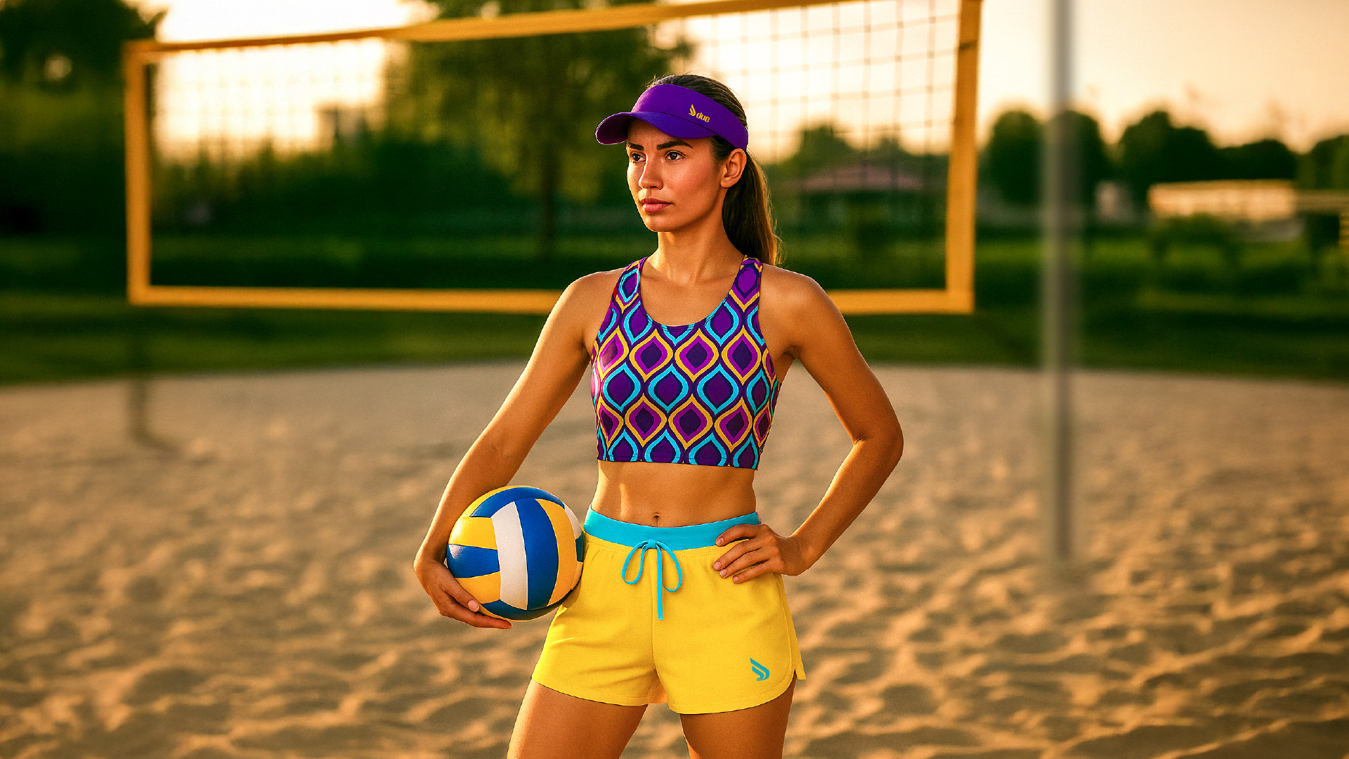
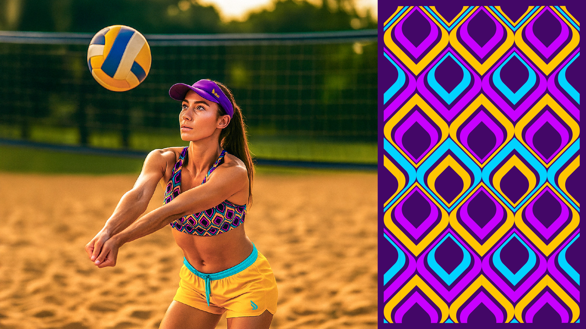
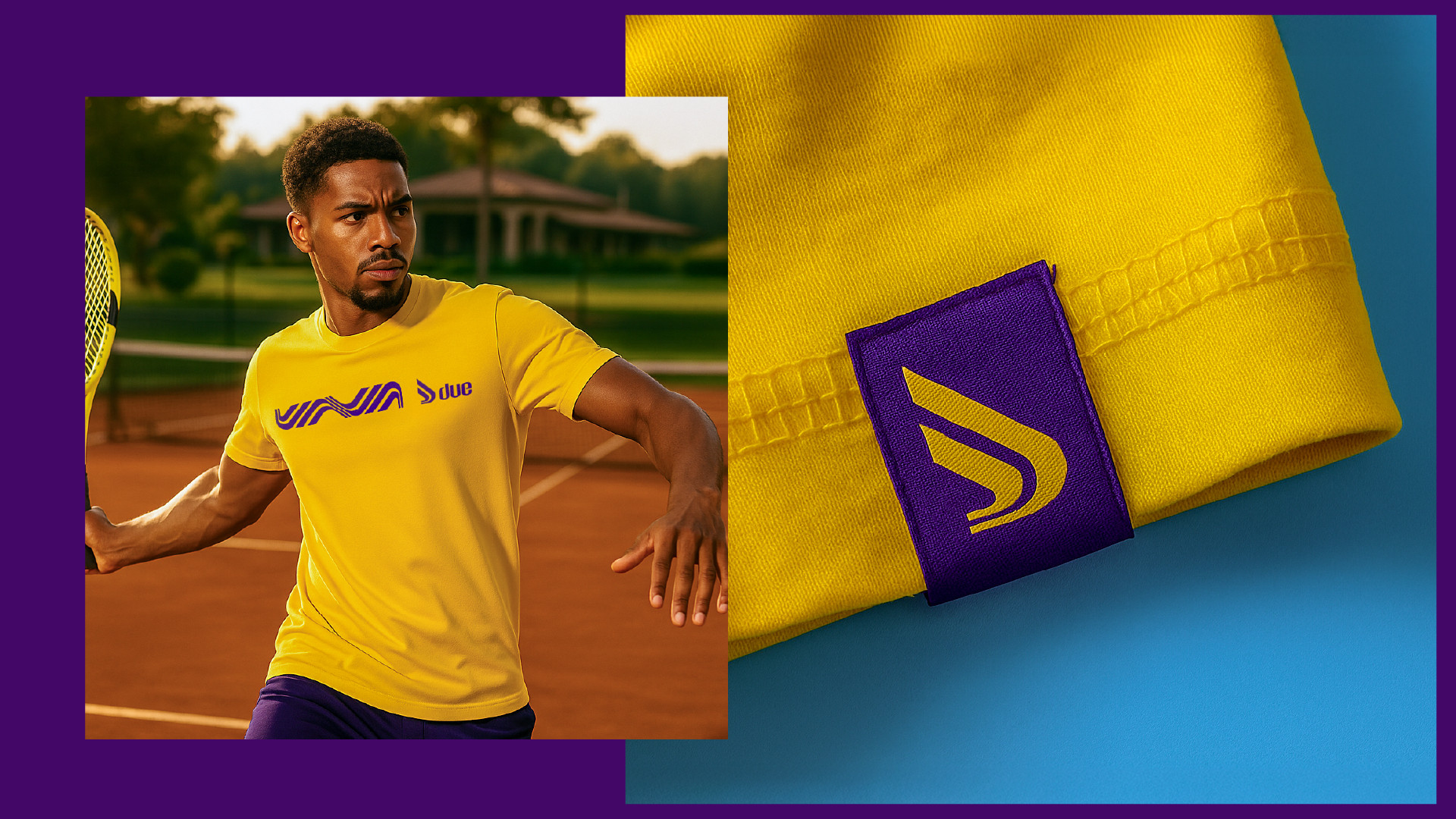
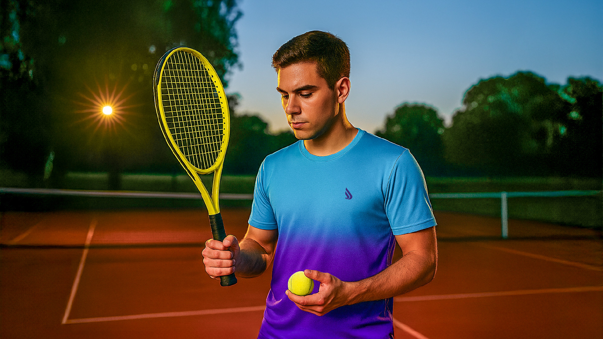
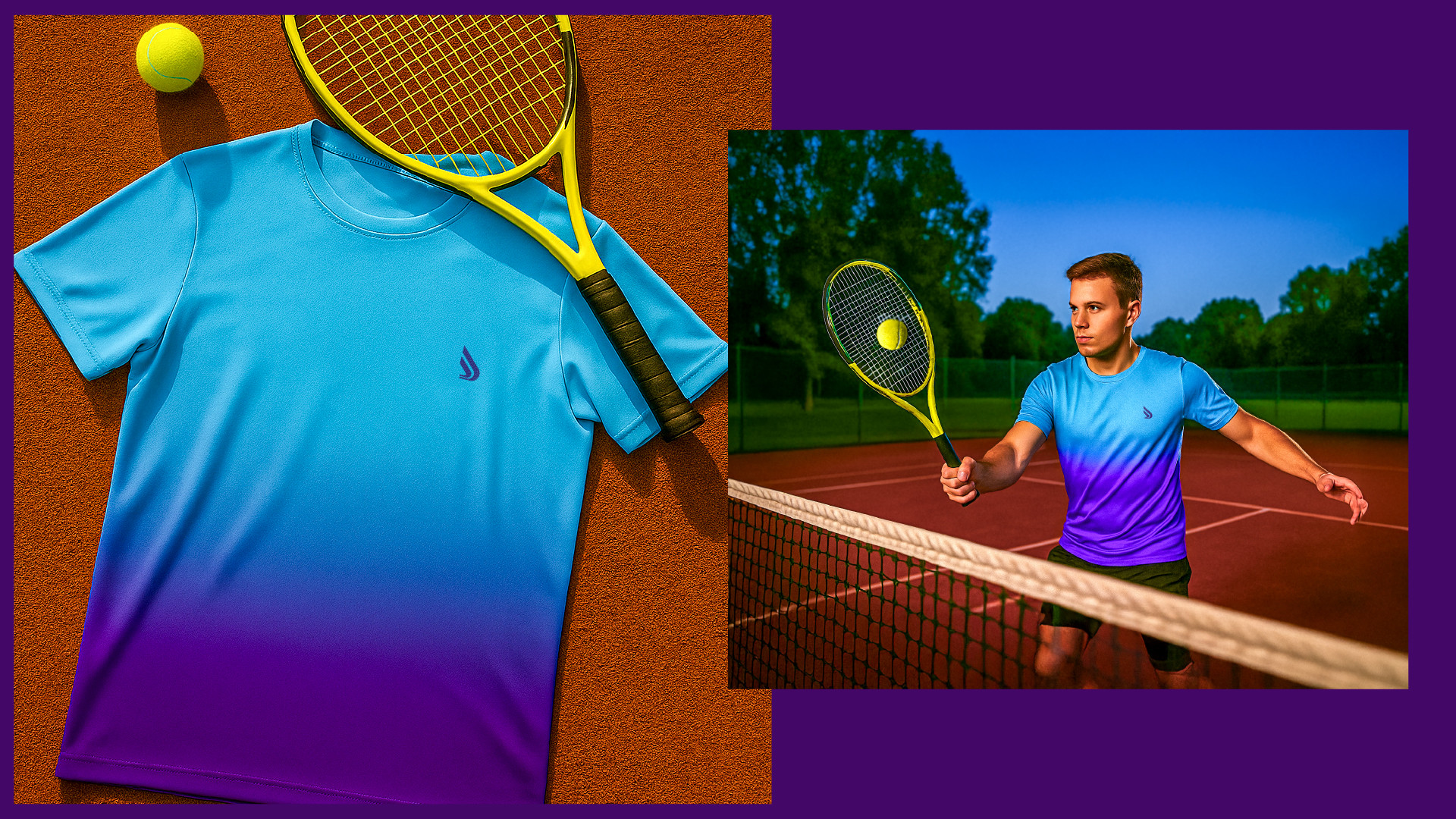
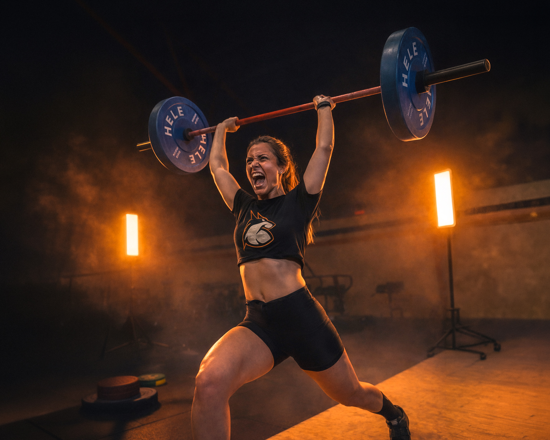
The logo was developed around the concept of movement, performance, and lightness, captured through a symbol that reflects the dynamic nature of sports and the fluidity of the body in motion.
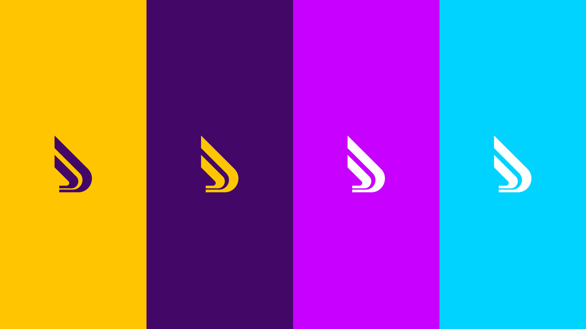
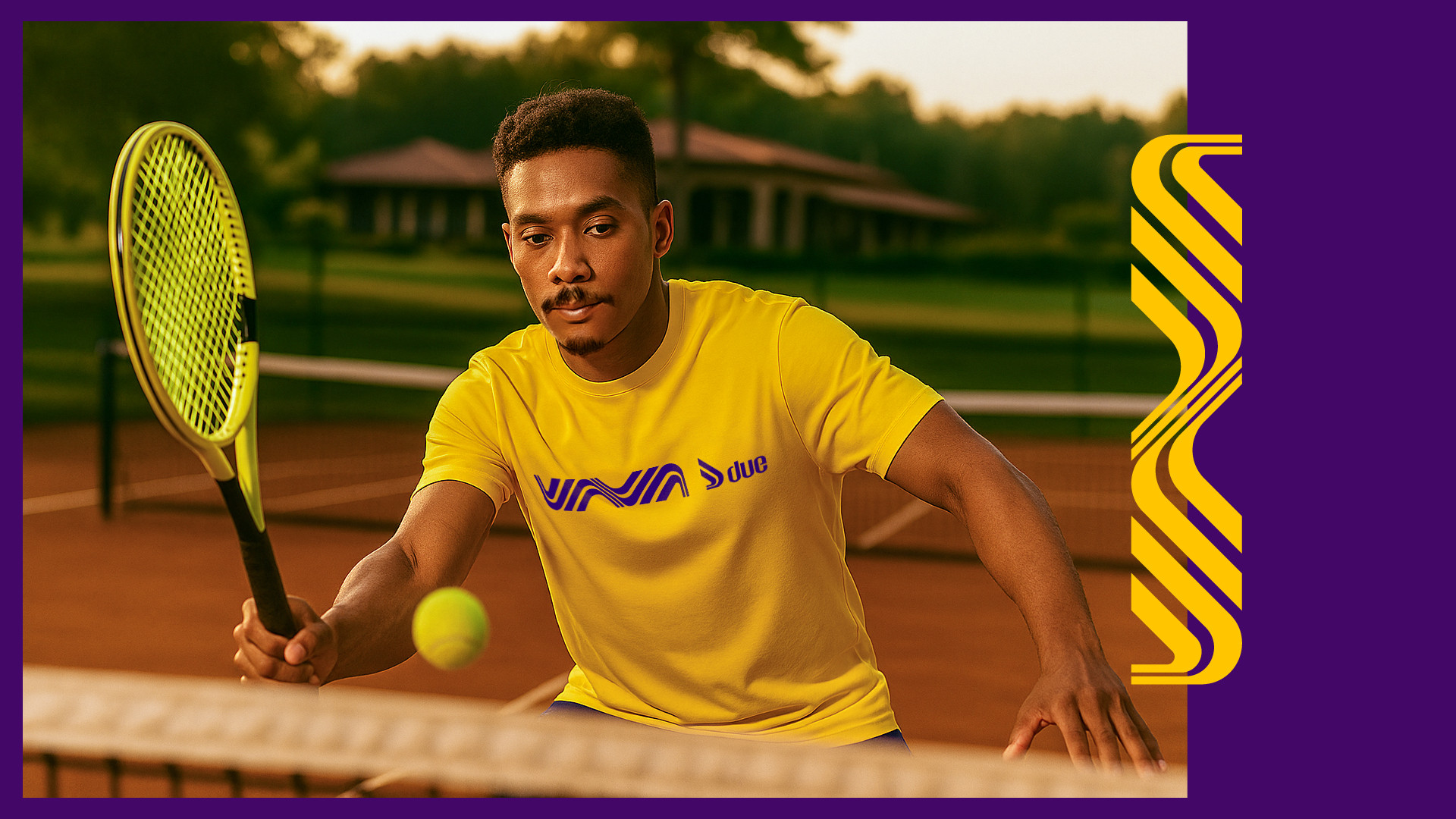
The color palette of purple and yellow brings bold contrast, energy, and modern appeal: purple represents authenticity and confidence, while yellow conveys vitality, optimism, and visual impact.
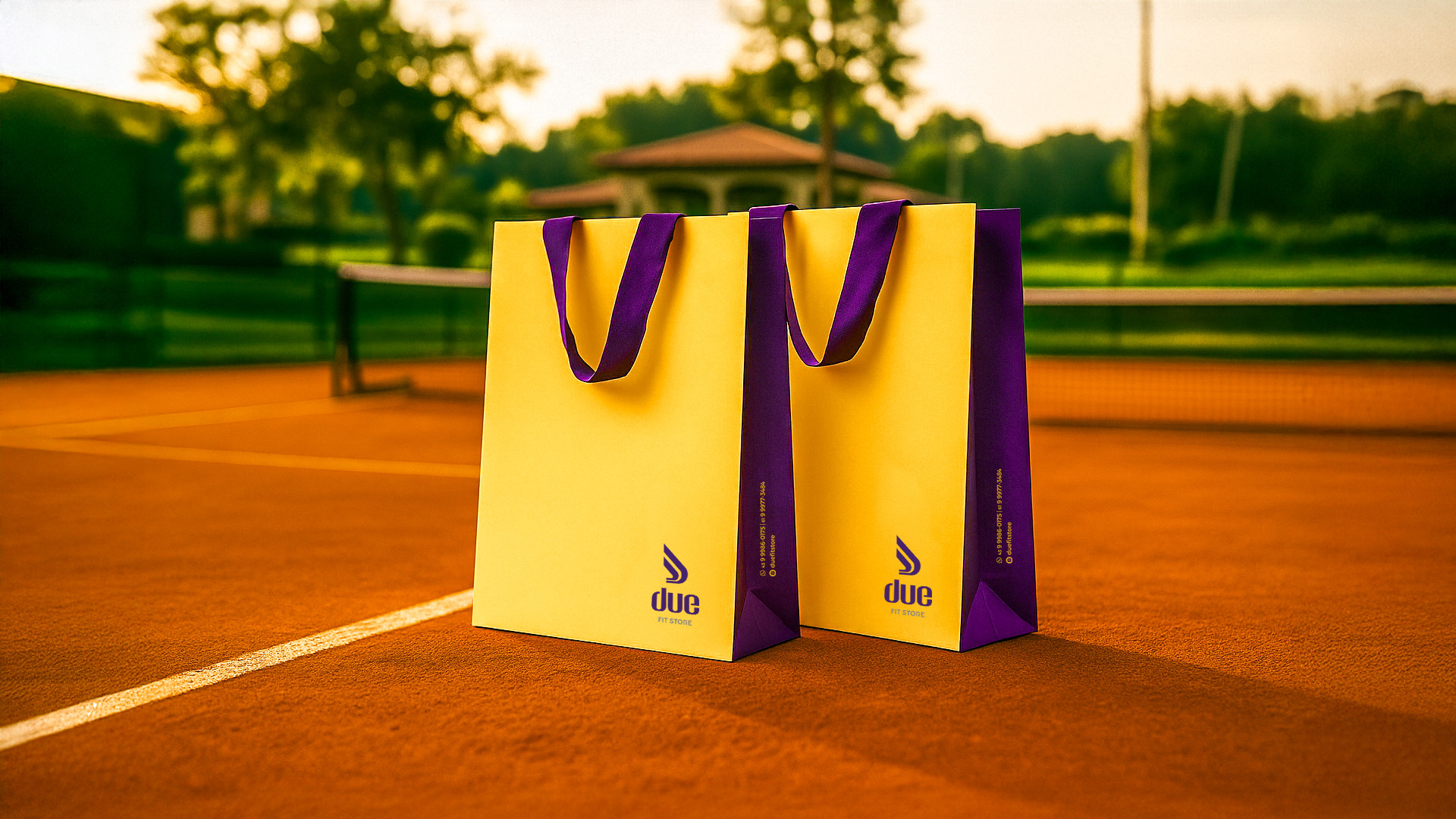
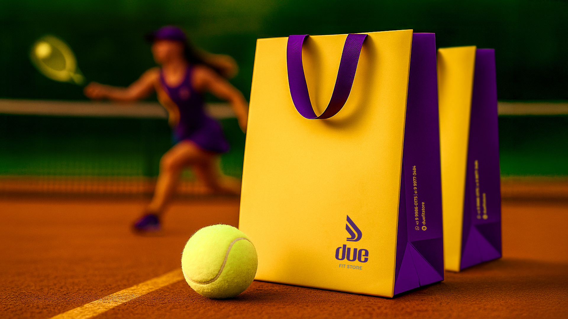
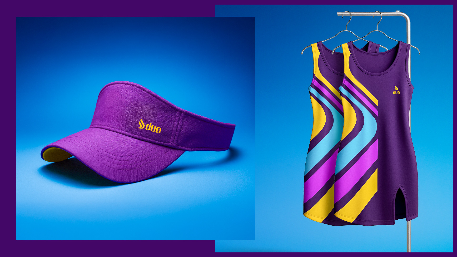
In addition to the logo, a set of supporting graphic elements was created to reinforce the brand identity across various applications — from communication to product design. The entire project was built with scalability in mind, ready to support future expansion, including the development of an in-house product line.
Due is born ready to grow.
![]()