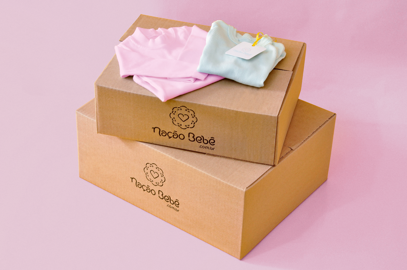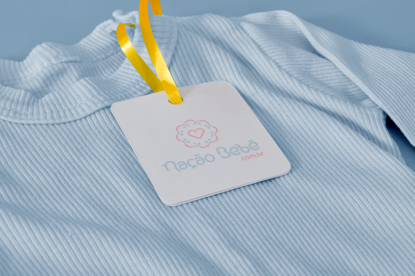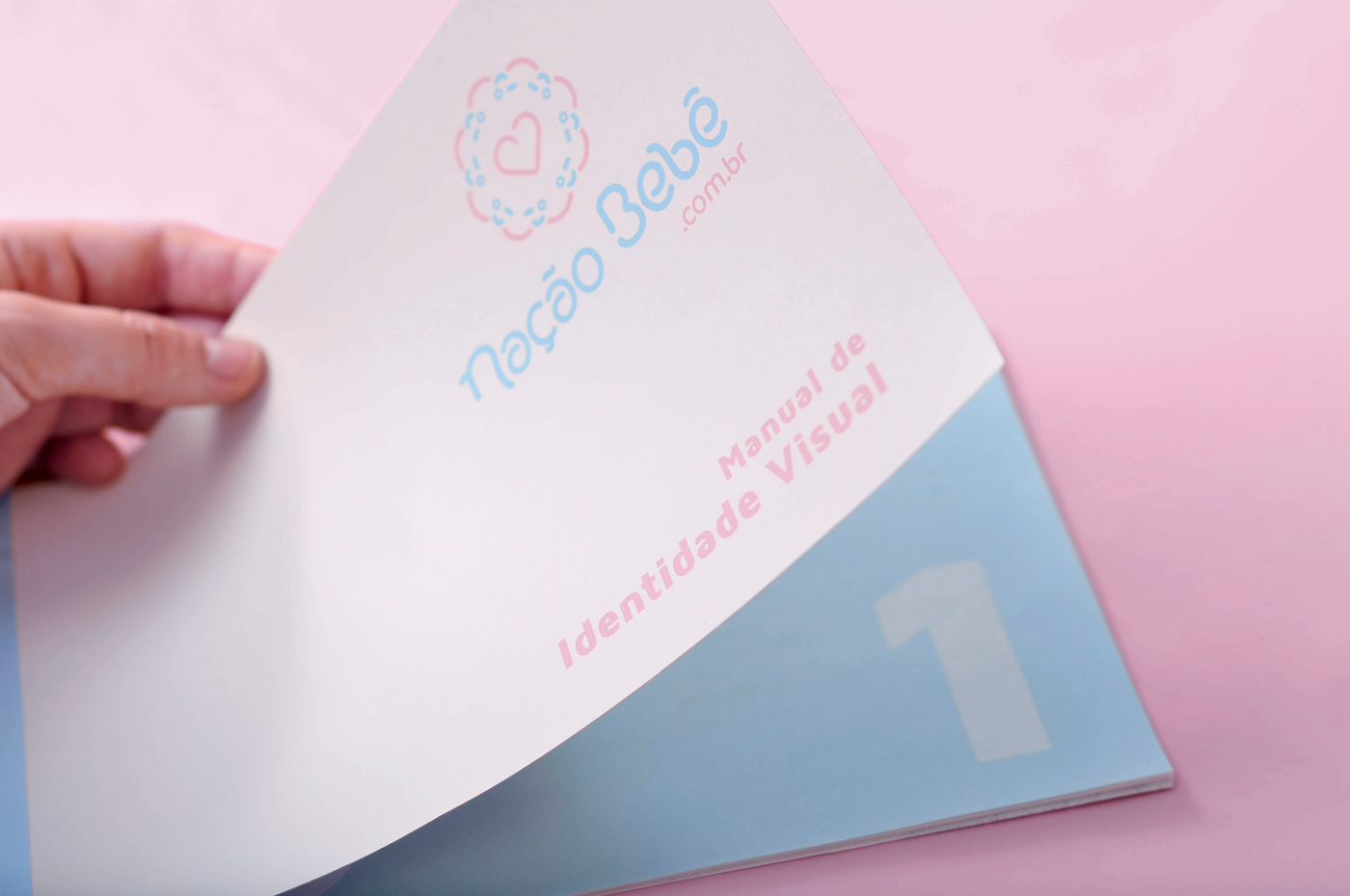
Nação Bebê
Visual Identity
Challenge
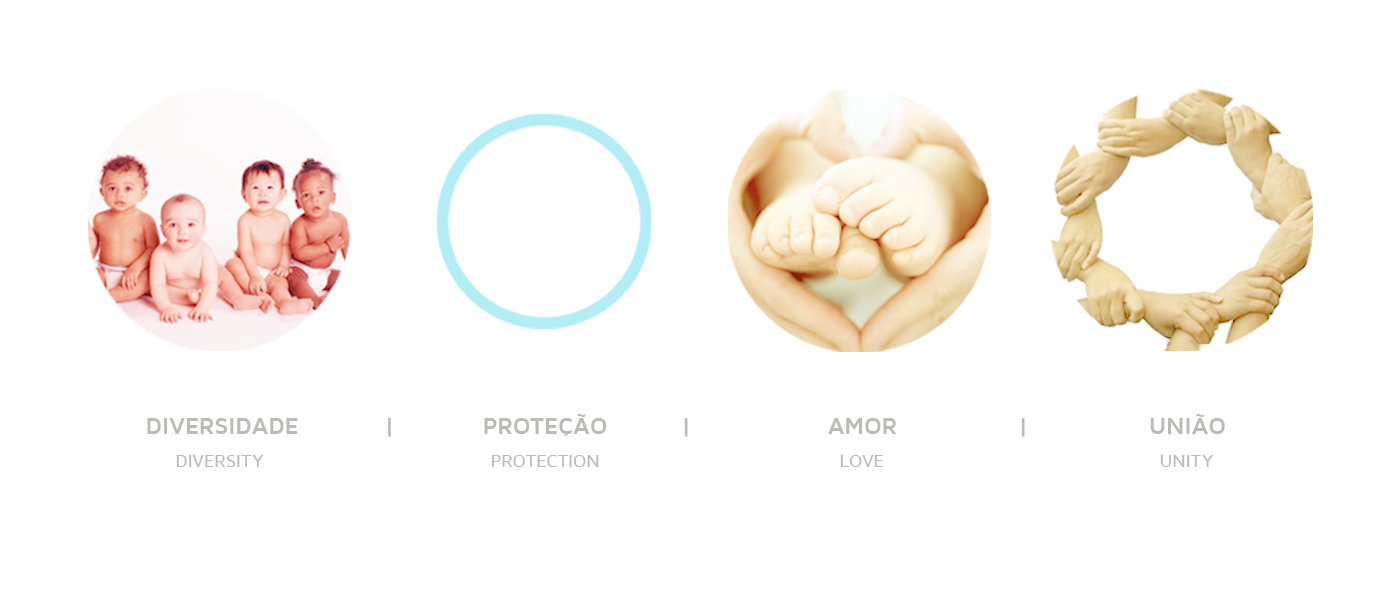
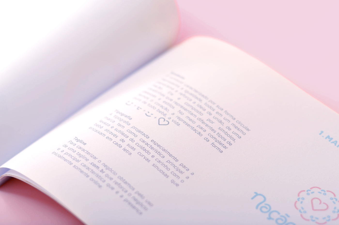
It was necessary to translate visually the company's concepts, which are: the diversity of races of a nation, the accessibility and ease of online shopping, and the love of mother for a new life, that of her child.
Proposal
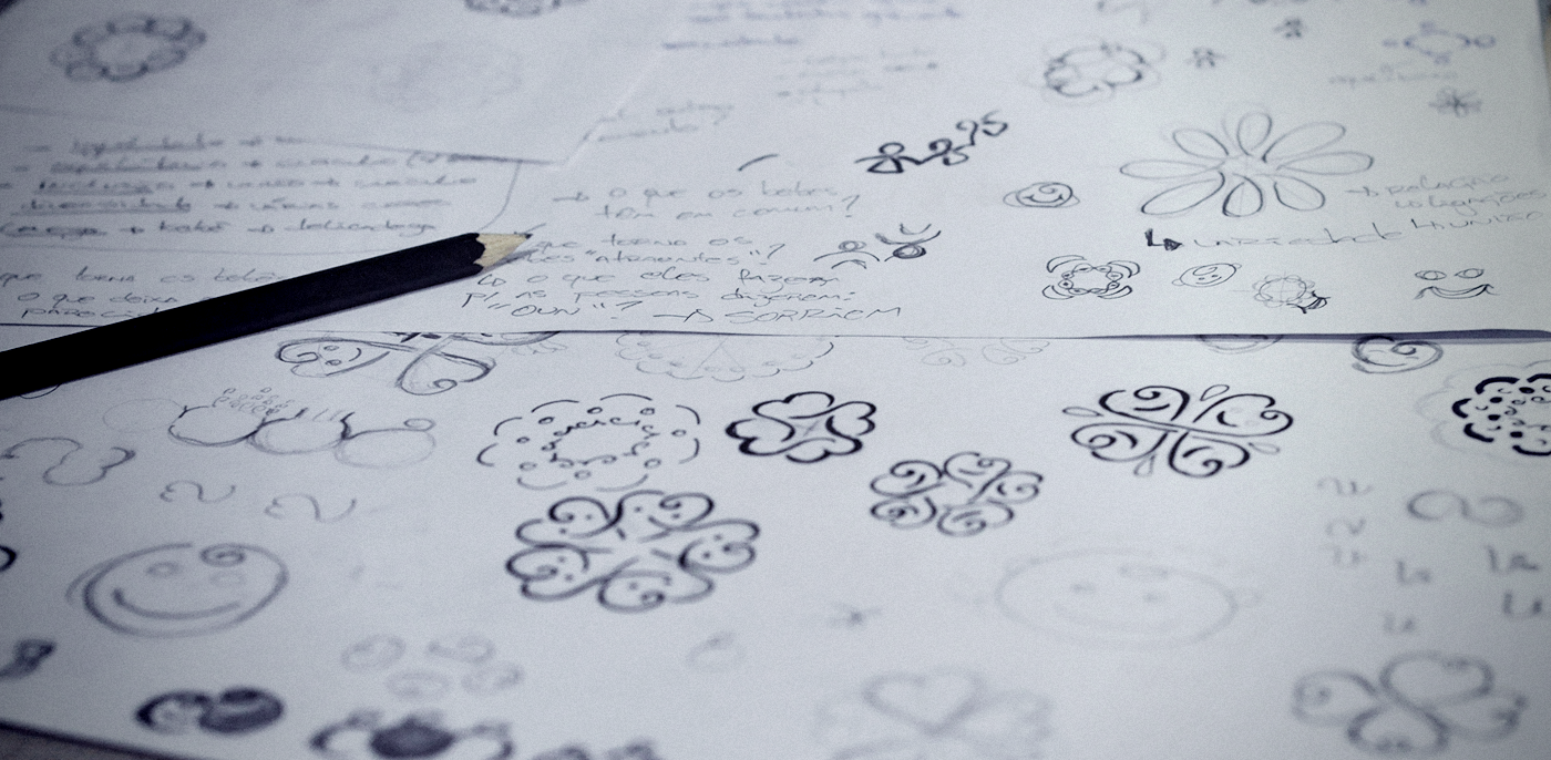
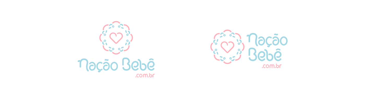
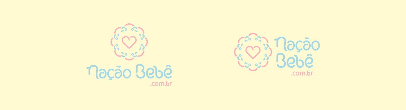
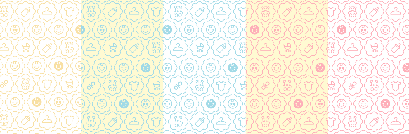
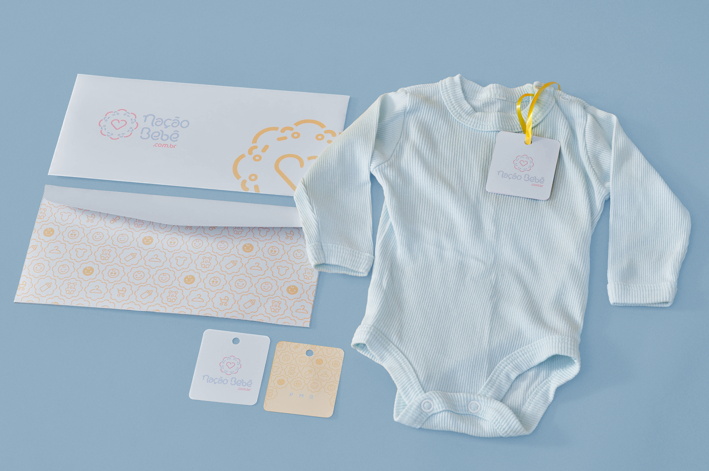
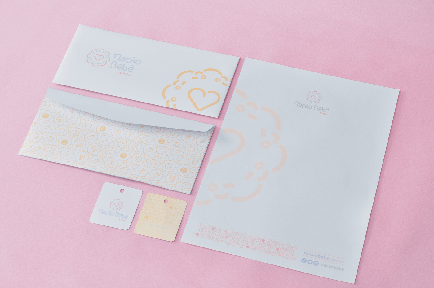
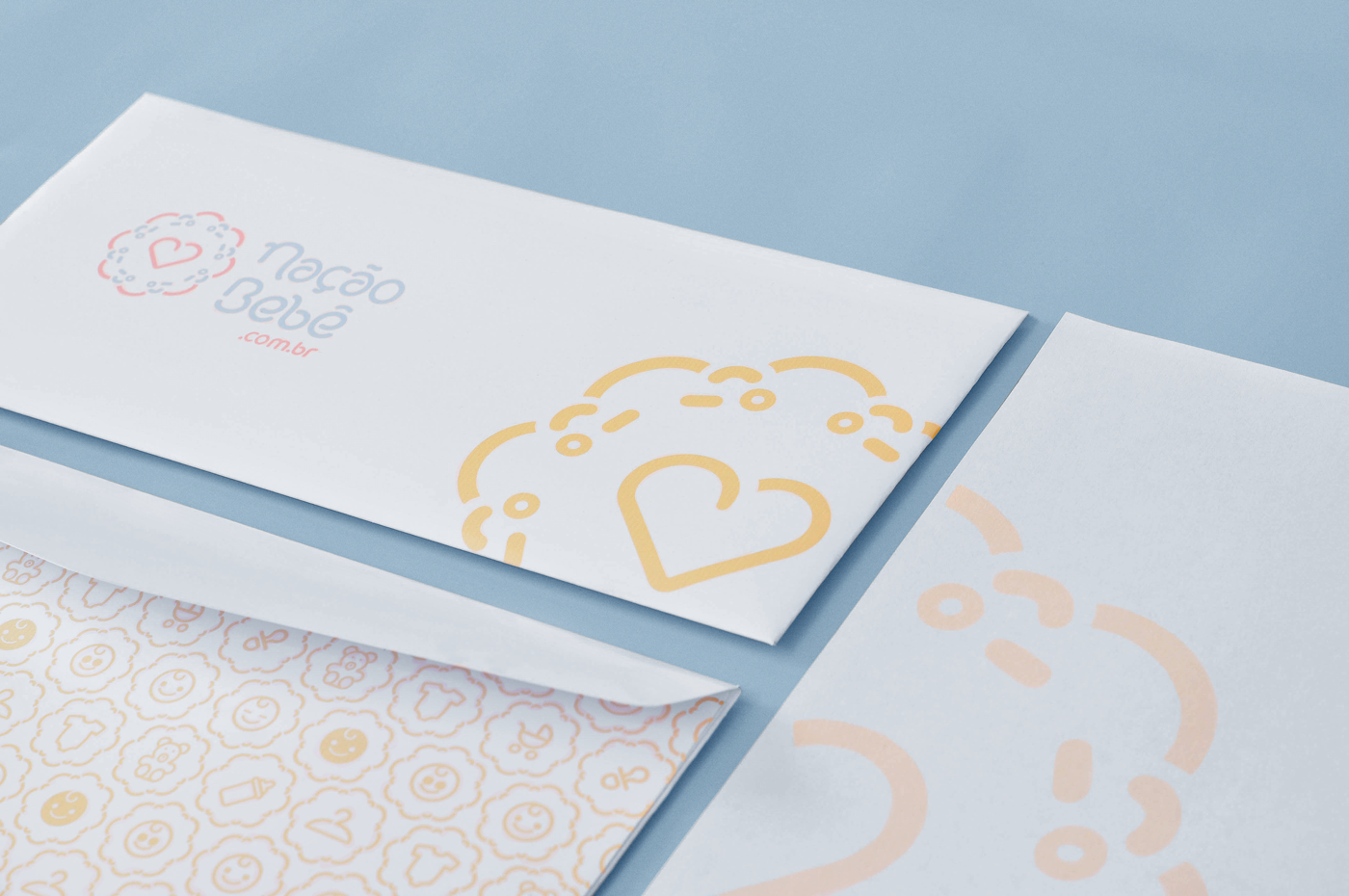
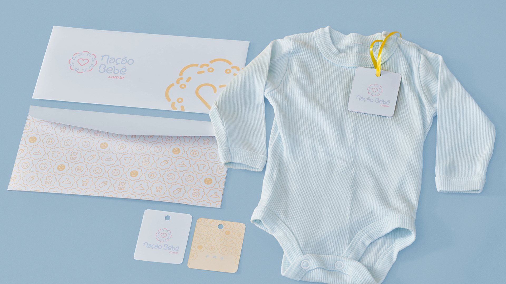
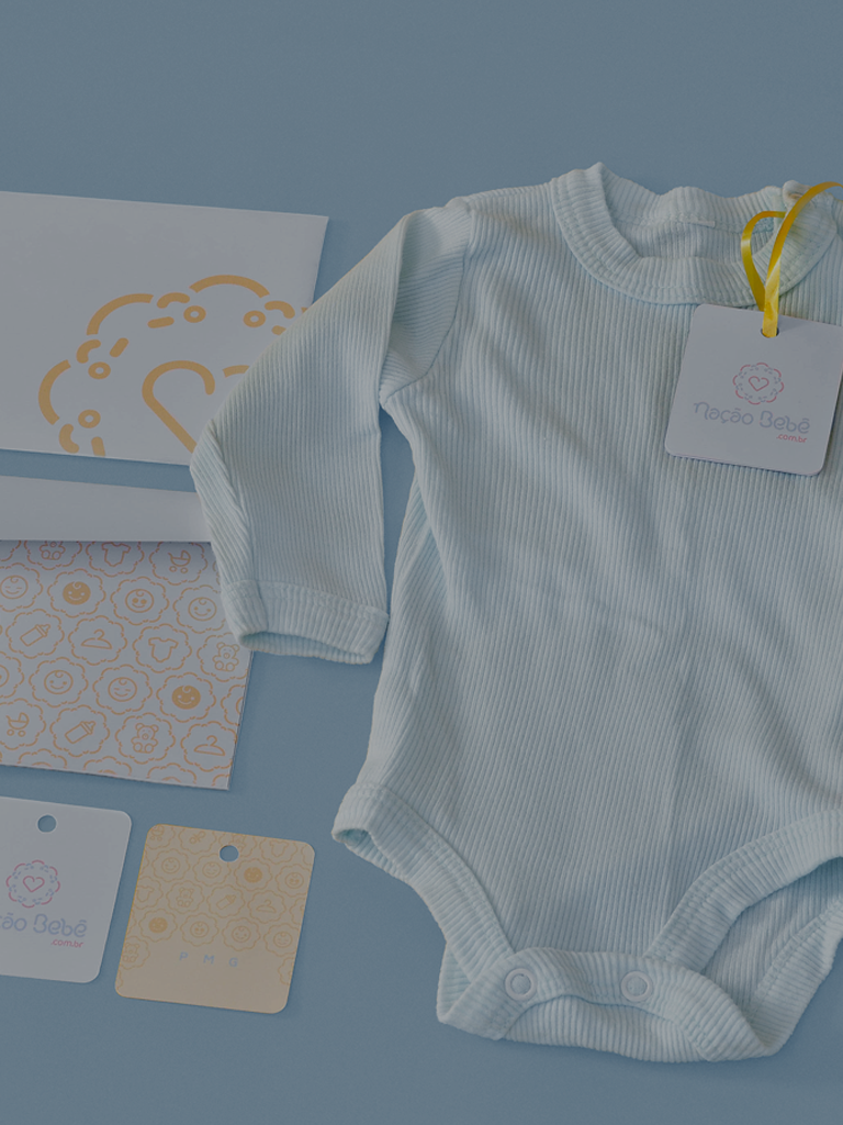
Therefore, we chose to work with a symbol characterized by its circular form representing equality, all in the same panorama and reinforcing the idea of union, of a nation. It is composed of little faces representing different types of people. In the middle to complete we have the heart, the representation of the pure form of every baby, life. The typography designed especially for the brand has as main characteristic the lightness and subtlety of the care and affection with the baby through its sinuous curves that fit in each letter.