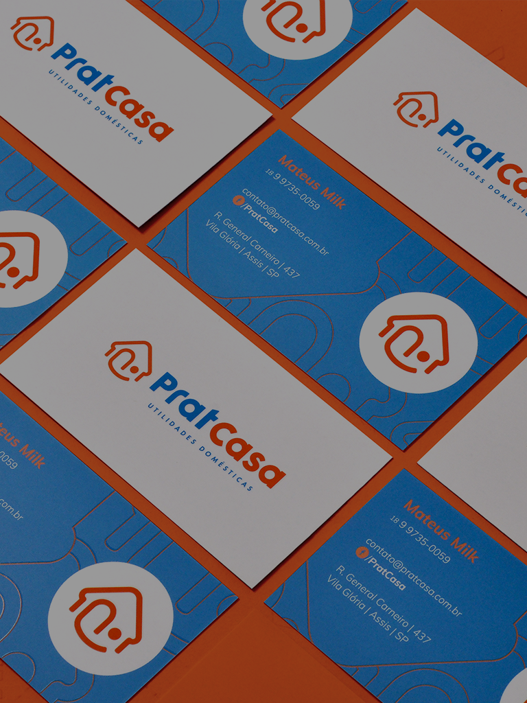
Pratcasa
Visual Identity | Package
Challenge
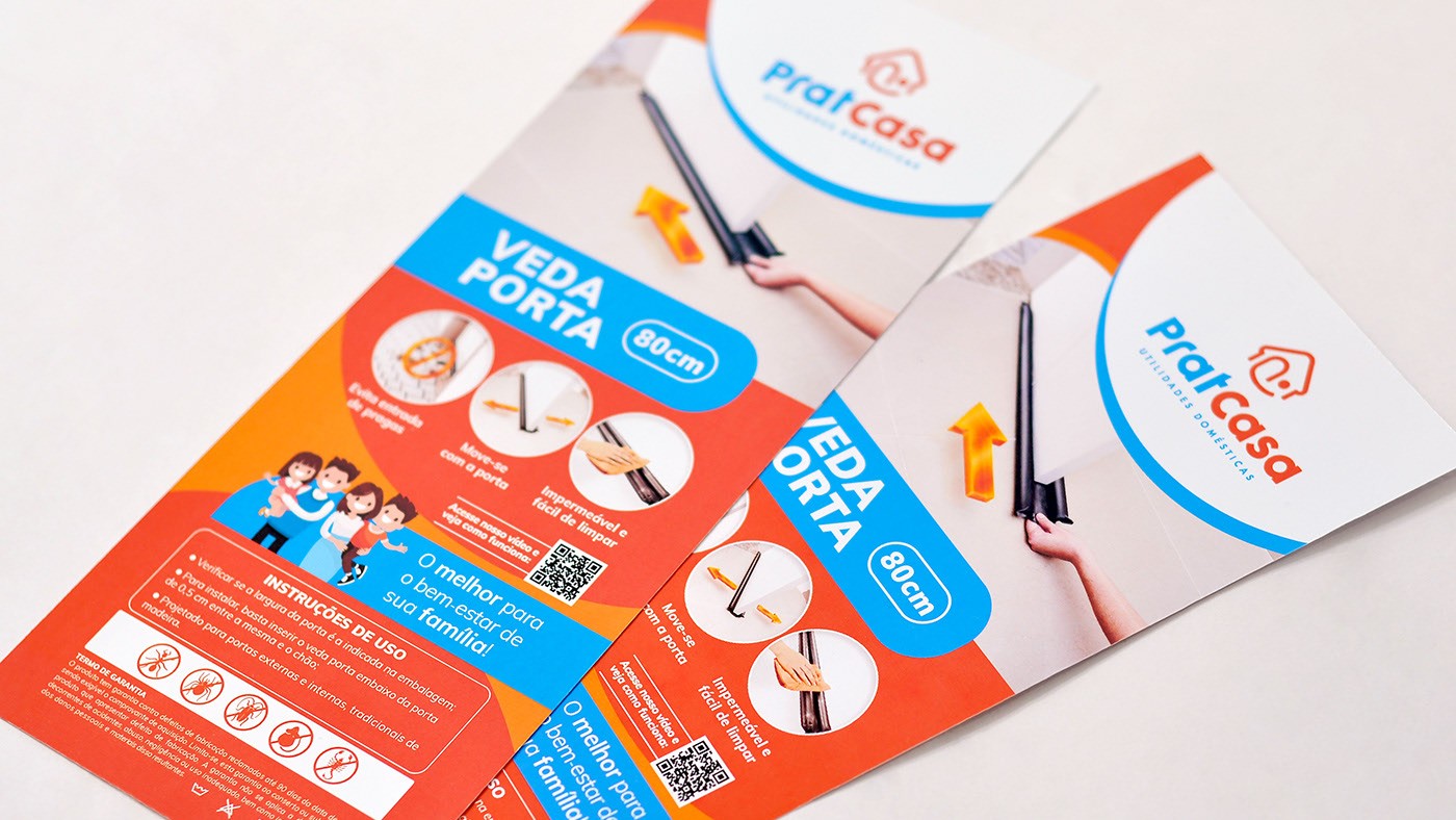
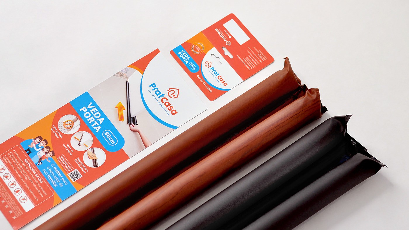
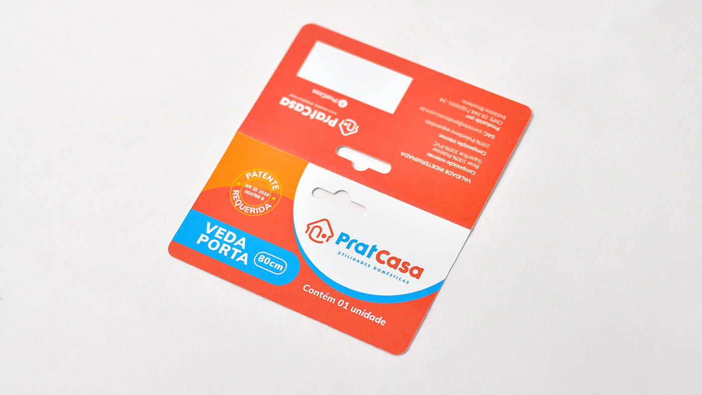
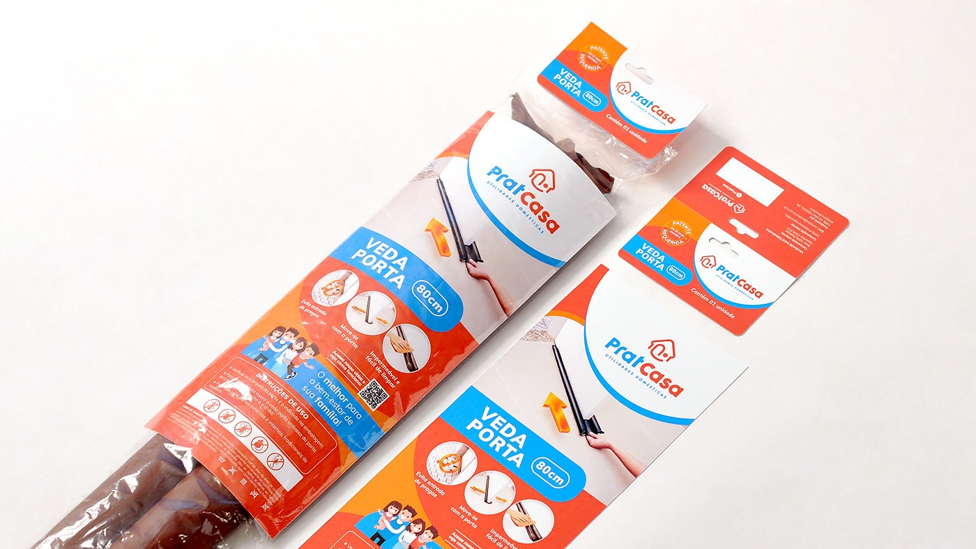
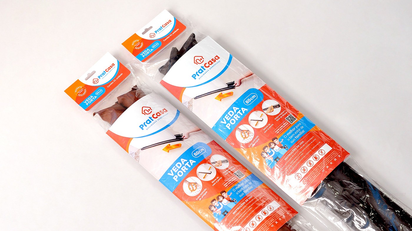
PratCasa is a brand focused on everyday household products. Safety, comfort, practicality and friendliness are the key concepts to translate what the company intends to show with its products. The challenge was to create an attractive and easy-to-understand brand focusing on keeping a low cost retail. The brand and all the visual communication aims to show trust and "win" the audience when paired with the competition.
Proposal
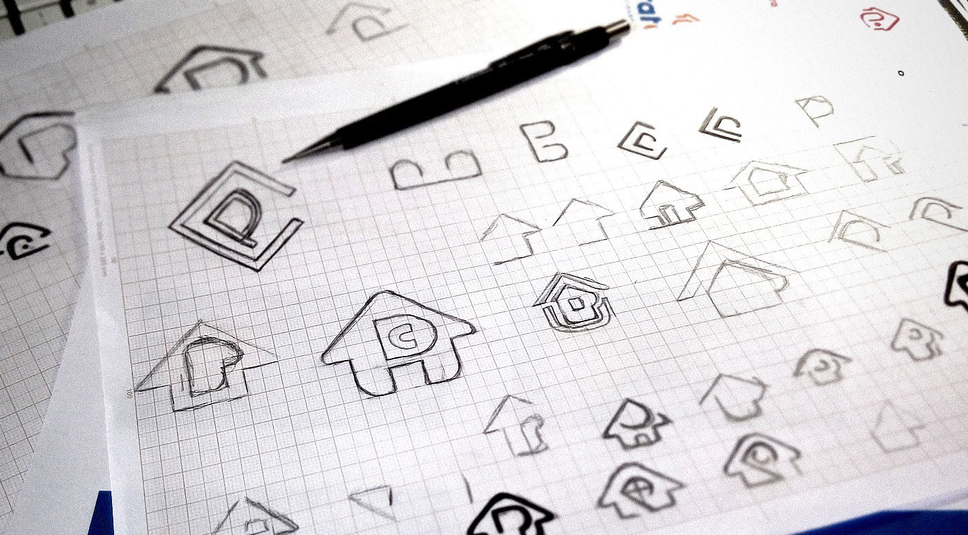
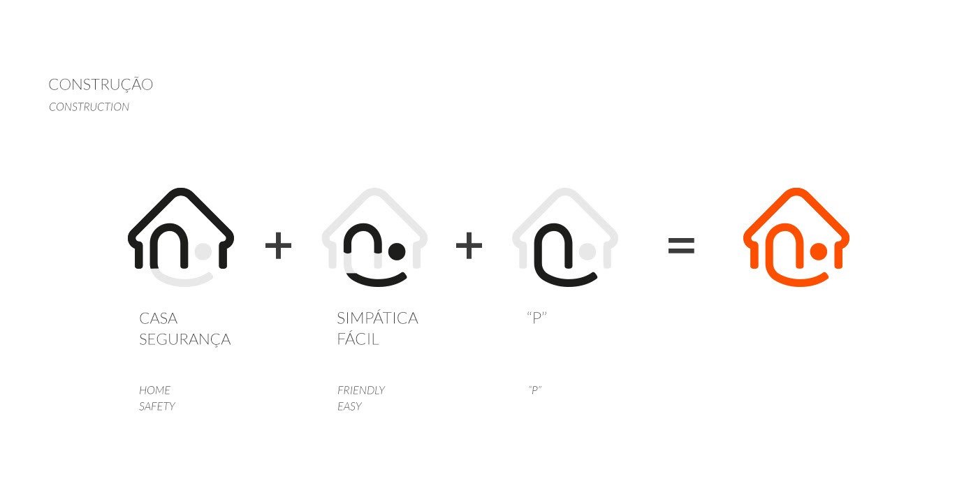
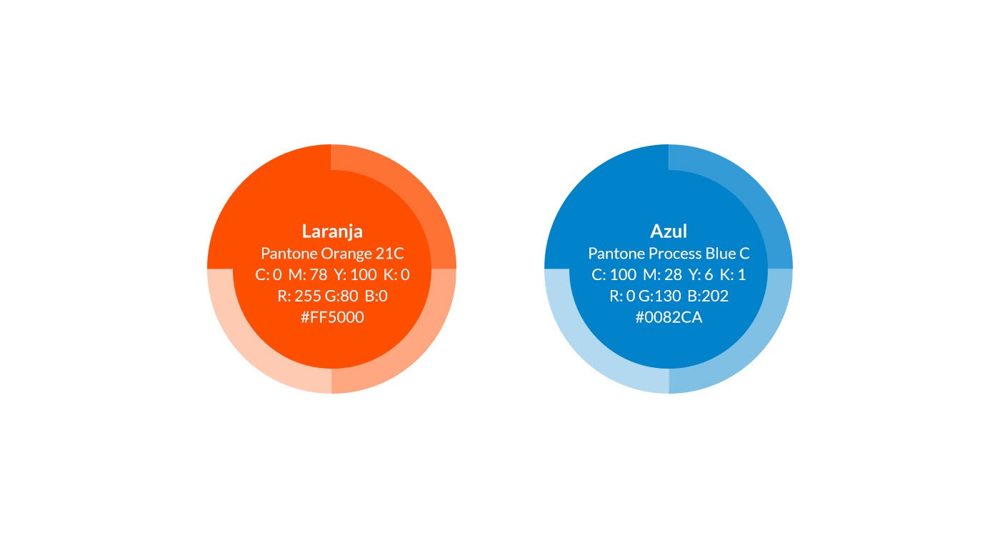
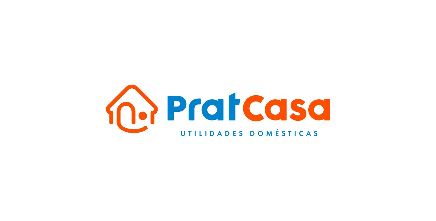
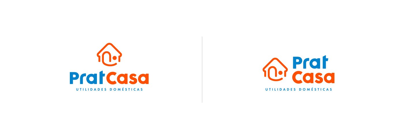
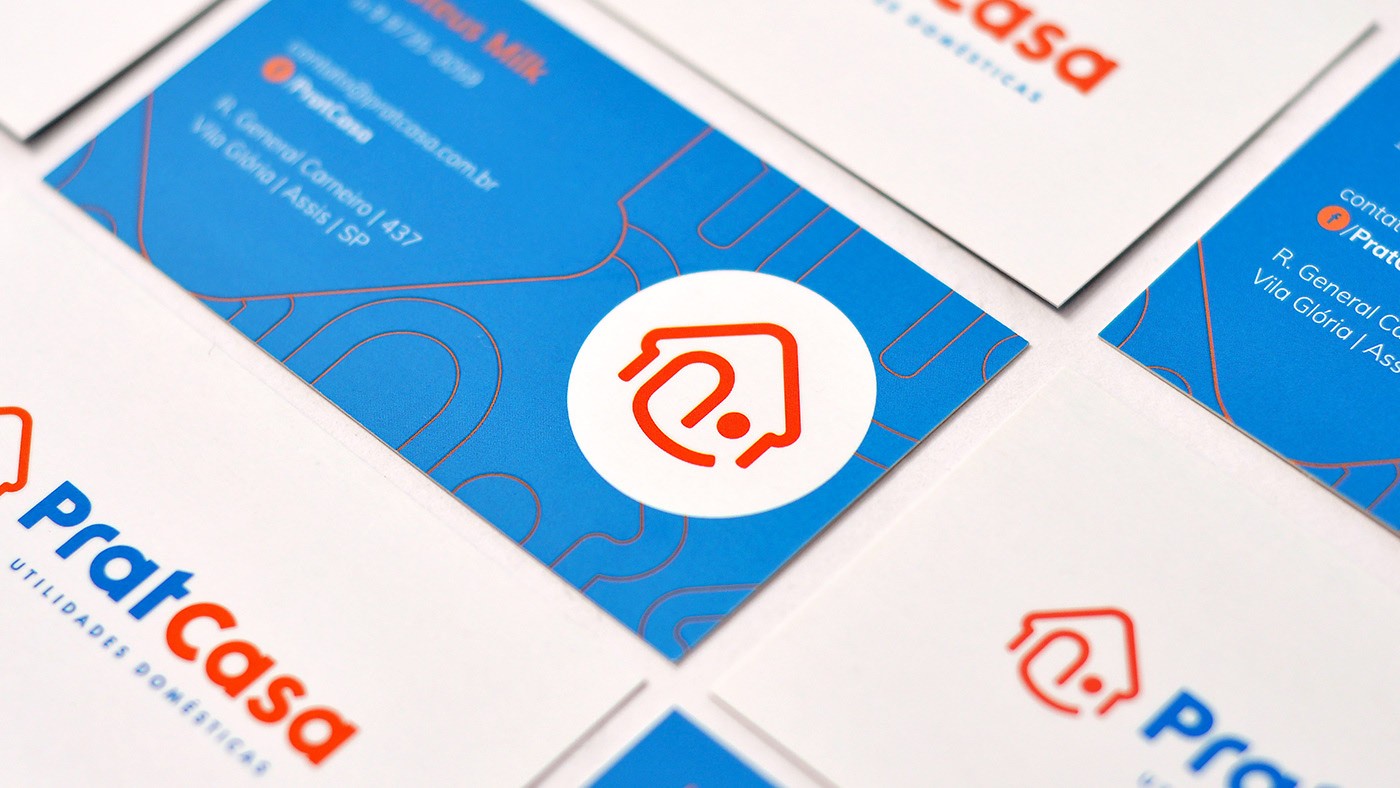
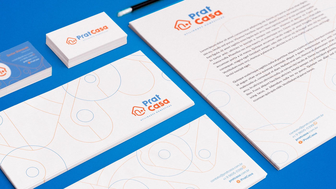
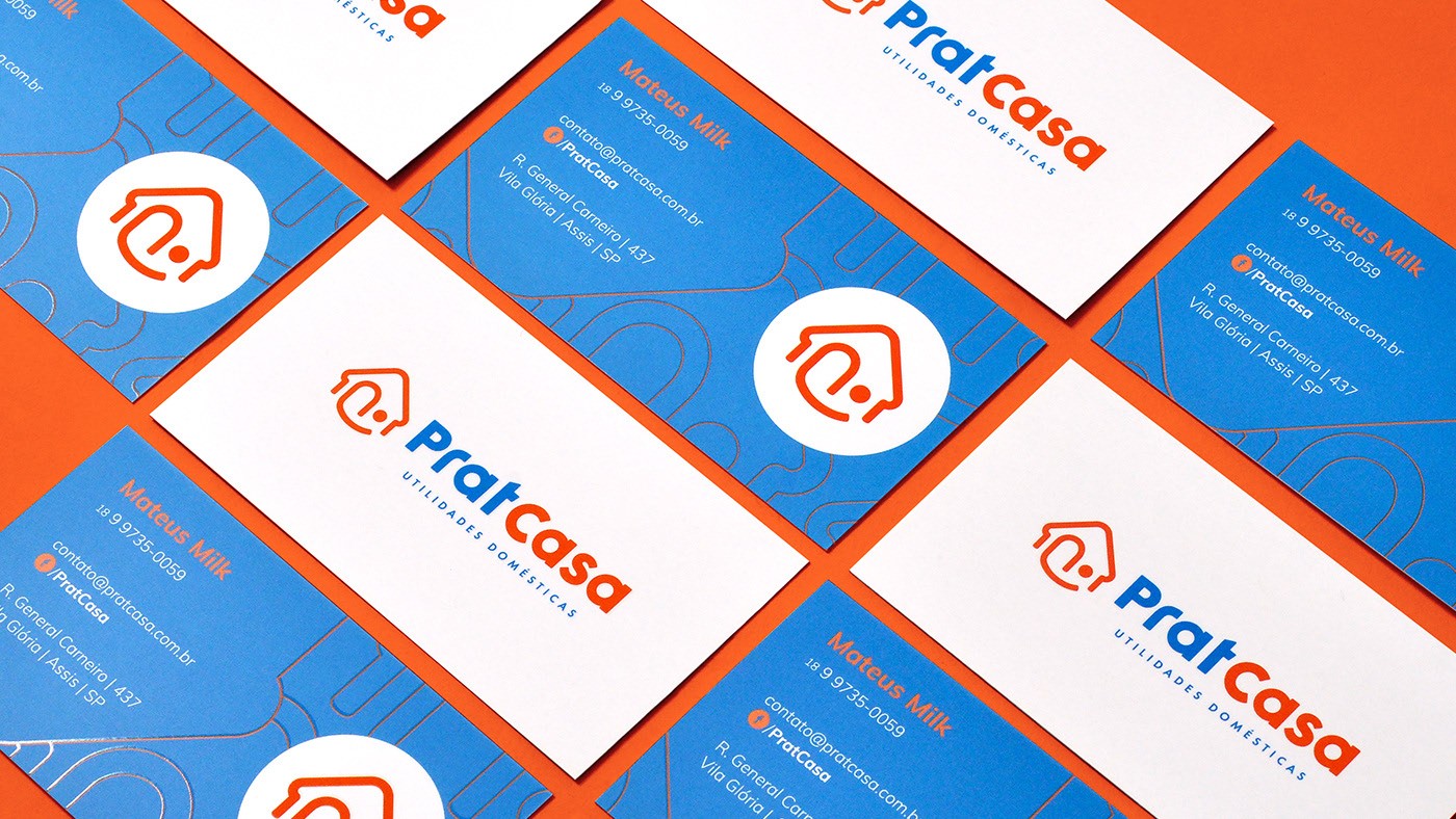
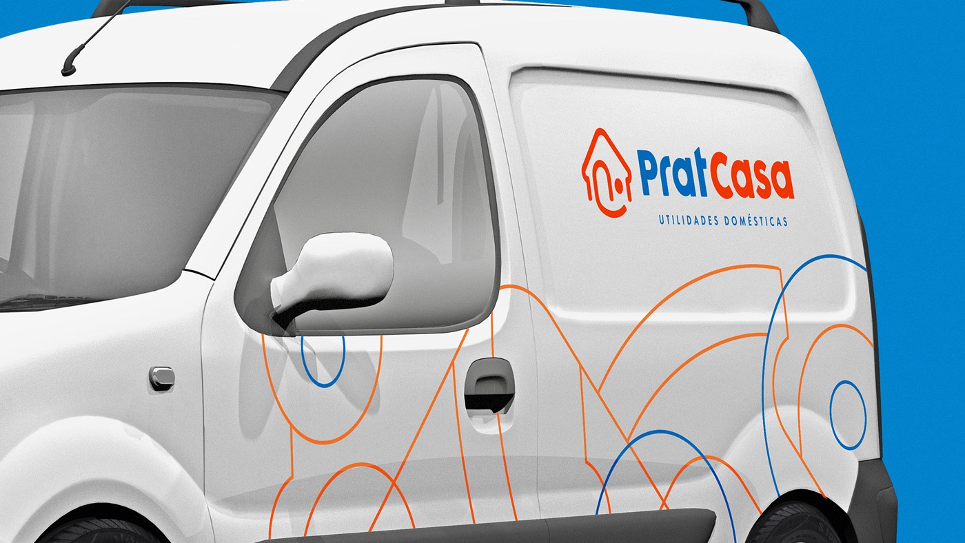
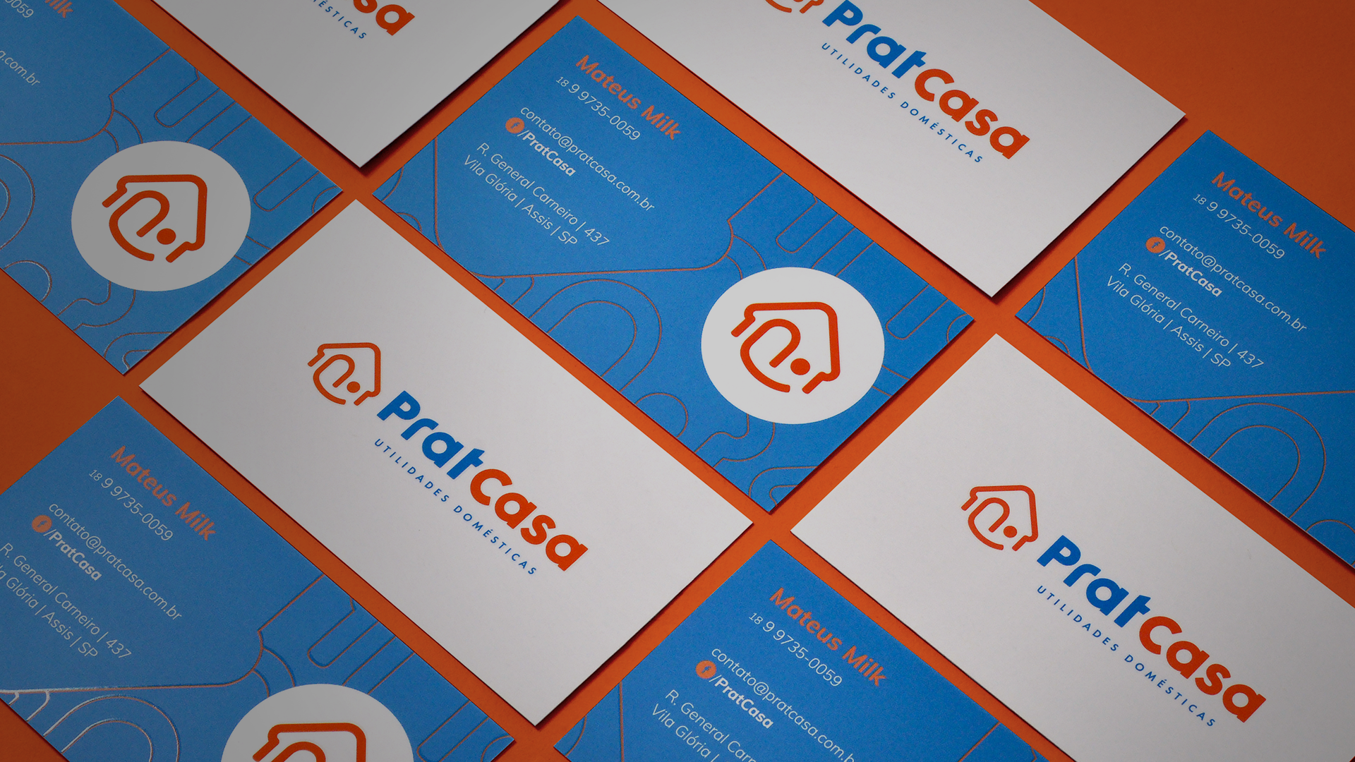
We simplify the understanding by putting the image of a house as part of the symbol, also, it has the function of reinforcing the brand name ("Casa" means house in Portuguese). The smile expresses sympathy and the "blink". Although simple, the symbol has personality, in the seam of the closed eye with the smile, subtly forming the letter "P". The colors work in order to attract attention due to saturation and contrast, demonstrating the idea of modernity.
