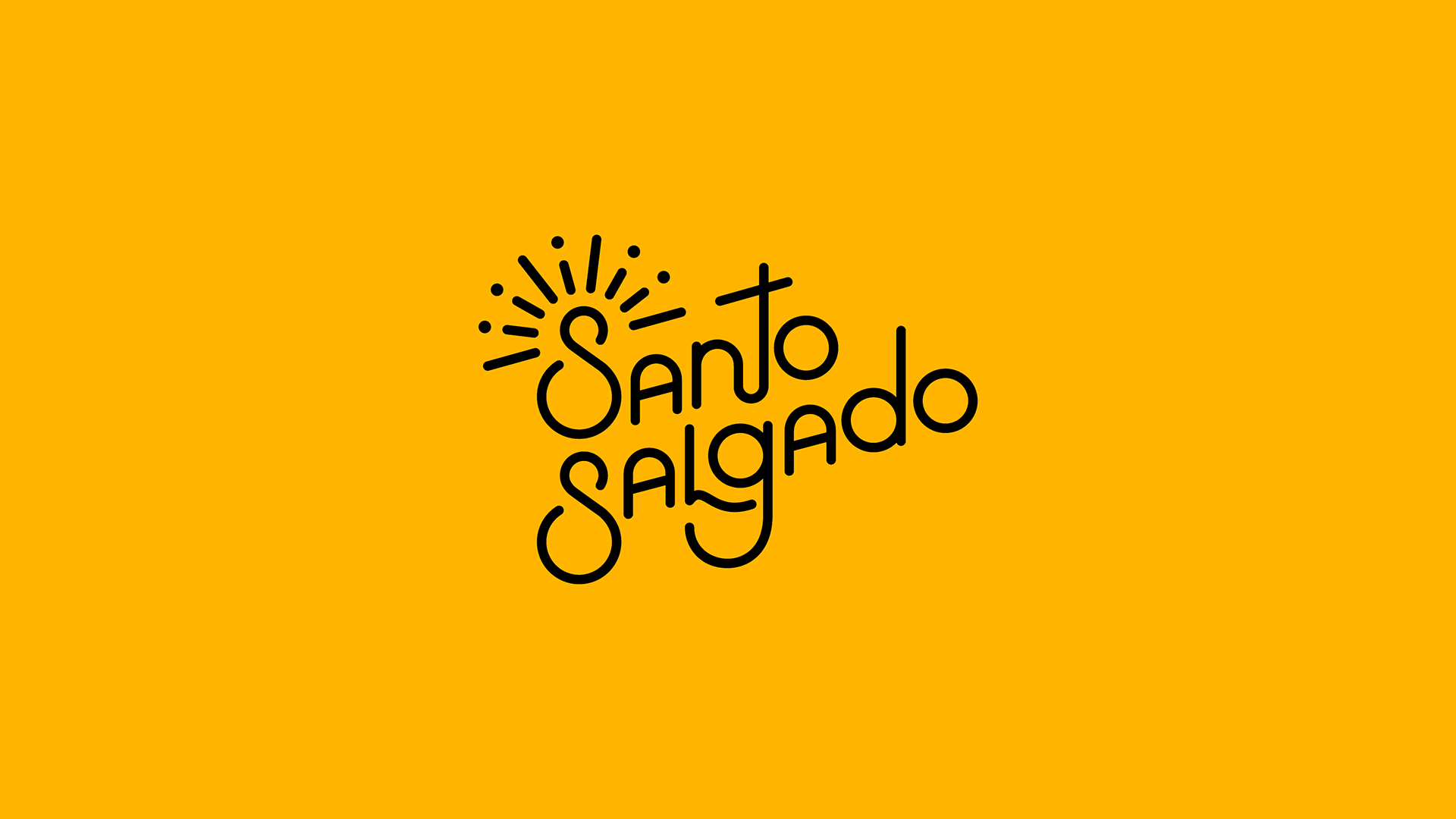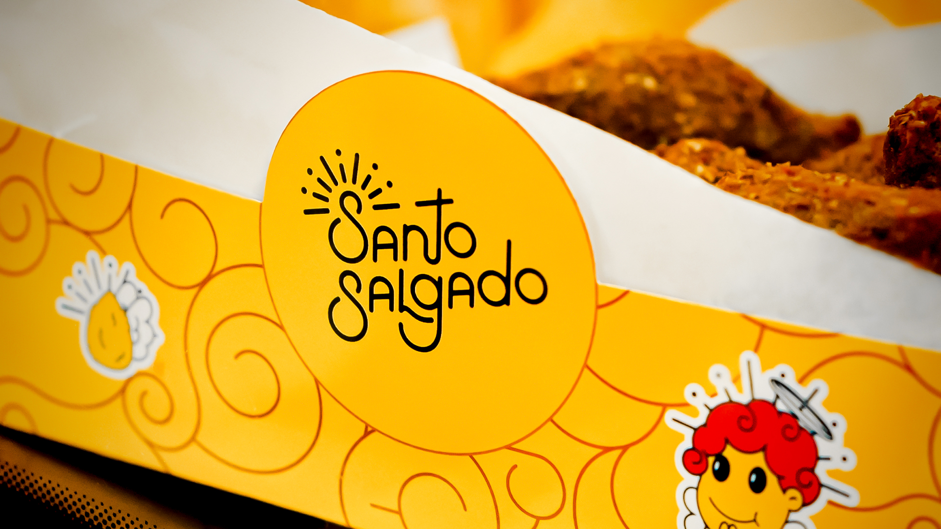
Santo Salgado
Visual Identity
| 2021
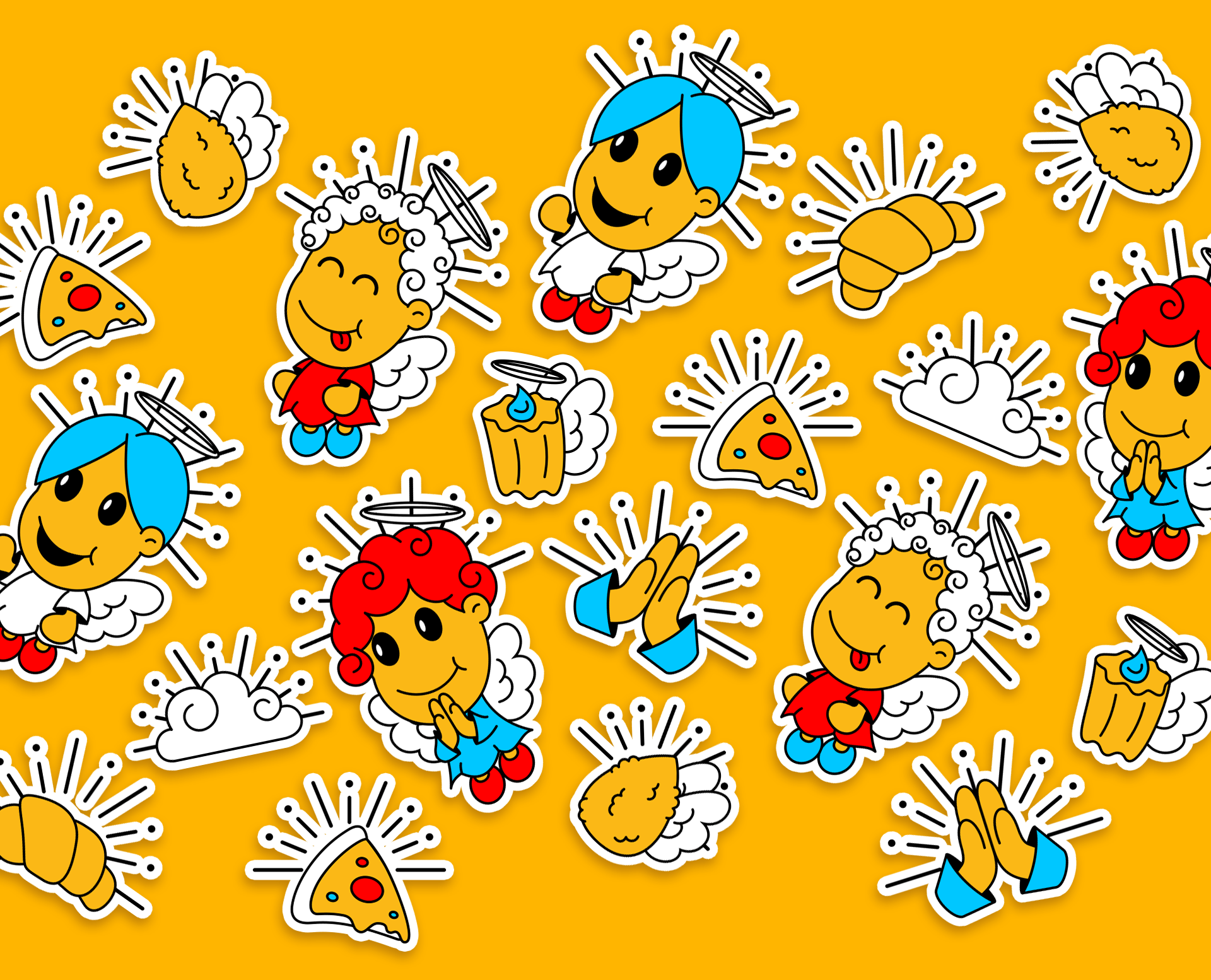
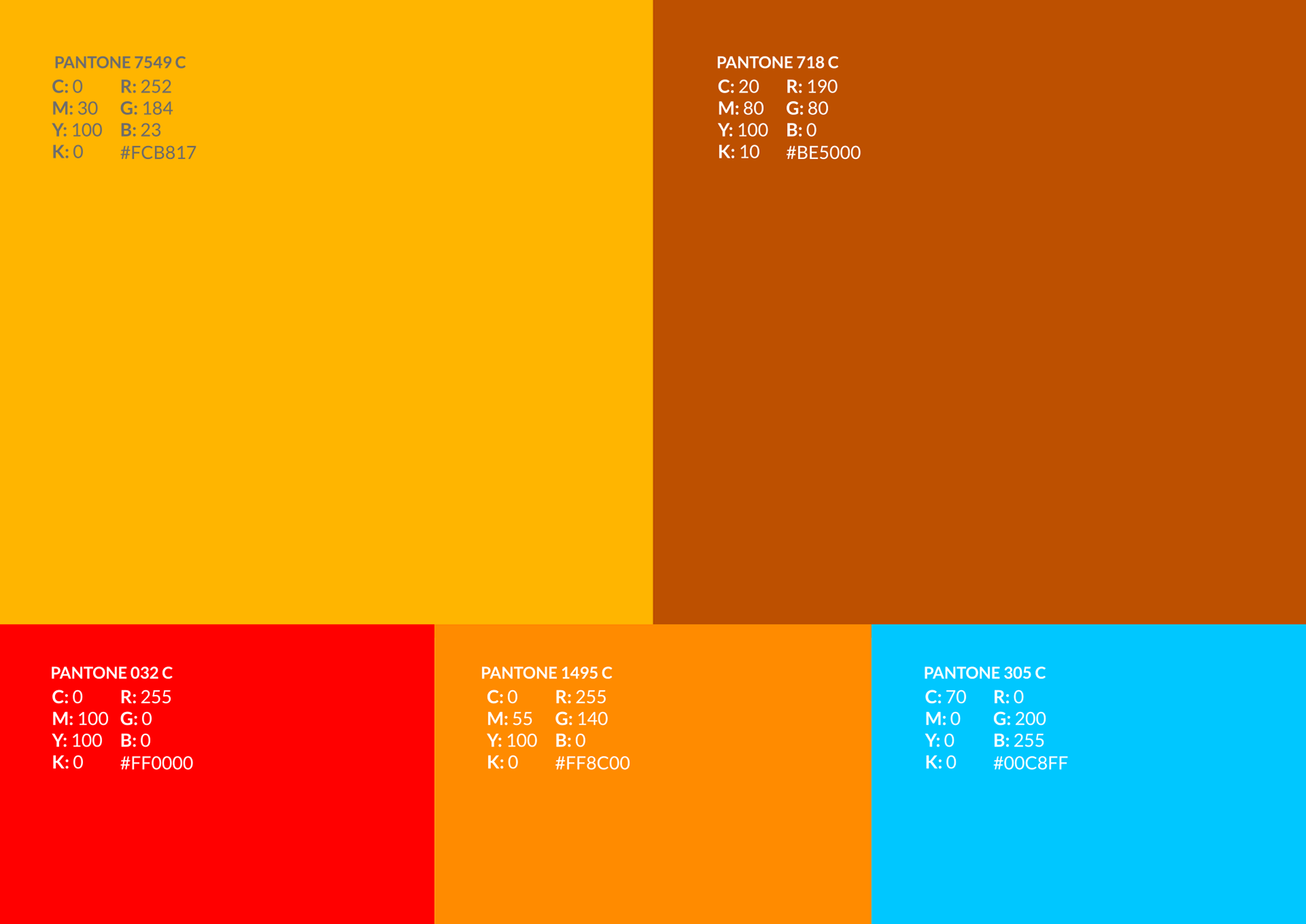
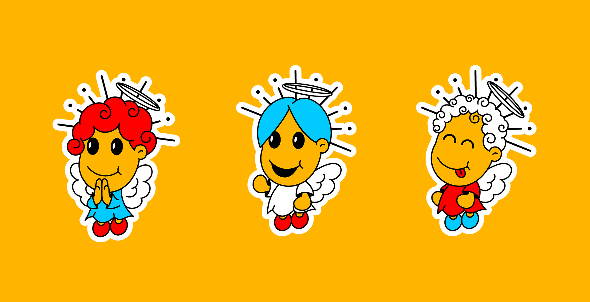
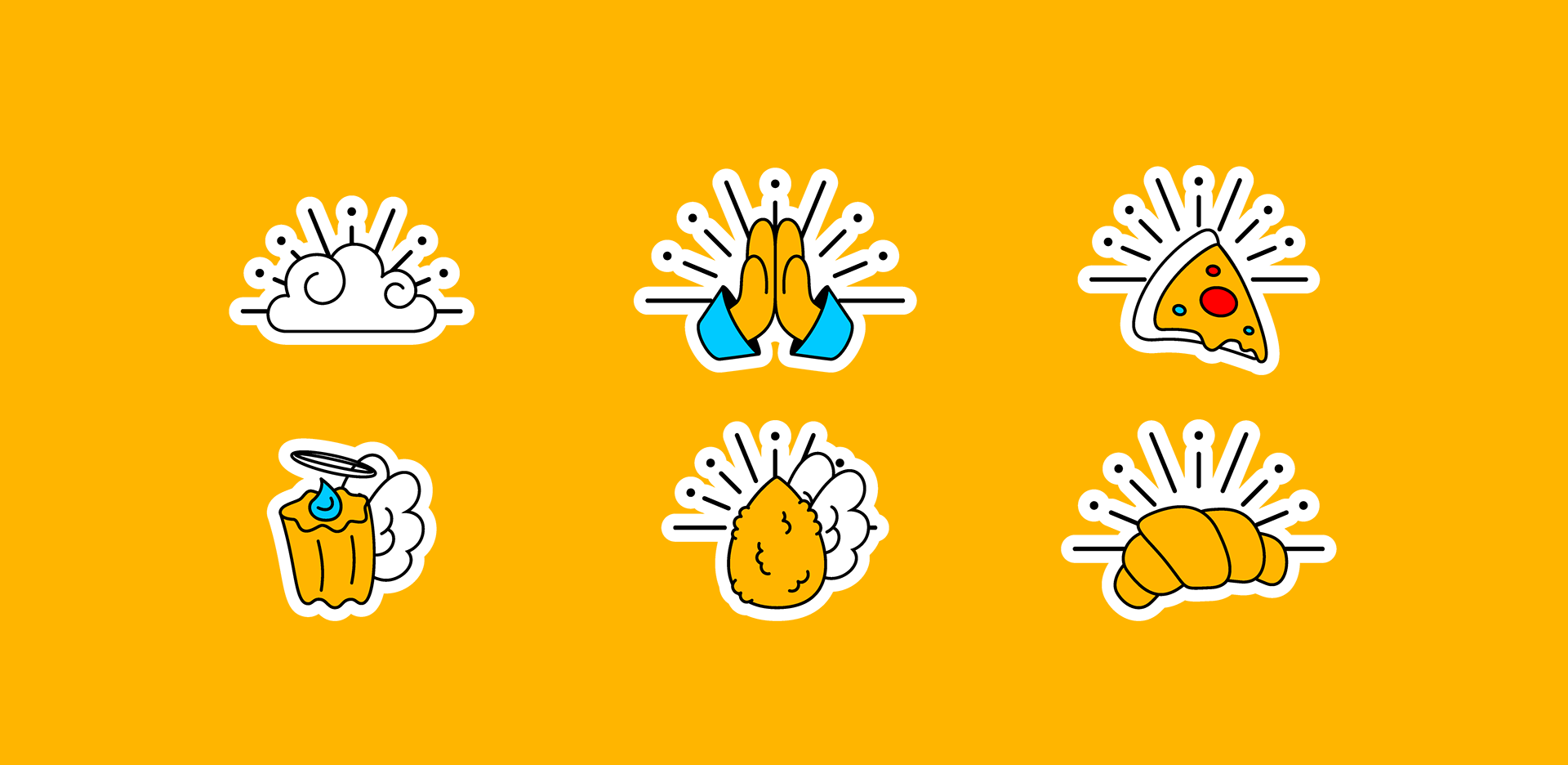
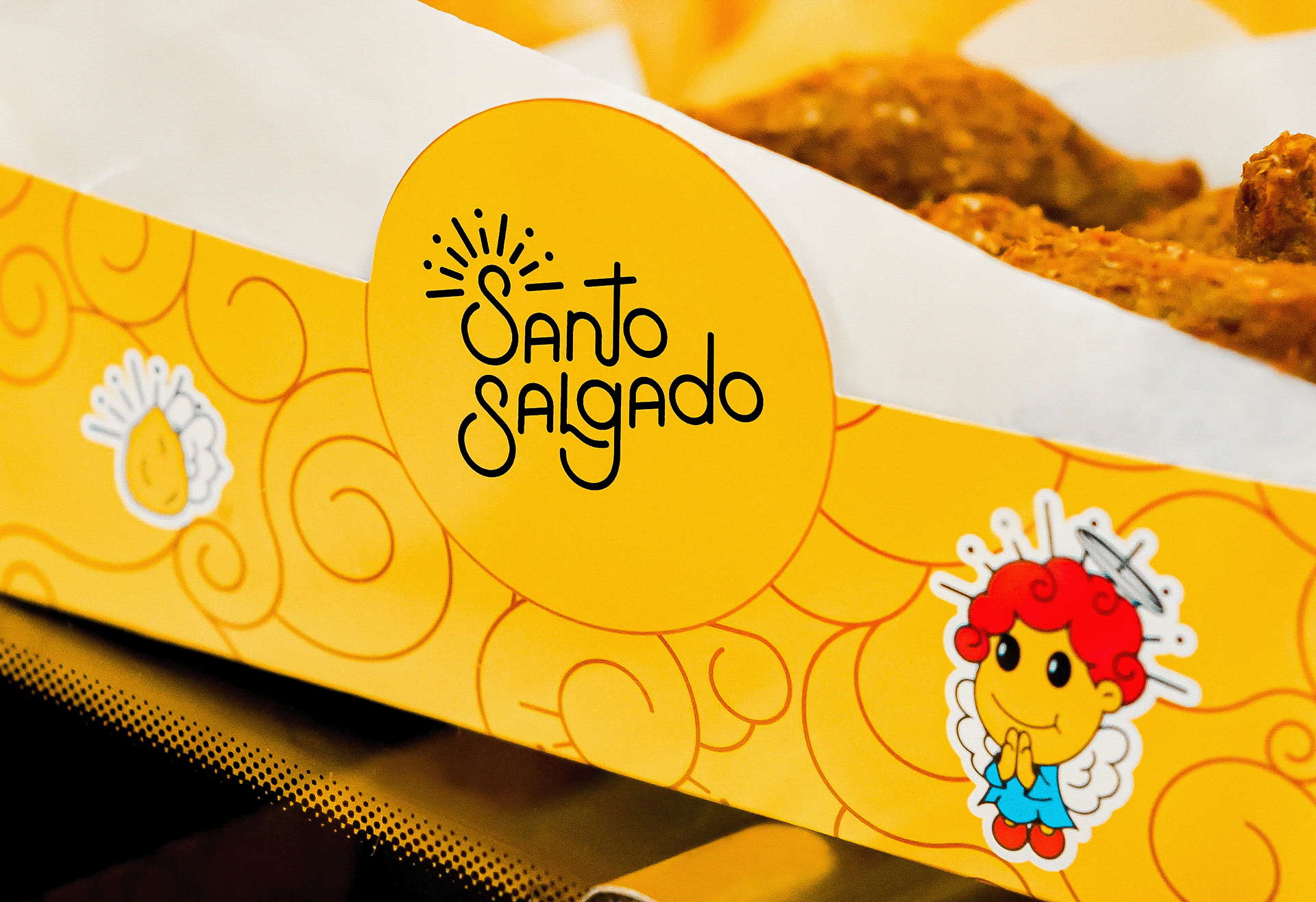
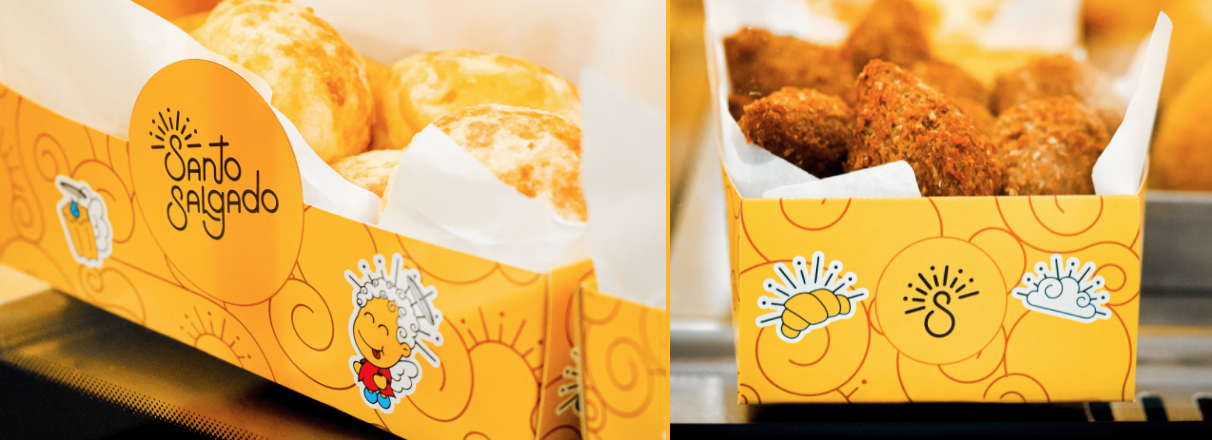
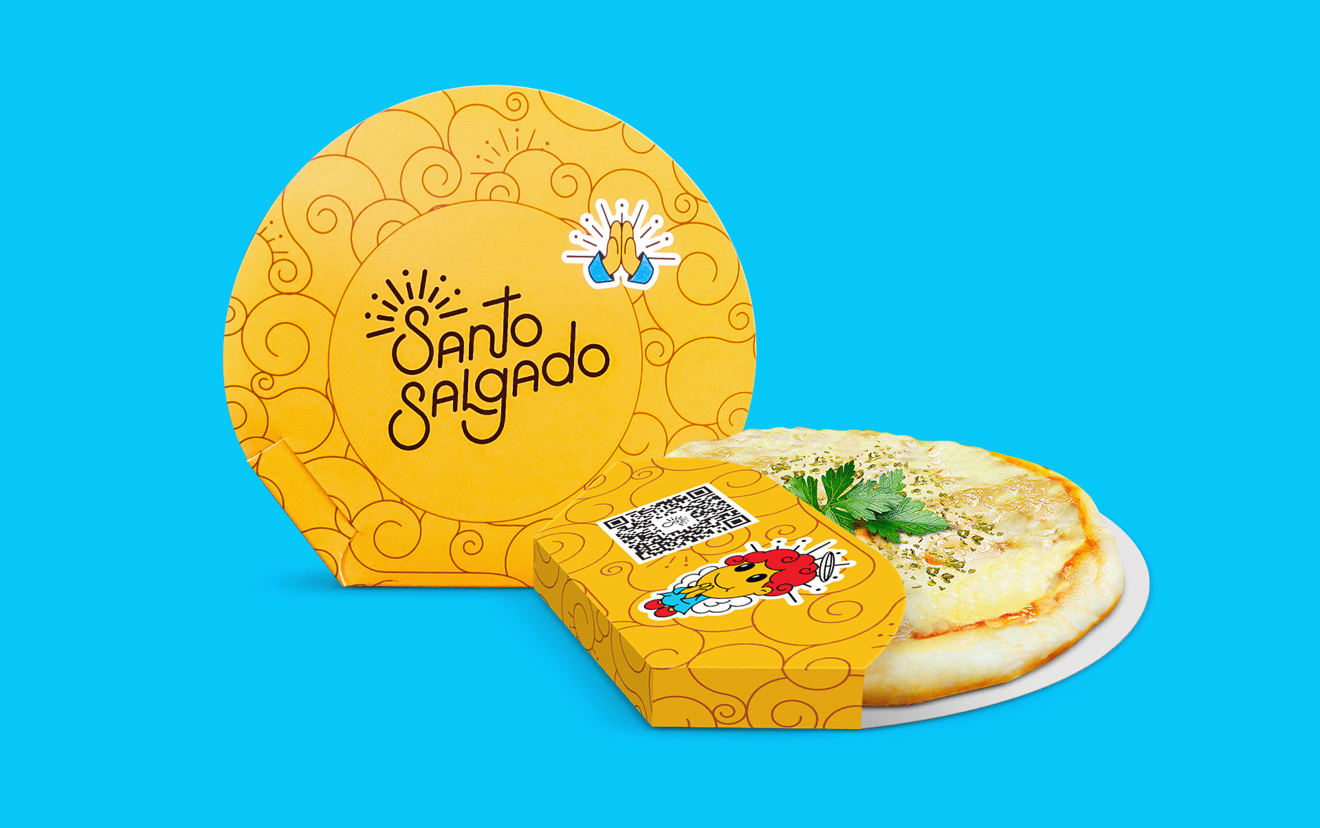
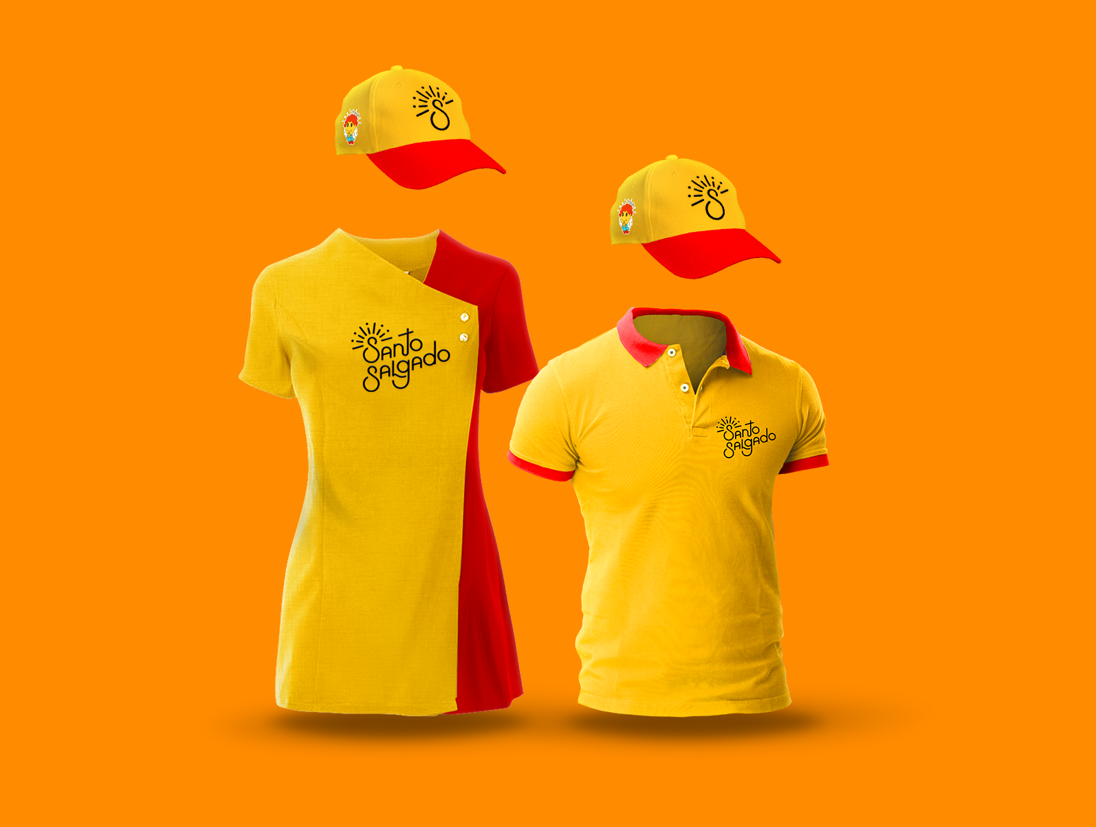
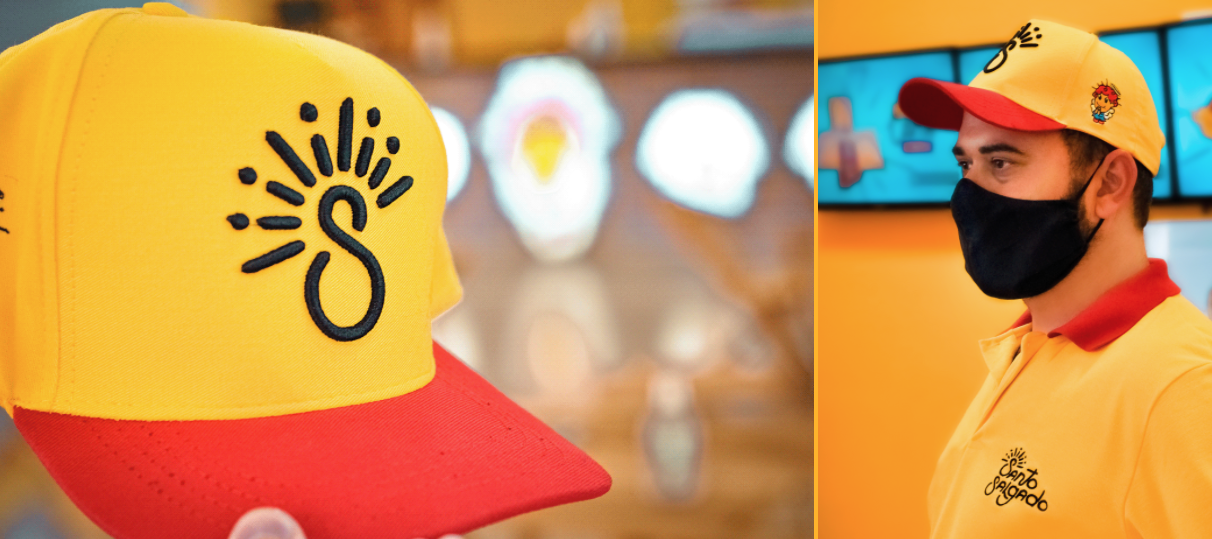
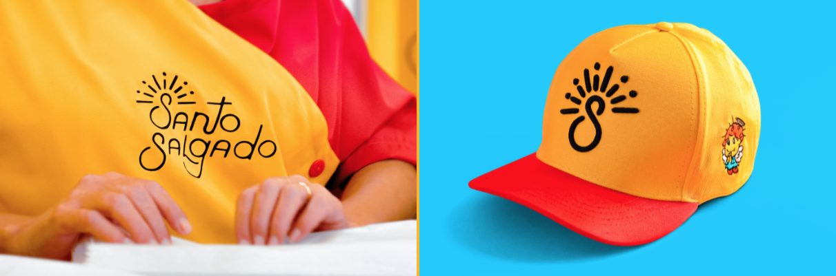
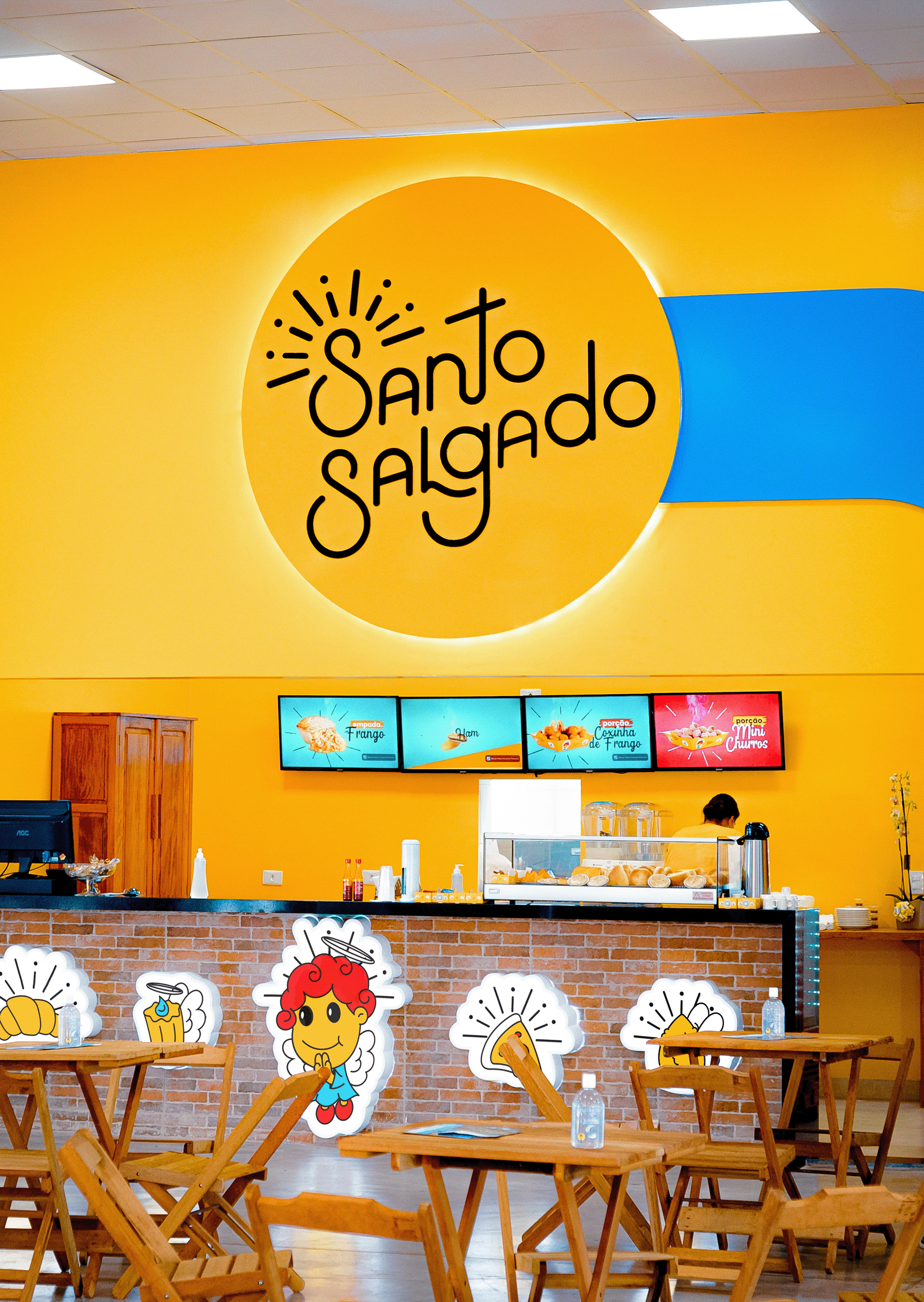
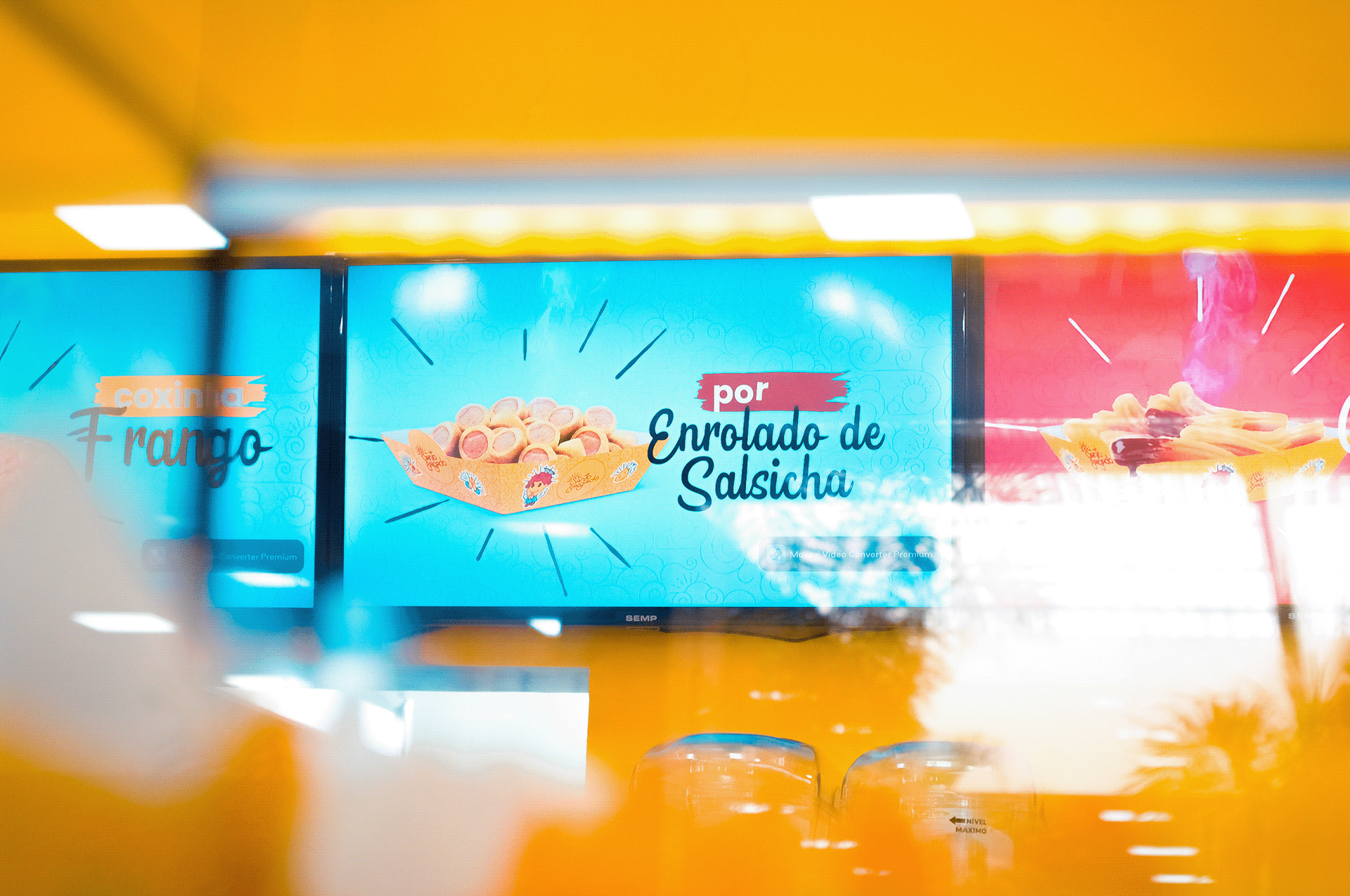
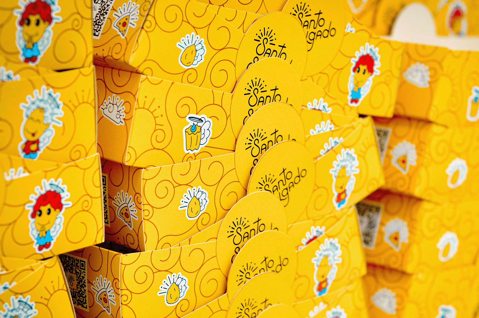
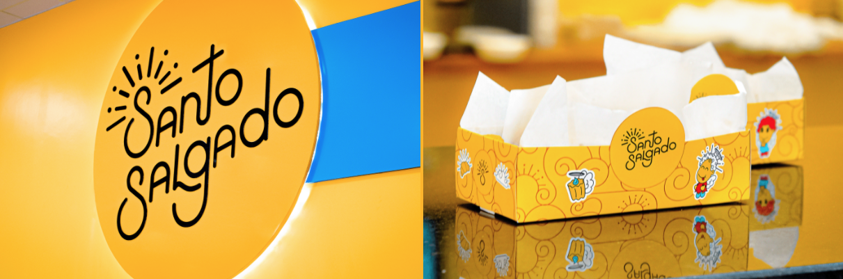
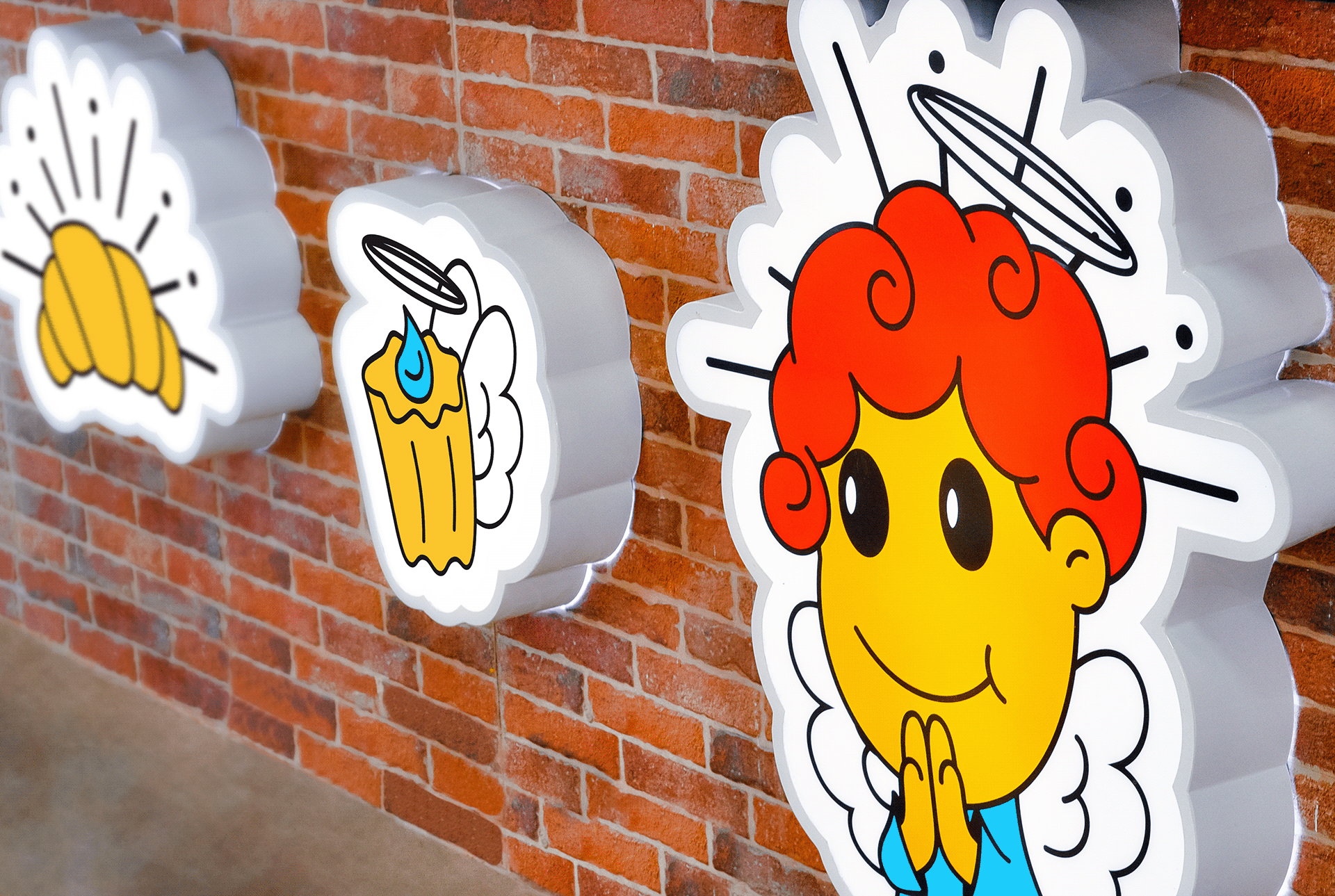
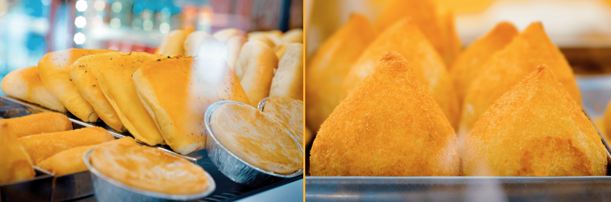
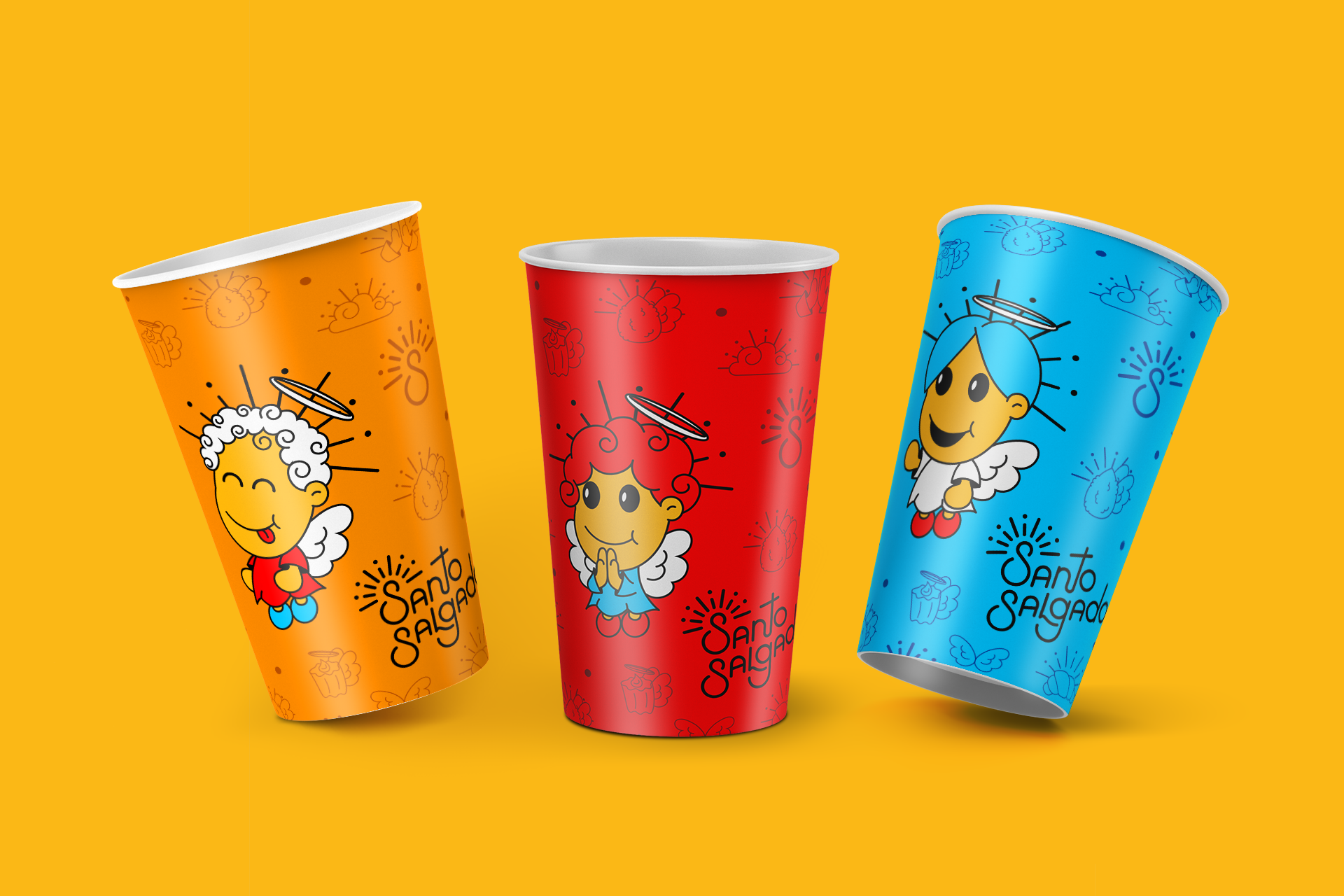
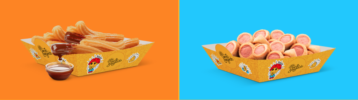
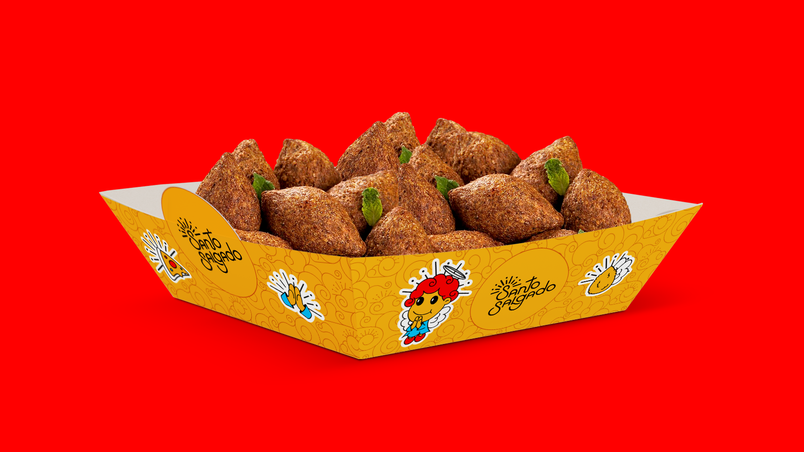
Friendliness, flavor and a hint of sophistication. This was the recipe we received to create the identity Santo Salgado. With this, we work with a playful appeal, but without that focus. This is due to the fact that children are the ones who boost the consumption of ready-to-eat snacks. To make this whole mix real, we worked with the slightly sophisticated logo, balancing it with the pattern composed of organic lines and brown, to warm up the brand awareness. To close, we created playful illustrations with well-defined contours, a characteristic inherited from the logo, filled with a palette of primary colors that make communication happy and simple.